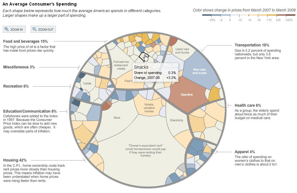
Interesting article exhibiting a very “organic” chart showing influence of various factors in the inflation.
Note the scale given at the top, showing the relationship between color and change in price. The graph itself is hierarchic, with 8 different categories (apparel, health care, etc…), and each is divided up into sub categories shown as blobs of various sizes, the size being proportional to the part of spending.
The graph is interactive on the NYT web site, and gives more info about a blob on mouse-over.
The graph is done in flash.
Newvisual
Category: Business / Stock Market
Where: Seattle, WA
Implementation: NA
Date: 2006
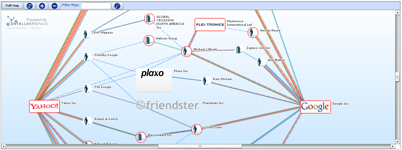
newvisual is a product of IntellectSpace Corporation a company that offers strategy and risk analysis solutions to investment banking and private equity sectors. The company develops and operates a Web based qualitative analysis system that analyzes and represents regulatory filings and corporate announcements. IntellectSpace was founded in 2003 and is based in Seattle, Washington.
Demographics
Geographical
Visualizing the medals at the Olympics
Category: Newsprint, Geographic
Where: NYT
Implementation: 2D
Date:
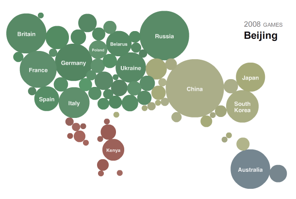
This is a dynamic display of the number of medals obtained at various olympics. This is nicely done, and uses some form of circle packing.
CityMurmur.org
Category: Geographic
Where: Politecnico di Milano
Implementation: geographic
Date: NA
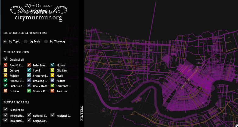
CityMurmur is a Web application that periodically scans a pool of news sources, blogs, and online newspapers searching for references to local streets, points of interest and areas of the city. using this information the application is then able to plot topographical and semantic maps of the city according to the topic discussed by the news source( culture, society,...), the source's topology (blogs, online newspapers), and its scale (local media, regional media). </i>
Government / Politics
Cartograms
- Category
- Geographic, Government / Politics
- Where
- Department of Physics and Center for the Study of Complex Systems, University of Michigan
Implementation: 2D
Date: 2008
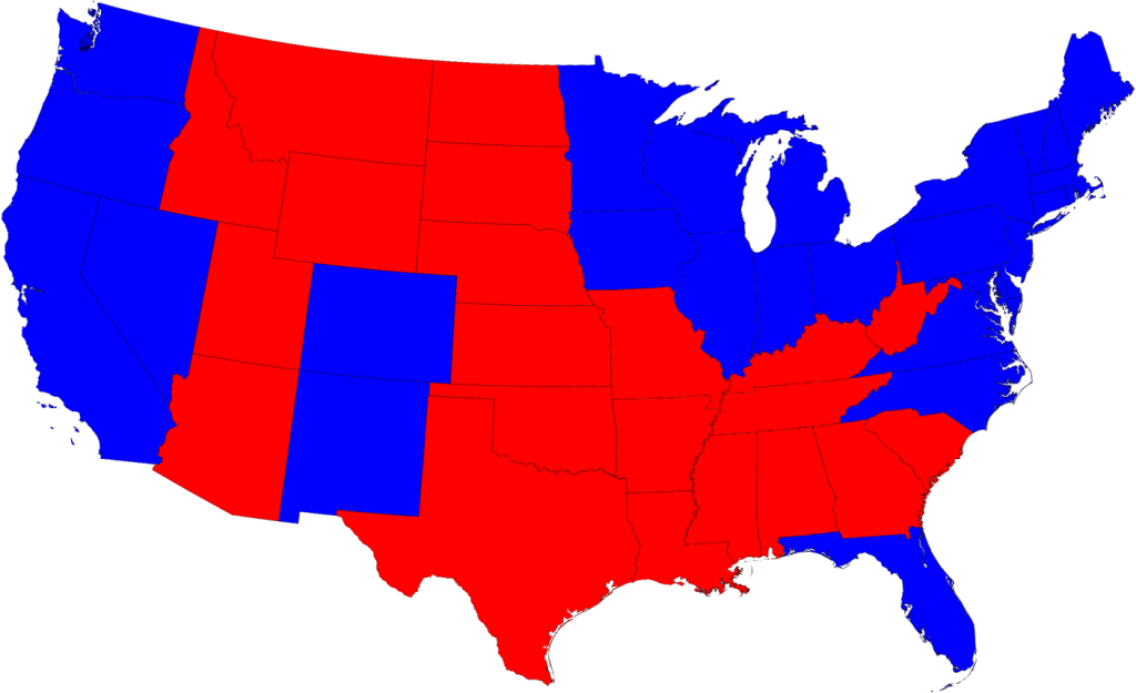
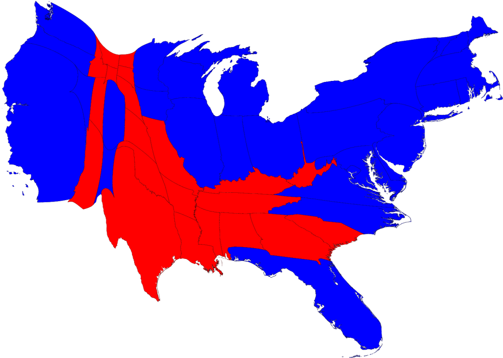
Maps of the 2008 US presidential election results, generated by M. E. J. Newman, U. Michigan.
The map on the left is geographically correct. The map on the right shows the states deformed in such a way that their area is now proportional to the number of electoral votes they carry.
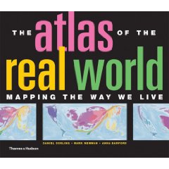
The author is a co-author of the Atlas of the Real World (Hardcover) published by by Daniel Dorling (Author), Mark Newman (Author), Anna Barford (Author), published Oct. 2008.
More cartograms can be found here.
A String of Debates
Category: Political/Government, Newsprint
Where: NYT
Implementation: 2D
Date: 2008
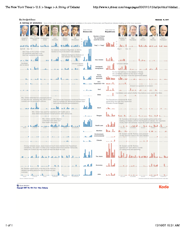
From the NYT, 12/15/2007 article: "A String of Debates", showing statistics on words/concepts appearing in candidates speeches
Historical
HistoryShots
Category: Historical
Where: Westford, MA 01886
Implementation: prints
Date: 2009
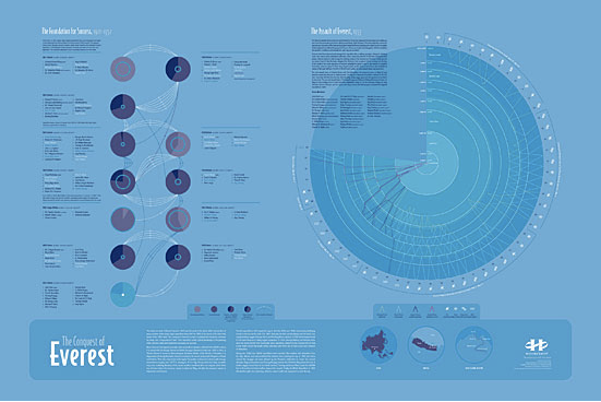
We create informational graphics that tell stories about subjects, time periods and events. Our purpose is to inform and entertain you with intense content embedded in an elegant design.
Humor
Funny Cartoons (for Wikipedians)
Category: humor
Where: http://xkcd.com/333/
Implementation: NA
Date: 2008
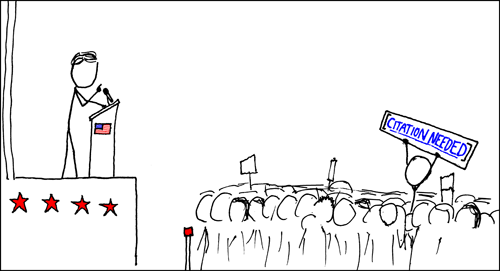
From the geeky site http://xkcd.com/. Note that the page on the laptop looks like a wikipedia page! There was a NYT article on 5/25/08, Link by link: This is funny only if you know Unix on this web-toon site.
Internet / Search
Chris Harrison's Wikipedia Visualization
Category: Lexical/Text, Internet/Search
Where: Politecnico di Milano
Implementation: network
Date: NA
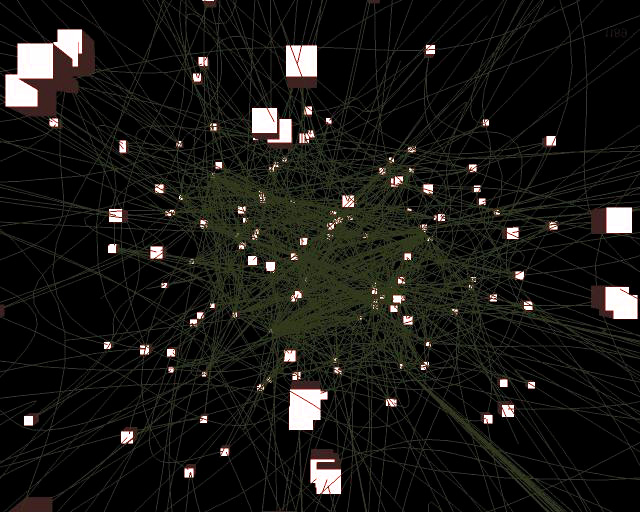
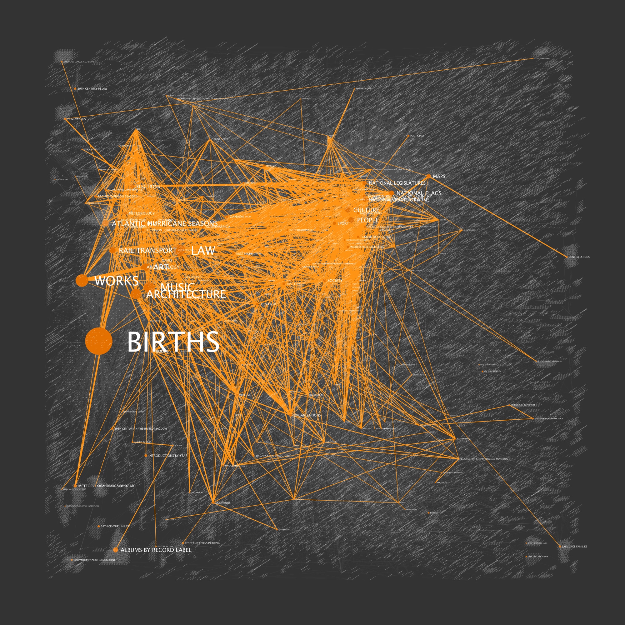
During [his] time at AT&T Labs, which coincidently has a great information visualization group, [he] started [to] think about how to visualizing something as massive as Wikipedia. With roughly 1.5 million articles (vertices) and tens of millions of article links (edges), a comprehensive visualization package would have to found or built. After playing around with GraphViz, but getting frustrated with layout limitations, I decided on the latter option: build!
Map of Science at Los Alamos
- Category
- text / lexical, Internet / Search
Where: Los Alamos National Laboratory
Implementation: network
Date: 2009
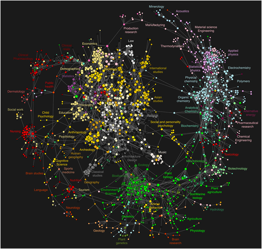
Los Alamos National Laboratory scientists have produced the world's first Map of Science—a high-resolution graphic depiction of the virtual trails scientists leave behind when they retrieve information from online services. The research, led by Johan Bollen, appears this week in PLoS ONE (the Public Library of Science).
Knowledge Management System
Code Swarm
- Category
- Knowledge Management System
Where: UC Davis
Implementation: 2D, 3D, network
Date: 2008
Code-Swarm is a visualization technique to show the evolution of a software project under CVS as it is updated, modified, and as it evolves under the influence of many contributors/programmers.
From Slashdot: http://developers.slashdot.org/developers/08/06/16/1855209.shtml
“A student at UC Davis has created some stunning visualizations of open source software contributions, including Eclipse, Python, Apache httpd and Postgres. From the website: ‘This visualization, called code_swarm, shows the history of commits in a software project. A commit happens when a developer makes changes to the code or documents and transfers them into the central project repository. Both developers and files are represented as moving elements. When a developer commits a file, it lights up and flies towards that developer. Files are colored according to their purpose, such as whether they are source code or a document. If files or developers have not been active for a while, they will fade away. A histogram at the bottom keeps a reminder of what has come before.’”
Watch the video: code_swarm - Eclipse (short ver.) from Michael Ogawa on Vimeo.
The code is available on Google-Code, and the 6/19/08 version is available here
Lexical / Text
NeoFormix Word Chart
Category: Lexical/Text
Where: NA
Implementation: 2D
Date: NA
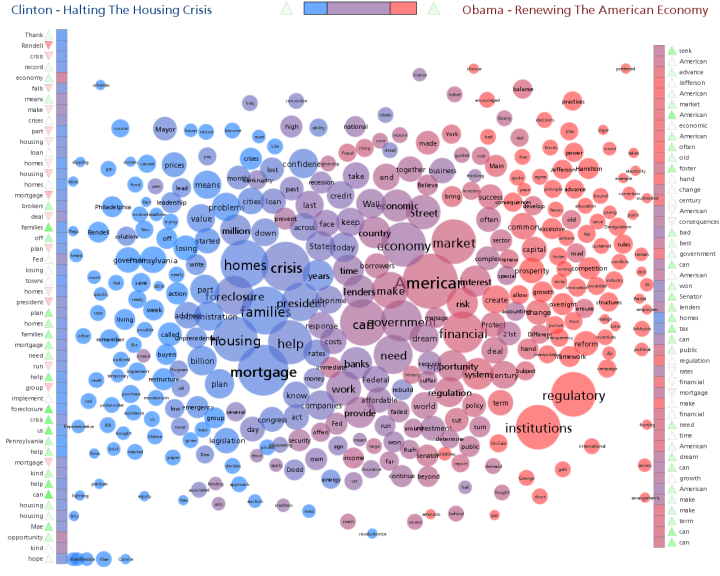
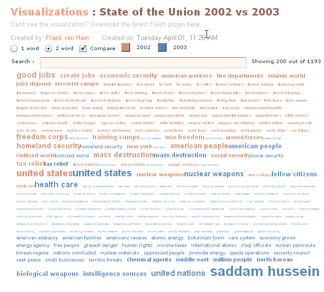
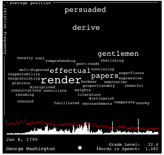
Interesting comparison of two speeches…
GapMinder.org
- Category
- text / lexical, government / politics
- Where
- Professor of International Health at Karolinska Institutet, Sweden
Implementation: network
Date: Present
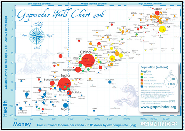
Watch a great presentation by Hans Rosling on world statistics on TED. He uses very clean, simple graphs (Flash, very likely) showing the variation of world data vary as a function of time. The message is extremely convincing.
Map of Science at Los Alamos
- Category
- text / lexical, Internet / Search
Where: Los Alamos National Laboratory
Implementation: network
Date: 2009
Los Alamos National Laboratory scientists have produced the world's first Map of Science—a high-resolution graphic depiction of the virtual trails scientists leave behind when they retrieve information from online services. The research, led by Johan Bollen, appears this week in PLoS ONE (the Public Library of Science).
Visual Thesaurus
Category: text / lexical
Where: NA.
Implementation: network
Date: Present
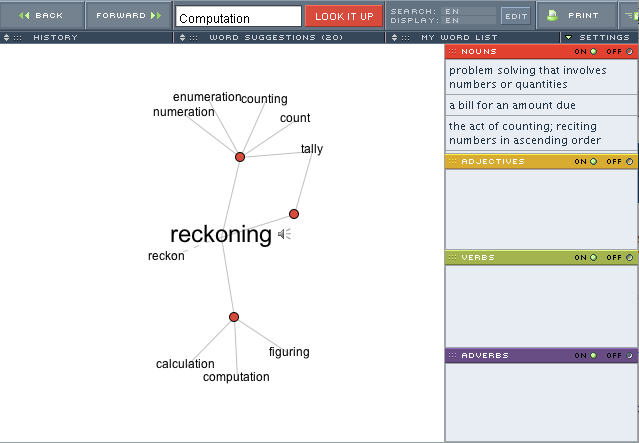
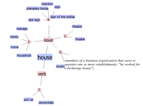
The Visual Thesaurus is an interactive dictionary and thesaurus that allows you to discover the connections between words in a visually captivating display. Written in Java.
A free version in Javascript is also proposed at http://www.kylescholz.com/blog/2006/06/javascript_visual_wordnet.html
The Visual Thesaurus is written using the ThinkMap SDK, available at http://www.thinkmap.com/thinkmapsdk.jsp
Well-Formed.Eigenfactor.org
Category: text / lexical
Where: University of Washington.
- Implementation
- network, temporal, hierarchical
Date: NA
Eigenfactor is a non-commercial academic research project by the Bergstrom lab in the Department of Biology at the University of Washington.
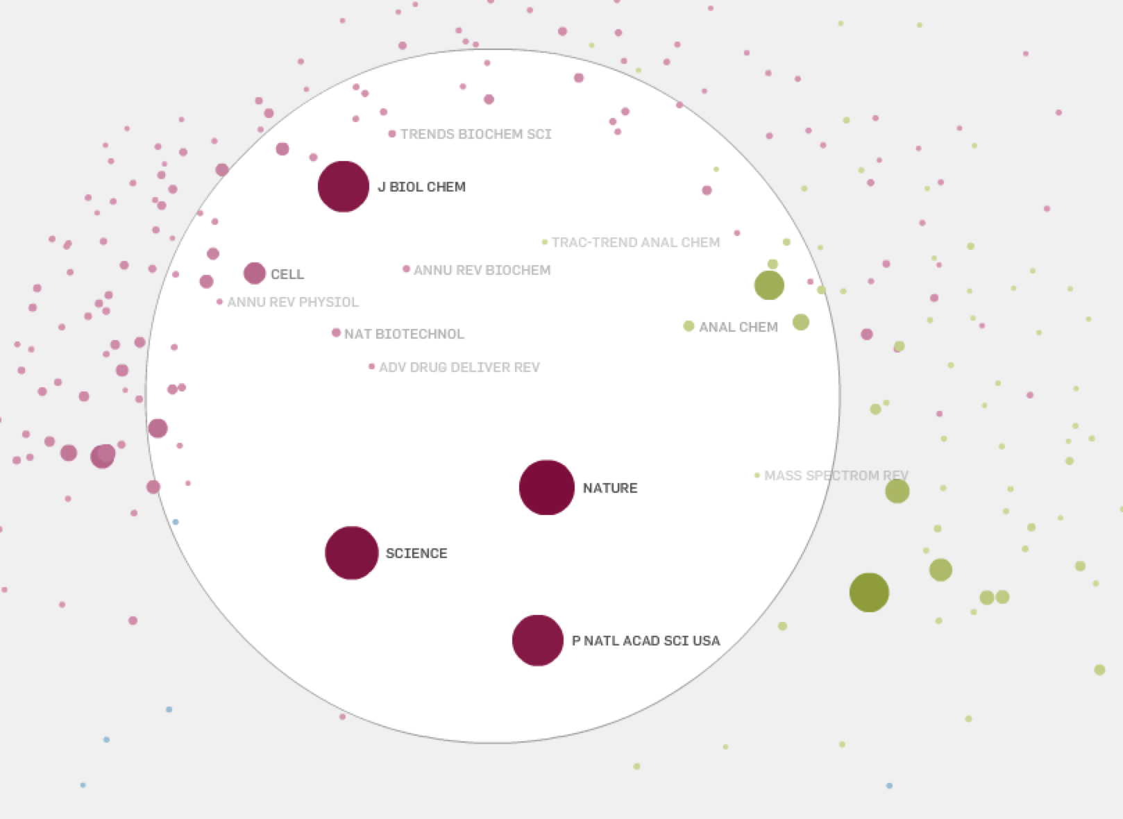
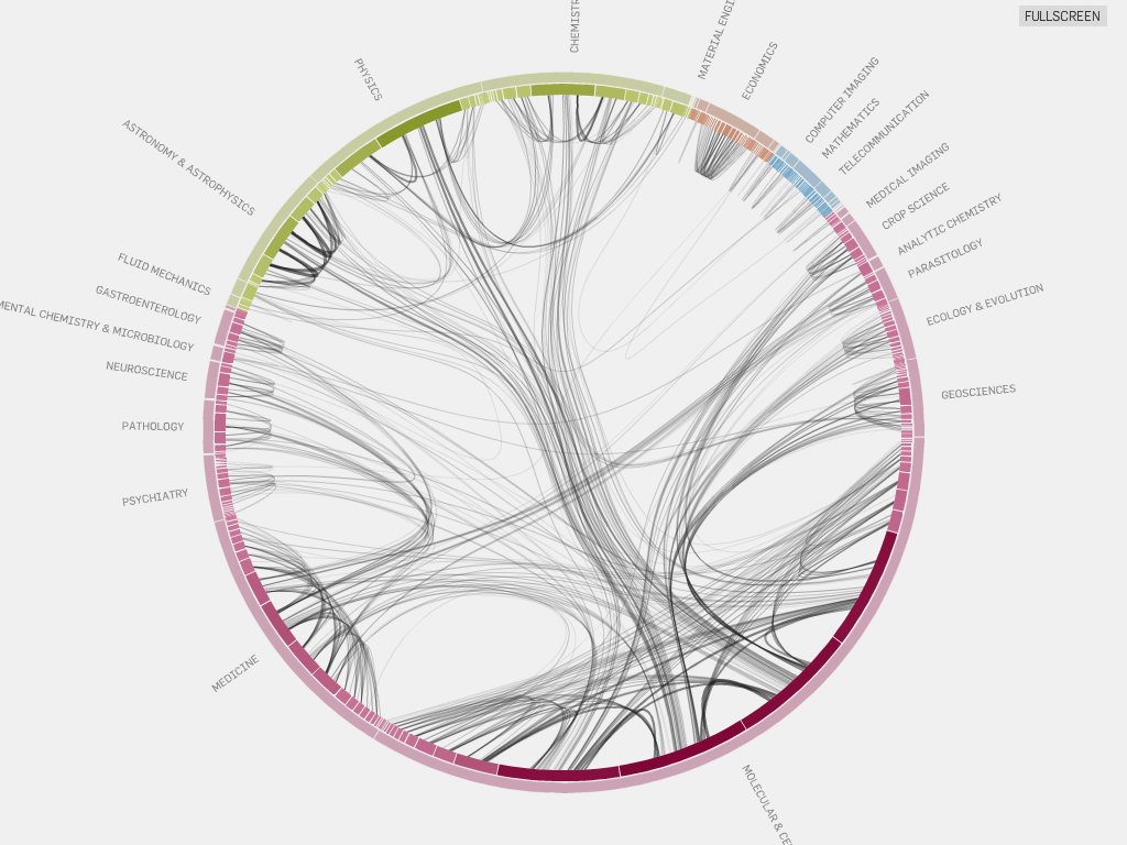
Interactive visualizations based on the Eigenfactor™ Metrics and hierarchical clustering to explore emerging patterns in citation networks. A cooperation between the Eigenfactor Project (data analysis) and Moritz Stefaner (visualization).
The visualization is dynamic, and generated with Flare (prefuse's successor).
The map visualization puts journals, which frequently cite each other, closer together. You can drag the white magnification lens around to enlarge a part of the map for closer inspection. Clicking one of the nodes will highlight all its connections. If a journal is selected, the node sizes represent the relative amount of citation flow (incoming and outgoing) with respect to the selection; otherwise, they are scaled by their Eigenfactor™ Score. Map calculated with Cytoscape, visualization built with flare
We use a subset of the citation data from Thomson Reuters' Journal Citation Reports 1997–2005. The complete data aggregate, at the journal level, approximately 60,000,000 citations from more than 7000 journals over the past decade. For an interesting subset, we select journals ordered by their Article Influence™ in 2005, but include no more than 25 journals from a single field. To make the subset coherent, we make sure that selected journals are included all years and that we cover the 10 journals with highest Eigenfactor™ score. To cluster the networks, we use the information-theoretic method presented in Maps of information flow reveal community structure in complex networks (PNAS 105, 1118 (2008)), which can reveal regularities of information flow across directed and weighted networks.
JellyFish
Category: Lexical / Text
Where: DMI Boston
Implementation: network
Date: 2005
Jellyfish visualizes an encyclopedia of the arts. The project should be seen as an experiment, which deals with a dynamic interface. The purpose was to remove a static, conventional design and to achieve a playful interface. The application was developed in Processing and uses an XML database to update content. 2005
SecViz.org
- Category:
- Network / searching, lexical / text
- Where:
- PixlCloud (founded by Raffael Marty, 1011 23rd Street #20, San Francisco, CA 94107, USA
Implementation: misc.
Date: 2009
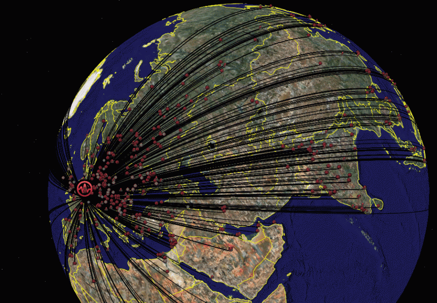
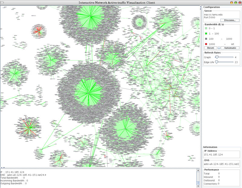
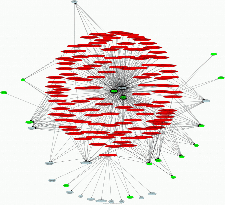
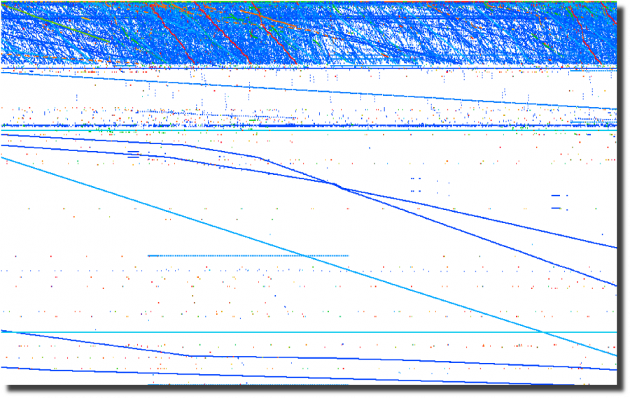
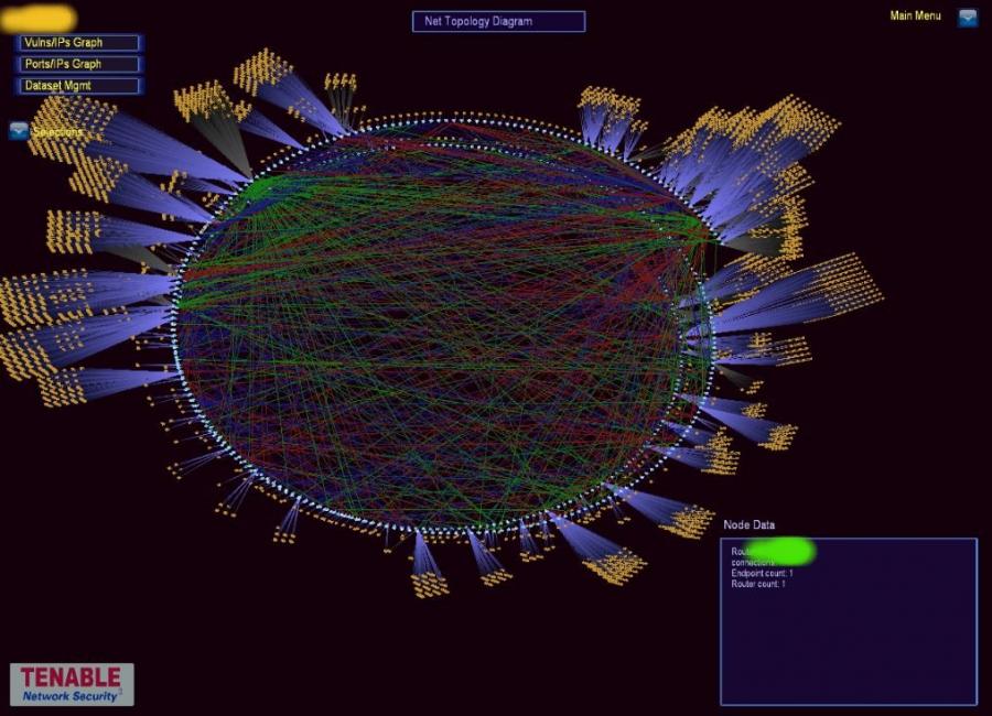
Below are some graphs taken from the dedicated to visualizing security information.
The SecViz portal is meant for people that are working on log analysis, log mining and especially on visualization of security related data to exchange, discuss, and comment on techniques, methods, parsers, and sample graphs.
The maintainer of the site, Raffael Marty (ram at secviz dot org), is the founder of PixlCloud, a visualization in the cloud company. He has written about security data visualization for various books and blogs and also talks at security conferences around the world on the topic of data visualization. He is also the author of AfterGlow, an open source tool for data visualization. (from http://secviz.org/content/about)
| Geo Tagging an Attack | The INAV software package for visualizing connection information in real time | API Calls and Imported Symbols of Nepenthes Download Binary Files |
|
24 hours of firewall logs plotted by source port over time |
Tenable Network Security's Security Center includes a 3D visualization tool |
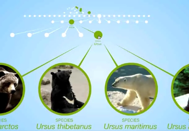
Tree Browser for the Encyclopedia of Life
Category: lexical text
- Where
- Biodiversity Heritage Library, The Field Museum of Natural History, Harvard University, Marine Biological Laboratory, Missouri Botanical Garden, Smithsonian Institution
Implementation: network
Date: NA
An interesting way of representing trees taken from the Encyclopedia of Life (eol). See the video tour at http://www.eol.org/content/page/screencasts.
PubNet
Category: text / lexical
Where: Yale & Rutgers Universities
Implementation: network
Date: 2005
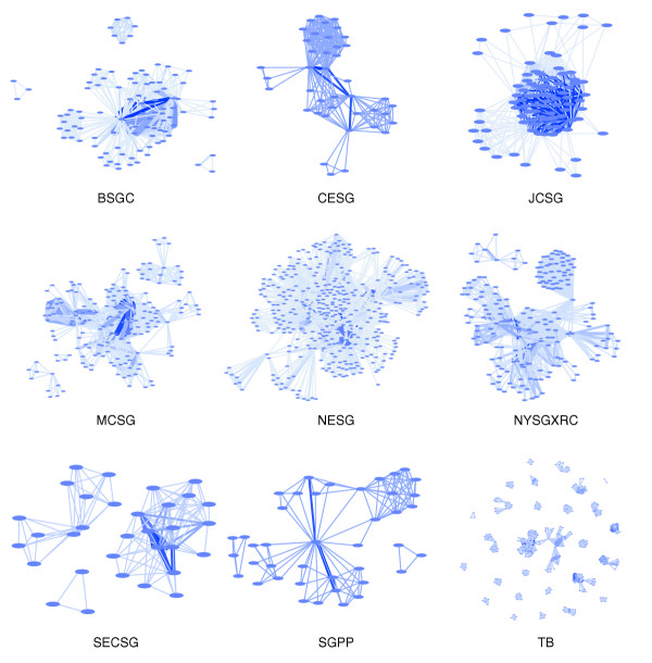
PubNet: a flexible system for visualizing literature derived networks, reviewed by Shawn M Douglas,1 Gaetano T Montelione,2 and Mark Gersteincorresponding, author1,3
Abstract: We have developed PubNet, a web-based tool that extracts several types of relationships returned by PubMed queries and maps them into networks, allowing for graphical visualization, textual navigation, and topological analysis. PubNet supports the creation of complex networks derived from the contents of individual citations, such as genes, proteins, Protein Data Bank (PDB) IDs, Medical Subject Headings (MeSH) terms, and authors. This feature allows one to, for example, examine a literature derived network of genes based on functional similarity.
VisPedia: Standford's Visualization of Wikipedia
Category: text / lexical
Where:Stanford
Implementation: network
Date: 2009
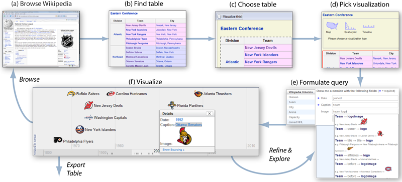
"We present Vispedia (live at vispedia.stanford.edu), a system that reduces the cost of data integration, enabling casual users to build ad hoc visualizations of Wikipedia data. Users can browse Wikipedia, select an interesting data table, then interactively discover, integrate, and visualize additional related data on-demand through a search interface and a query recommendation engine. This is accomplished through a fast path search algorithm over a semantic graph derived from Wikipedia. Vispedia also supports exporting the augmented data tables produced for use in more traditional visualization systems. We believe that these techniques begin to address the "long tail" of visualization by allowing a wider audience to visualize a broader class of data."
NeoFormix.com
Category: Text / Lexical, Art
Where: NA
Implementation: misc
Date: 2008
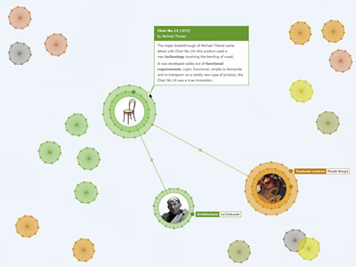
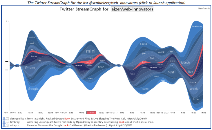
A sample on the right of many visualizations from NeoFormix maintained by Jeff Clark.
NearWord
Category: Lexical/text
Where:
Implementation: 2D
Date: 2007
Interactive 2-D Graph of word relationships in Dictionary (Prefuse)
NearWord is a free visual synonym thesaurus, based on the WordNet dictionary and the Prefuse visualization toolkit, using Flash-based force-directed graphs.
Visualizing Pairs of Words in two different documents
Category: Politics/government, Lexical/Text
Where:NA
Implementation: 2D
Date: 2008
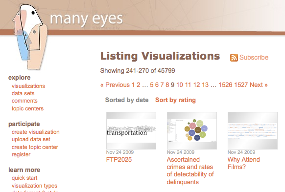
Think of it as a 2-D Tag-Chart. From ManyEyes, an IBM-based research group
DocuBurst
Category: Lexical/Text
Where: U. Toronto, Can
Implementation: 2D
Date: 2006 to present
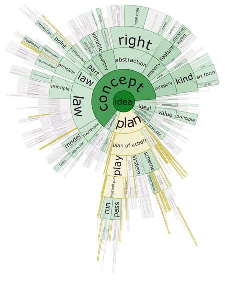
DocuBurst is the first visualization of document content which takes advantage of the human-created structure in lexical databases. We use an accepted design paradigm to generate visualizations which improve the usability and utility of WordNet as the backbone for document content visualization. A radial, space-filling layout of hyponymy (IS-A relation) is presented with interactive techniques of zoom, filter, and details-on-demand for the task of document visualization. The techniques can be generalized to multiple documents.
A technical report on this project is available in PDF as well as a short poster abstract from the IEEE Information Visualization Symposium 2006.
conflate.net
Category: Lexical/Text
Where: NA
Implementation: Graph, 2D
Date: 2008
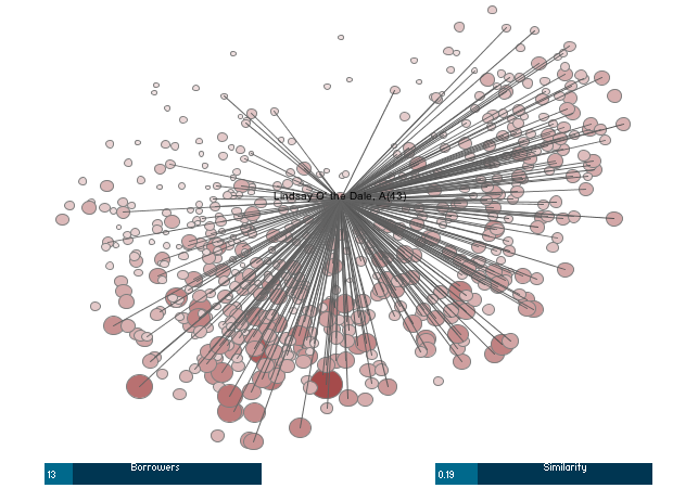
Conflate.net shows a Processing visualization applet where the user can control the number of books shows (as circles) and the threshold defining whether they are similar or not.
This site visualization is no longer available.
Category: Lexical/Text
Where: U. Vienna
Implementation: network, 2D
Date: 2007
A library for exploring graphically graphs. Written in Processing, created and maintained by the University of Vienna.
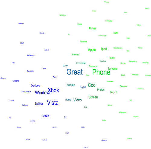
Using the transcripts of Bill Gates' keynote from CES 2007 and Steve Jobs' keynote at Macworld 2007 (via Todd Bishop's Microsoft Blog) the author created this relational tagcloud using Rhizome Navigation.
TextArc
Category: Lexical/text
Where:
Implementation:
Date:
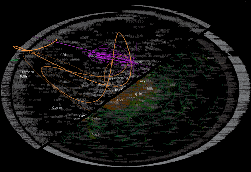
The work of W. Bradford Paley, associated with Columbia University. A different view of a whole book in one graphic visualization. Visually pleasing. Harder to figure out how to make use of it.
Measuring dynamic relationships between readers and stories
Category: Lexical/text
Where: NA
Implementation: 2D
Date: 2008
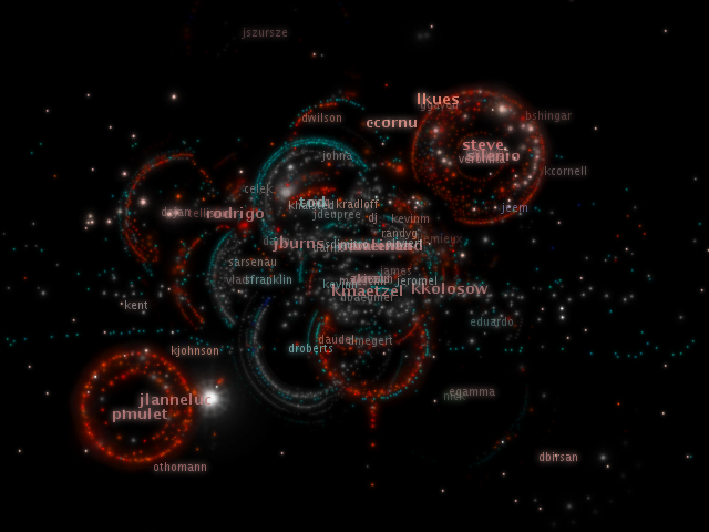
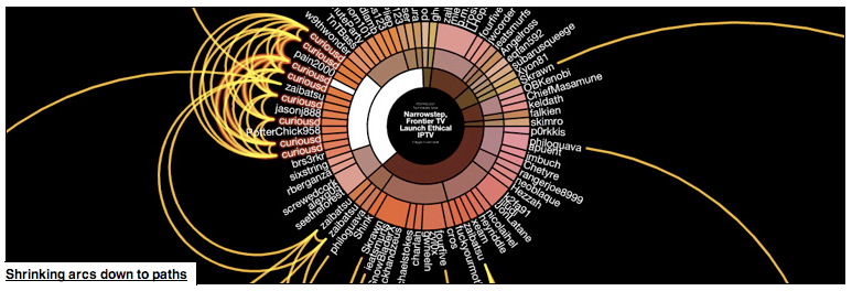
Digg Arc displays stories, topics, and containers wrapped around a sphere. Arcs trail people as they Digg stories across topics. Stories with more Diggs make thicker arcs.
Maps of market and news
Category: Lexical/Text, political
Where: NA
Implementation: 2D
Date: NA
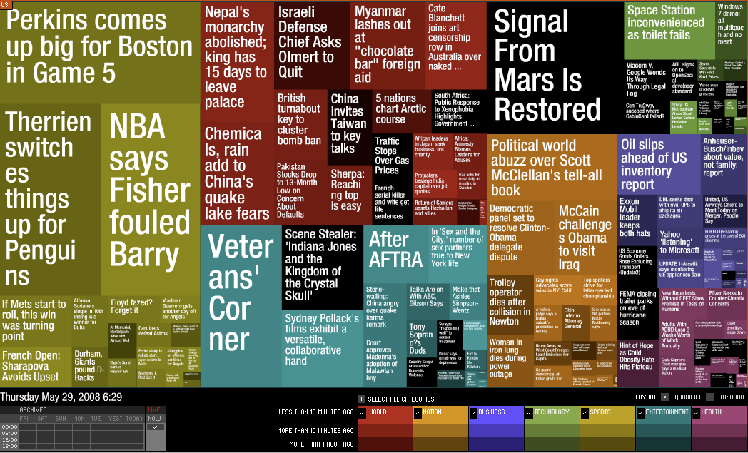
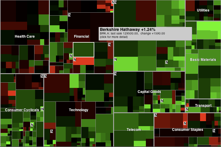
Two interesting uses of treemaps. Both are referenced in the http://StateOfTheUnion.net web site (in the essay)
StateOfTheUnion.net I
- Category
- Lexical/Text, Political/Grovernment
Where: NA
Implementation: 2D
Date: NA
This is done with processing, and truly interactive. As the arrow key is moved left or right, we move by one year backward or foreward, respectively, and see in red the words used the year before, and in white the words of the current year. Cool…
The link contains an interesting essay, reproduced below:
The {Sorry} State We Are In
by Brad Borevitz
The triumph of iconicity over rhetoricity–call it the society of the spectacle, call it what you will. The change has certainly not gone unobserved. And yet, we are likely to blinker our awareness of the situation–and imagine that the mechanisms of our governance continue unaffected–that the institutions of democracy are somehow untouched by these changes. But how can this possibly be the case?
A democratic system of government depends on communicative practices that are founded on rhetoric: an art of persuasion. This implies a public sphere as the ground of a competitive exchange of argument and counter argument. Reason theoretically rules such a domain, where syllogistic conventions determine the outcome of a competition of ideas based on the strength of evidence and the logical coherence of their exposition.
What has displaced this rhetorical arena is a screen on which assertions are projected. It may be that these assertions compete for attention, but they don’t entertain argument or tolerate critique. Assertions are immune from denigration based on counterfactual evidence, or the revelation of faulty logic. Competition in this environment is a matter of precedence, authority, style, volume, frequency, and ultimately saturation.
Contemporary political ideas, which take the form of memes circulating in the soup of our media saturated world, are formally equivalent to the fragments of iconic identity circulating as agents of corporate entities, the brands. Politics is branding, the media practice of producing identity as awareness and desire, through the deployment of declarative language and image.
Not only have commercial interests produced a scarcity of actual public space by their domination of the landscape and their occupation of the commons, they have gained almost total control over the virtual spaces of communication, and colonized the language of political discourse itself.
In this atmosphere, the public debate over ideas is obsolete, if not impossible. The significance of such a change is immense. In Benjaminian terms, politics enters the realm of the aesthetic, a situation symptomatic of fascism.
How is it that we have arrived at this state? Why are we so surprised as we wake now to the nightmare? After all, here in the U.S., the president has been informing us of the state of the union from the year the constitution was ratified. Were we not listening to the message–not reading in this text the signs of transformation? When was it that the words addressed to us changed from having a rhetorical significance to an iconic one? When was it that the words last demanded our understanding, and when did they come to simply demand that we buy in?
StateOfTheUnion.net II
Category: lexical/text
Where: NA
Implementation: 2D
Date: NA
3D network of word relationships
Category: Lexical/text
Where: NYT
Implementation: 3D
Date: 2006
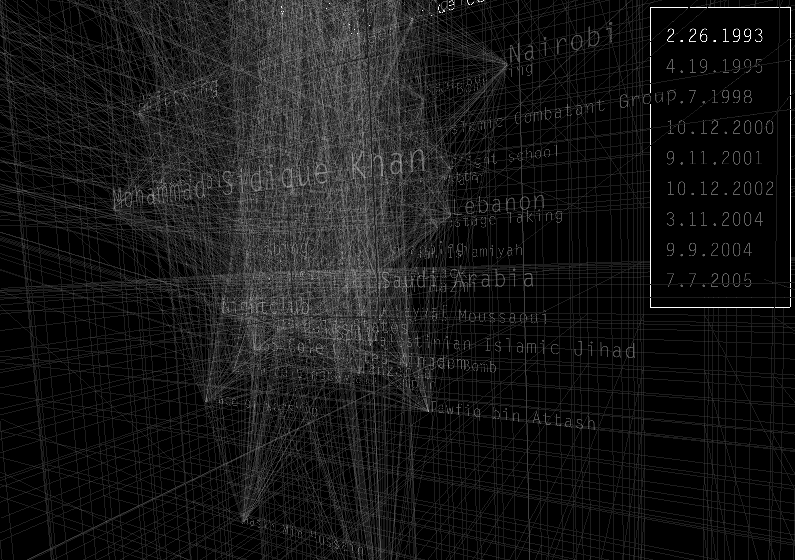
This was done for the NYT, 3 Dec. 2006. The article is “Rewiring the Spy”. This is done in Processing and shows the connections existing between words in a government database dealing with terrorism.
Multimedia
Cinegraph.viz
Category: Multimedia
- Where
- The GeoVISTA Center and the Department of Geography, The Pennsylvania State University
Implementation: multi-dimensional
Date: 2007
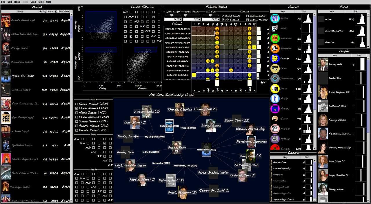
A visual tool to explore the relationships in the Internet Movie Database. Implemented with Improvise.
Cinegraph is an interactive visualization for exploring and analyzing the InfoVis 2007 contest data set derived from the Internet Movie Database (IMDB). By combining two complementary visual interaction techniques, cross-filtered views and attribute relationship graphs, Cinegraph supports a wide variety of general and highly focused analytic tasks. Users can express complex lines of questions in the form of rapid sequences of simple interactions. Designed and built in a little over two days by a single visualization designer using the Improvise visualization environment, Cinegraph provides high-dimensional interactive drill-down capability into the people, genres, awards, release dates, and box office characteristics of movies described in the database, using ancillary photographs of people, images of movie posters, and icons of movie genres to enhance the interaction process. (from http://www.cs.ou.edu/~weaver/improvise/examples/cinegraph)
Watch the movie on Cinegraph...
SeaDragon
Category: multimedia
Where: Microsoft
Implementation: 2D
Date: 2009
Technology for browsing large amount of pictures in jpeg2000 format. SeaDragon was purchased by Microsoft.
Presentation by Tamara Munzner
Category: multimedia
Where: Google
Implementation: NA
Date: NA
Tamara Munzner of U. British Columbia presents a talk at Google titled 15 Views of a Node Link Graph: An Information Visualization Portfolio
Watch the video!
It’s one-hour long, but worth it. It would be nice to see if some of the software she demonstrates for exploring graphs is available…
Tamara’s Web site and group’s
site have good information.
News / Newsprint
Naming Names
- Category
- political/government, newsprint
Where: NYT
Implementation: 2D, network
Date: June 21, 2008
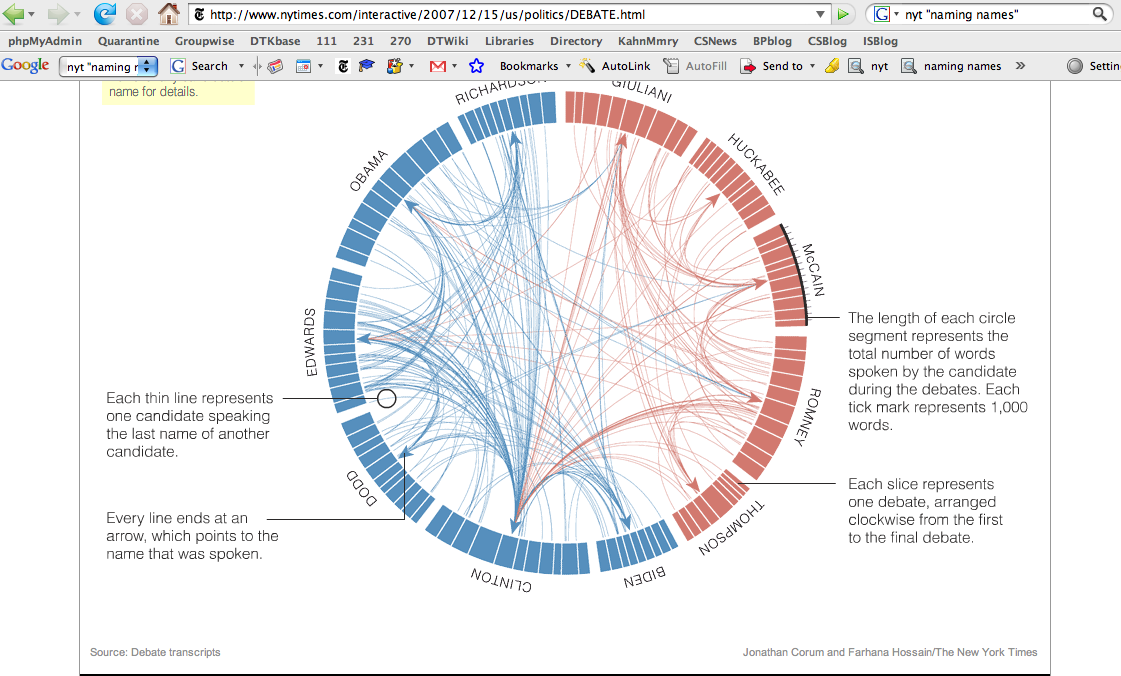
From article in NYT, "Naming Names," on candidates naming each other names.
Visualizing the medals at the Olympics
Category: Newsprint, Geographic
Where: NYT
Implementation: 2D
Date:
This is a dynamic display of the number of medals obtained at various olympics. This is nicely done, and uses some form of circle packing.
A String of Debates
Category: Political/Government, Newsprint
Where: NYT
Implementation: 2D
Date: 2008
From the NYT, 12/15/2007 article: "A String of Debates", showing statistics on words/concepts appearing in candidates speeches
The Rest of the Genome
Category: Newsprint Graphics
Where: NYT
Implementation: NA
Date: 2008
Aritcle by By CARL ZIMMER Published: November 10, 2008
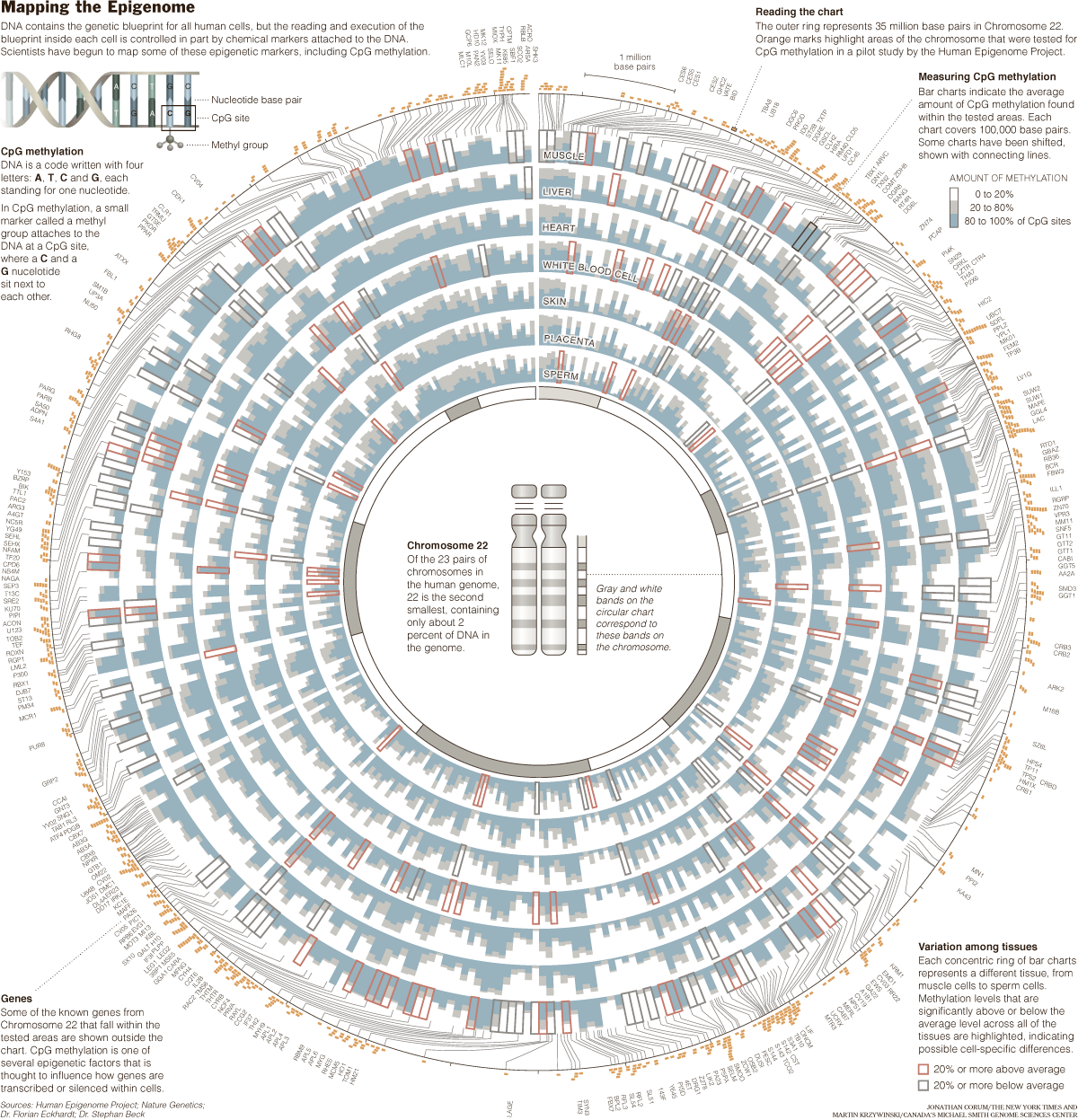
From http://www.nytimes.com/2008/11/11/science/11gene.html?pagewanted=2&_r=1, NYT article of 11/11/08, on Thomas R. Gingeras of Cold Spring Harbor Laboratory. He is a leader of Encode, an effort to determine the function of every piece of DNA in the human genome.
Bubble Chart from the NYT
Category: Newsprint
Where: NYT
Implementation: 2D
Date: 2008
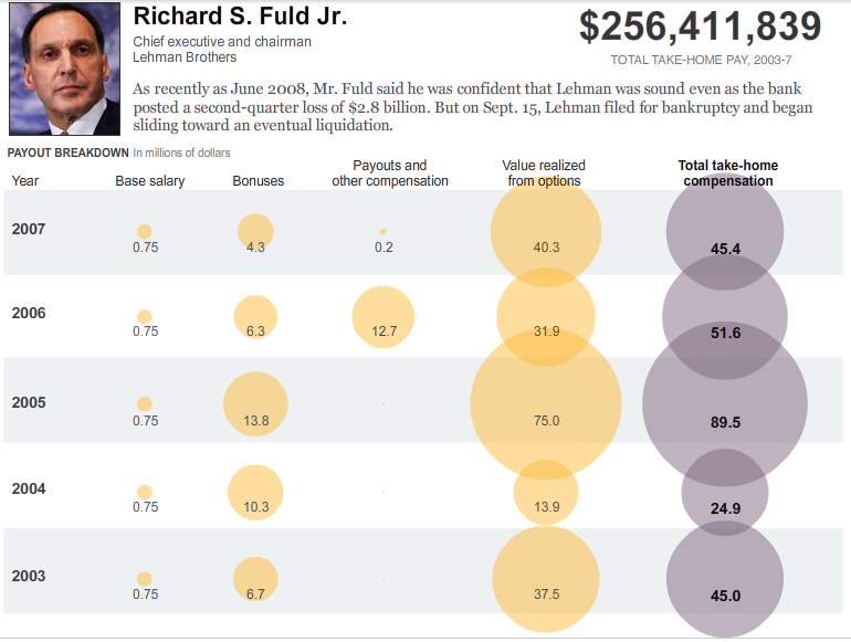
From the Oct. 7, 2008 NYT article "Multimillion-Dollar Men" Link to the interactive display.
Note the overlap of the bubble, indicating excess and data too large in magnitude for the display...
In the Art of a DNA Graph
- Category
- scientific, newspring
Where: NYT
Implementation: 2D
Date: 6/18/2008
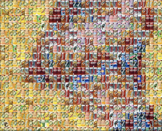
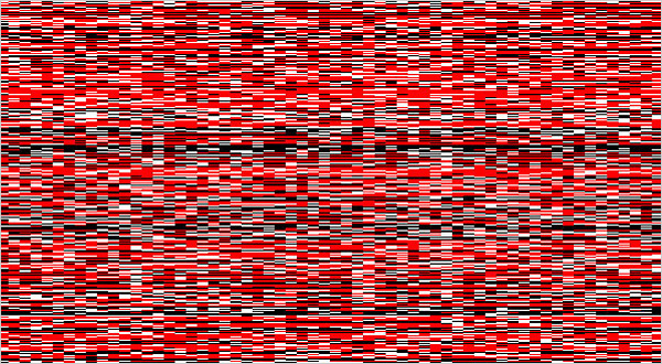
“DNA Collage 1” is on the cover of the new issue of Connecticut Medicine. Dr. Ruaño called it a “snapshot” of variations in the genome sequences of 62 people, one to a column, from blood samples taken in clinical studies at the hospital.
DESIGN AND SCIENCE: The Life and Work of Will Burtin
Category: Newsprint
Where: NYT
Implementation: NA
Date: 06/01/2008
Visuals
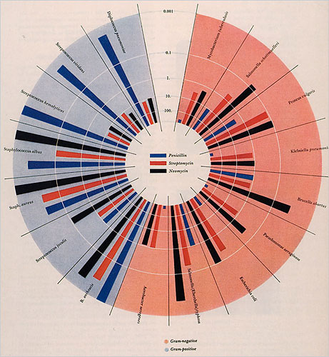
Burtin was one of many designer exiles who fled the Nazis and Fascists, including the Bauhaus teachers Herbert Bayer and Laszlo Moholy-Nagy […] Burtin was the art director of Fortune magazine in the late ’40s, responsible for introducing abstract and conceptual art covers. Burtin’s most impressive contribution was the marriage of science and design.
After a recent spate of graphic designer biographies, this detailed monograph is definitely overdue. Burtin’s virtually forgotten work, like the exhibition “Metabolism — the Cycle of Life,” prefigures the interaction design practiced today on the Web and reveals just how entertaining well-articulated graphic and exhibition design about science can be.
Visualizing 3D
Category: Newsprint
Where: NYT
Implementation: NA
Date: 5/13/2008
Article from the NYT on 5/13/08.
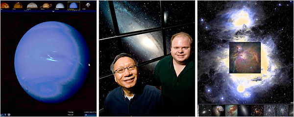
“Exploring the virtual universe is incredibly smooth and seamless like a top-of-the-line computer game, but also the science is correct”
The WorldWide Telescope results from careful planning and lengthy development in a research division. It has the richer graphics and it created special software to present the images of spherical space objects with less polar distortion. WorldWide Telescope requires downloading a hefty piece of software, and it runs only on Microsoft Windows.
Google Sky started as a Google “20 percent” project, in which engineers can spend time on anything they choose. Google Earth, where Google Sky began, requires a software download, but its Web-based version, which came out in March, does not. The Google culture encourages engineers to put new things onto the Internet quickly and keep improving them, a philosophy geared to constant evolution instead of finished products.
Product Search / Shopping
Scientific
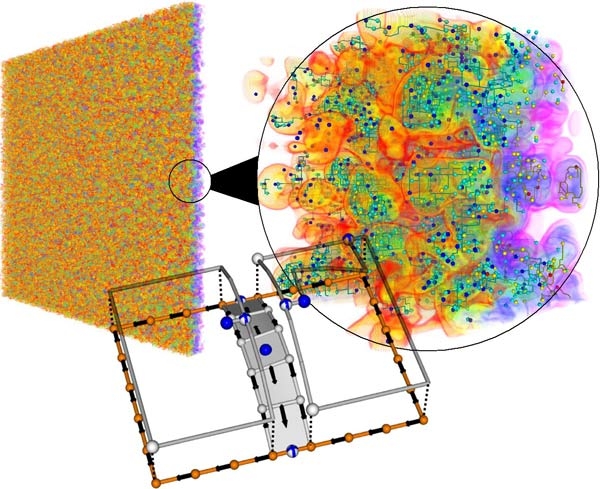
Morse-Smale Complex, and the visualization of "big data"
Category: 3D, Scientific, algorithms
Where: UC Davis
Implementation:3D
Date: 2009
Basking in Big Data [1], or how Visualization software makes viewing and interacting with enormous data sets practical without a supercomputer.
Recently [...] researchers at the University of California, Davis, and Lawrence Livermore National Laboratory announced that they have developed software that makes analysis and visualization of huge data sets possible without the aid of a supercomputer. The researchers' algorithm (the Morse-Smale Complex algorithm) slices up data into more manageable chunks, then stitches it back together on the fly, so that the data can be manipulated in three dimensions, all on a computer with the power and capacity of a high-end laptop. (from Technology Review, http://www.technologyreview.com/computing/21976/?a=f )
Slides of presentation at VisWeek 09 [www.idav.ucdavis.edu/~garth/vis09-tutorial/pdfs/childs.pdf here].
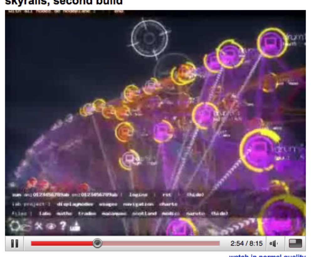
Skyrails
Category: Scientific
- Where:
- The University of New South Wales - Sydney Australia
Implementation: network, 3D
Date: 2009
SKYRAILS is a 3D OpenGL visualization software.
Skyrails is a social network (or any graph really) visualization system. It has a built in programming language for processing (as far as visualisation attributes goes) the graph and its attributes. The system is not only aimed at expert users though, because through the scripting languages menus can be built and the system can be used by any users.
The main distinguishing point of the system comes from the built in scripting language, the added flexibility of how to represent attributes (nodes can be binded to planes and spheres based on their attributes) and the scriptability of the user interface system. This makes skyrails ideal for creating presentations targeted at the average users. (from http://cgi.cse.unsw.edu.au/~wyos/skyrails/)
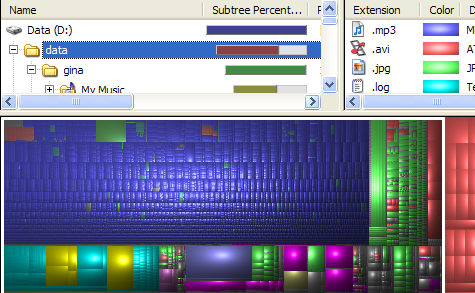
Tree Maps from LifeHacker
Category: scientific
Where: NA
Implementation: 2D
Date: 2008
Social Network
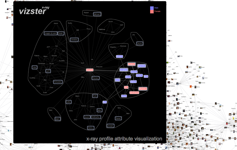
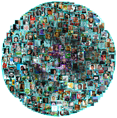
Vizster
Category: Social Network
Where: Stanford
Implementation: network
Date: 2005
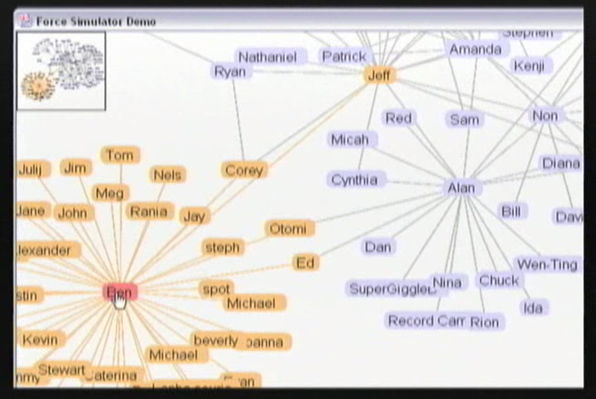
A project from Jeffrey Michael Heer at Stanford (http://jheer.org/vizster/), using the Prefuse package.
(Some notes about Prefuse can be found here)
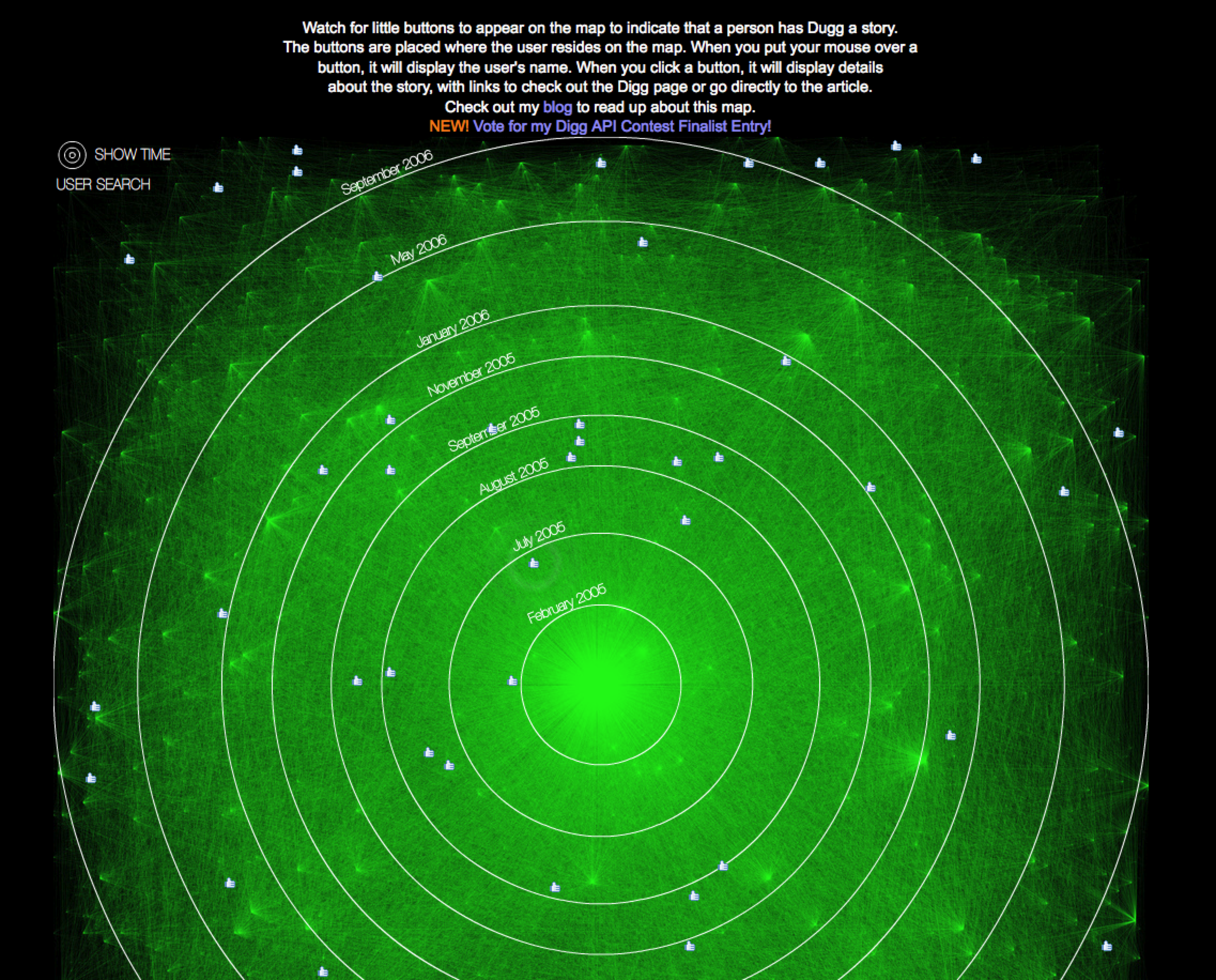
Digg HeatMap
Category: Social Network
- Where:
- The work of Brian Chaler of BitGravity
Implementation: 2D, network
Date: 2009
A dynamic interactive flash display of readers as they "digg" stories.
WikiCompany
Category: Social Network
Where: NA
Implementation: network
Date: 2009
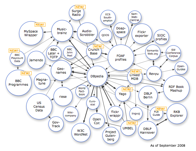
Wikicompany is a free content licensed ("Creative Commons: Attribution-Share Alike 3.0"), worldwide business directory that anyone can edit. Creating a new company profile is easy, fast and free.
Wikicompany profiles are now also part of the exciting Linking Open Data and DBPedia projects. These projects provide free, structured data sets and software tools for developing innovative Semantic Web applications.
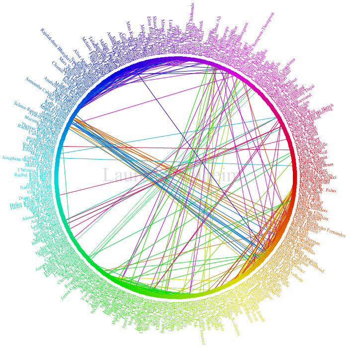
Facebook’s “friend wheel”
Category: Social Network
Where: Faccebook
Implementation: 2D
Date: current
Interesting display of friendship links on Facebook.
Some Graphviz Examples
Category: Social Network
Where: NA
Implementation: 2D
Date: 2008
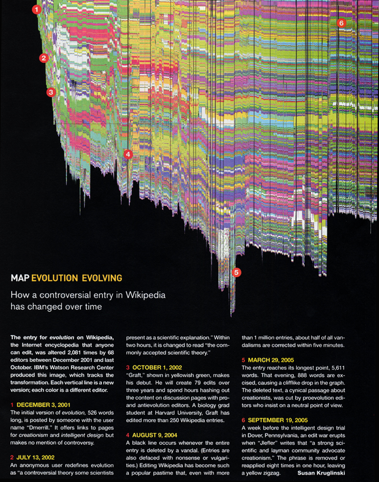
Evolution of a wikipedia page
Category: Social Network
Where: Visual Communication Lab, IBM
Implementation:
Date: 2003
Generated by Martin Wattenberg and
described in “Studying Cooperation and Conflict between Authors
with history flow Visualizations”, 2004 (link).
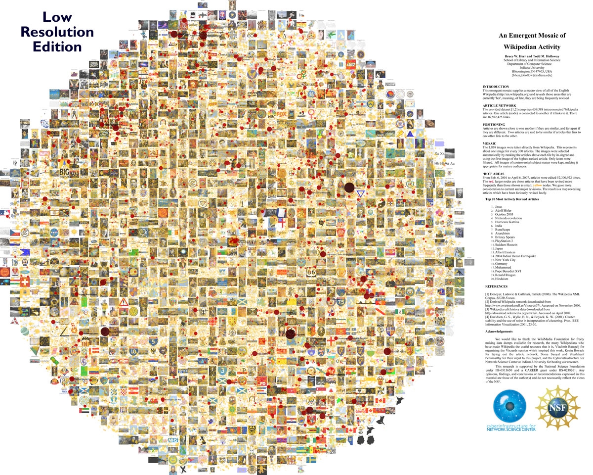
Neat graphical representation of activity in Wikipedia
Category: Social Network
- Where
- School of Library and Information Science, Indiana University, Bloomington, IN, USA
Implementation: 2D
Date: 2007
Click here for full size image.
Very interesting and artistic way to depict activity in the wikipedia pages.
For more information, check Bruce Herr’s http://abeautifulwww.com/2007/05/20/visualizing-the-power-struggle-in-wikipedia/
or “Visualizing the ‘Power Struggle’ in Wikipedia”
A nicer web-2.0 type graph where the user can zoom in and out can be found here: http://scimaps.org/maps/wikipedia/
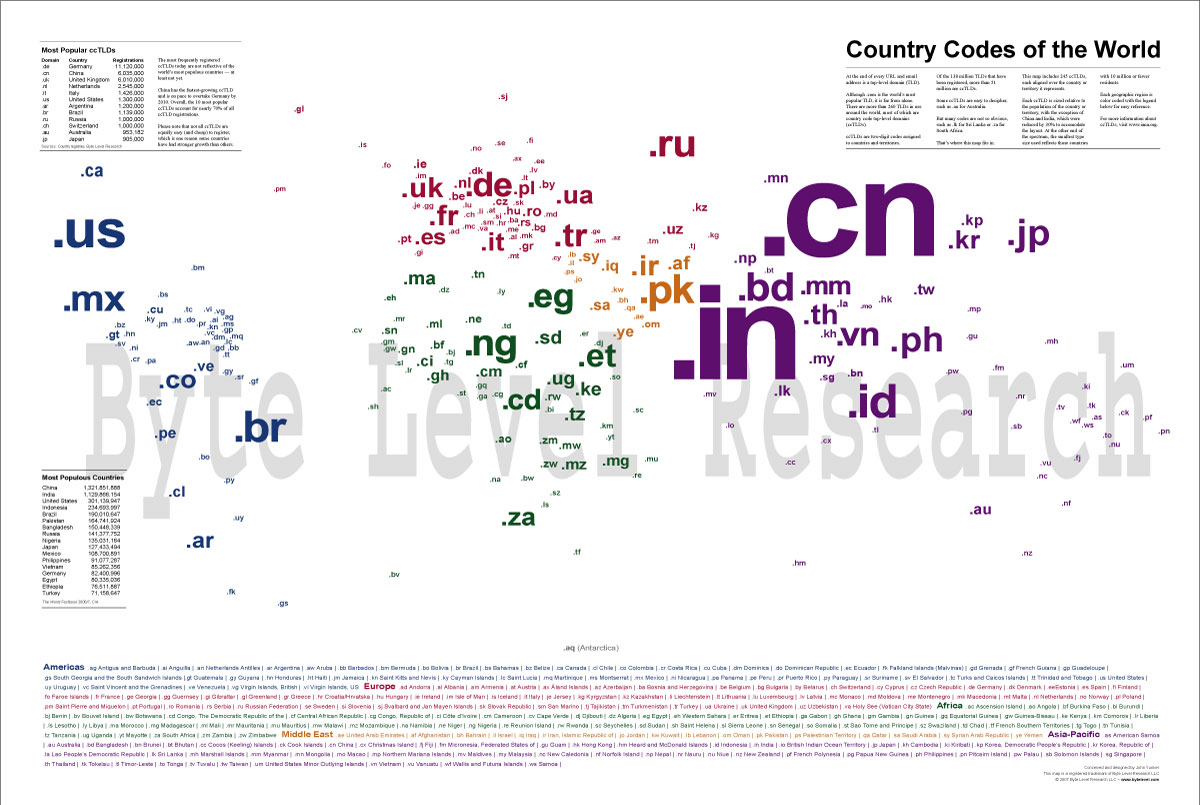
Another nice image representing graphically the geography and activity by domain name
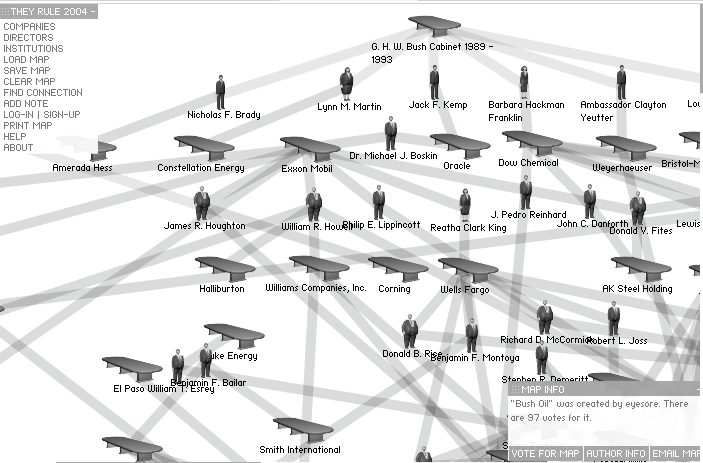
They Rule
Category: Social Network
Where: created by Josh On
Implementation: 2D
Date: NA
See video by Josh On at http://theinfluencers.org/en/josh-on/video/3 on TheyRule.
Surveys
Viz4All
Category: Survey
Where: University of Maryland, College Park.
Implementation: mixed
Date: 2005
A survey of Internet Visualization Tools
Viz4All is a survey of visualization tools examined by graduate students participating in the spring 2005 Information Visualization class at the University of Maryland, College Park. Our criteria for visualizations on this website: are designed for use by the general public (not specialists); present practical, useful, and possibly entertaining information; with an interactive interface that gives users control over the display.
The Best Tools for Visualization at ReadWriteWeb
Category: Survey
Where: NA
Implementation: NA
Date: Compiled 2008 by Sarah Perez
This is a collection of sites and packages used for displaying (mostly) social networks, but not only. ( pdf list)
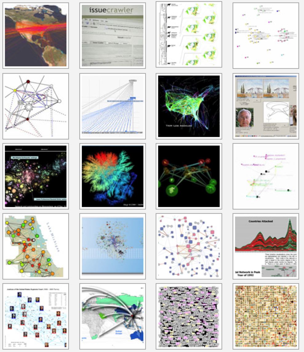
NetSci 07: Visualization Competition 07
Category: Survey
Where:New York Hall of Science
Implementation: mixed
Date: 2007
Visualizing Network Dynamics Competition, At NetSci07, New York Hall of Science, Queens, NY, May 20th-25th, 2007
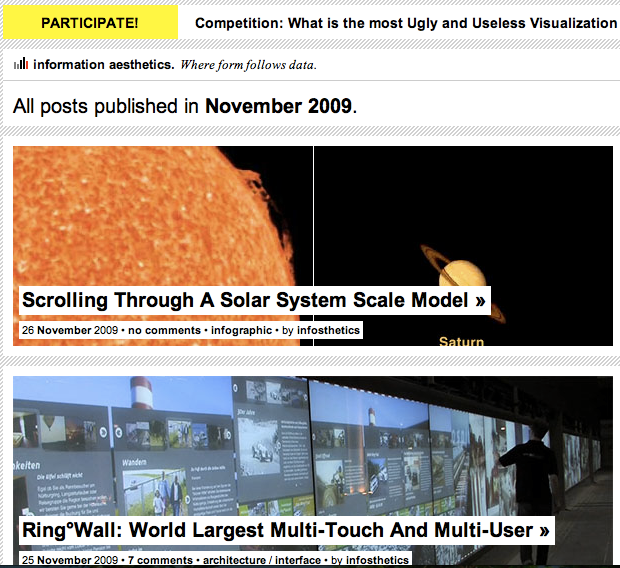
infosthetics
Category: survey
- Where
- Design Lab, Architecture, Design and Planning, University of Sydney, Australia
Implementation: misc
Date: present
http://infosthetics.com/ form follows data - data visualization & visual communication
Another site dedicated to collecting stunning examples of visualization.
Inspired by Lev Manovich's definition of "information aesthetics", this weblog explores the symbiotic relationship between creative design and the field of information visualization. More specifically, it collects projects that represent data or information in original or intriguing ways. Since its conception in December 2004, several other terms have been introduced within the academic world for similar phenomena, ranging from 'Information Aesthetic Visualization' over 'Casual Information Visualization' to 'Artistic Data Visualization' .
SmashingMagazine
Category: Survey
Where: SmashingMagazine
Implementation: NA
Date: 2007
Founded in September 2006, Smashing Magazine delivers useful and innovative information to Web designers and developers. Our aim is to inform our readers about the latest trends and techniques in Web development. We try to convince you not with the quantity but with the quality of the information we present. We hope that makes us different. Smashing Magazine is, and always has been, independent. (from http://www.smashingmagazine.com/about-us/ )
Article in pdf format.
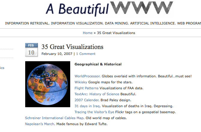
35 Great Visualizations
Category: survey
Where: Search Team in Applied Research at AT&T
Implementation:
Date:
Can be found here: abeautifulwww.com, a blog on visualization, design and aesthetics found on the Web and maintained by Todd Holloway.
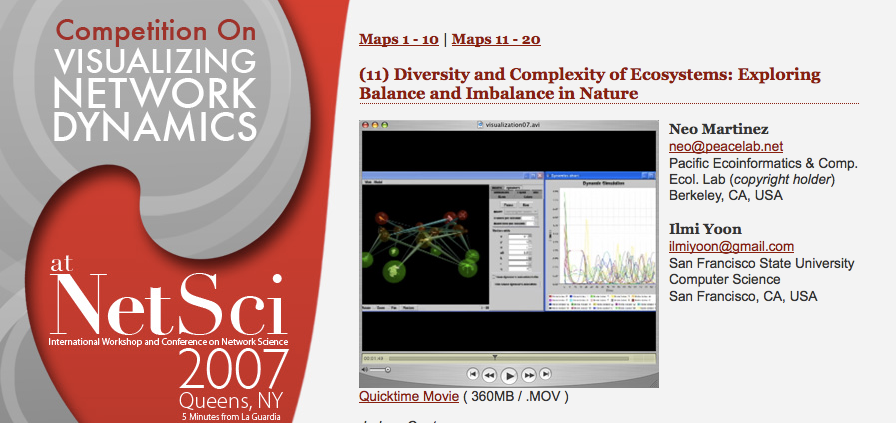
Competition on visualizing network dynamics
Category: Survey
Where: NetSci, Queens, NY
Implementation: NA
Date: 2007
Some interesting designs for representing large networks.

