Difference between revisions of "Faculty Learning Communities: Data Visualization"
(→Invited Speaker: Prof. Greg Brown, Music Dept. Smith College) |
|||
| Line 195: | Line 195: | ||
* '''Greg Brown''' will explore the aesthetic and technical aspects of creating a virtual machine to generate music that evolves in an autonomous and quasi-organic nature. He will provide a brief discussion of the concept of sonification and a review of the rules for Conway's Game of Life and how they can be adapted to the sonic realm. Finally, there will be a presention the music itself along with concurrent video. | * '''Greg Brown''' will explore the aesthetic and technical aspects of creating a virtual machine to generate music that evolves in an autonomous and quasi-organic nature. He will provide a brief discussion of the concept of sonification and a review of the rules for Conway's Game of Life and how they can be adapted to the sonic realm. Finally, there will be a presention the music itself along with concurrent video. | ||
| − | * Location | + | * Location FH246. |
| + | |||
| + | ===Show and Tell=== | ||
| + | ====[http://code.google.com/apis/publicdata/ Data Publishing Language]==== | ||
| + | [[Image:GoogleDataPublishingLanguage.png | 500px | right]] | ||
| + | '''Category''': Algorithm/Visual Data Structures<br /> | ||
| + | '''Where''': [http://code.google.com/apis/publicdata/ code.google.com]<br /> | ||
| + | '''Implementation''': NA<br /> | ||
| + | '''Date''': Feb 2011<br /> | ||
| + | |||
| + | From [http://googleblog.blogspot.com/2011/02/visualize-your-own-data-in-google.html googleblog.blogspot.com]: ''Today, we’re opening the Public Data Explorer to your data. We’re making a new data format, the Dataset Publishing Language (DSPL), openly available, and providing an interface for anyone to upload their datasets. DSPL is an XML-based format designed from the ground up to support rich, interactive visualizations like those in the Public Data Explorer. The DSPL language and upload interface are available in Google Labs.'' | ||
| + | |||
| + | Follow Google's tutorial on DSPL [http://code.google.com/apis/publicdata/docs/tutorial.html here]. | ||
| + | |||
| + | |||
| + | |||
| + | <br /> | ||
| + | <br /> | ||
| + | <br /> | ||
| + | <br /> | ||
| + | |||
| + | ====[http://www.aviz.fr/geneaquilts/ GeneaQuilts]==== | ||
| + | [[Image:GuineaQuilts.png | 500px | right]] | ||
| + | '''Category''': Algorithms <br /> | ||
| + | '''Where''': [http://www.aviz.fr/geneaquilts/ www.aviz.fr]<br /> | ||
| + | '''Implementation''': Java <br /> | ||
| + | '''Date''': 2010<br /> | ||
| + | |||
| + | From [http://www.aviz.fr/geneaquilts/ www.aviz.fr ]: ''GeneaQuilts is a new visualization technique for representing large genealogies of up to several thousand individuals. The visualization takes the form of a diagonally-filled matrix, where rows are individuals and columns are nuclear families. The GeneaQuilts system includes an overview, a timeline, search and filtering components, and a new interaction technique called Bring & Slide that allows fluid navigation in very large genealogies. '' | ||
| + | <br /> | ||
| + | <br /> | ||
| + | <br /> | ||
| + | <br /> | ||
| + | ====[http://olihb.com/2011/01/23/map-of-scientific-collaboration-between-researchers/ Map of Collaboration between Researchers]==== | ||
| + | [[Image:MapOfCollaborationsInResearch.png | 500px | right]] | ||
| + | '''Category''': Geographic/GIS<br /> | ||
| + | '''Where''': [http://www.science-metrix.com/ science-metrix.com Olivier H. Beauchesne]<br /> | ||
| + | '''Implementation''': NA<br /> | ||
| + | '''Date''': Jan 2011 <br /> | ||
| + | |||
| + | From [http://olihb.com/2011/01/23/map-of-scientific-collaboration-between-researchers/ Beauchesne's blog]: ''My employer, Science-Metrix, is bibliometric consulting firm. In other words, we engineer ways to measure the impact and growth of scientific discovery (and publications) in the world. To accomplish this, we license data from scientific journal aggregators like Elsevier’s Scopus and Thomson Reuter’s Web of Science. The data we have is bibliographic in nature. We don’t have the full text of the articles but rather citation networks, authors and their affiliations, abstracts, etc.<br /><br />From this data, I extracted and aggregated scientific collaboration between cities all over the world. For example, if a UCLA researcher published a paper with a colleague at the University of Tokyo, this would create an instance of collaboration between Los Angeles and Tokyo. The result of this process is a very long list of city pairs, like Los Angeles-Tokyo, and the number of instances of scientific collaboration between them. Following that, I used the geoname.org database to convert the cities’ names to geographical coordinates. '' | ||
| + | <br /> | ||
| + | <br /> | ||
| + | <br /> | ||
| + | <br /> | ||
| + | |||
| + | ====[http://projects.nytimes.com/census/2010/explorer?ref=nyregion The NYT maps census data]==== | ||
| + | [[Image:NYTMapsCensusData.png | 500px | right]] | ||
| + | '''Category''': Political/Census<br /> | ||
| + | '''Where''': [http://projects.nytimes.com/census/2010/explorer?ref=nyregion The New York Times]<br /> | ||
| + | '''Implementation''': GoogleMap API<br /> | ||
| + | '''Date''': Dec 2010<br /> | ||
| + | |||
| + | From [http://projects.nytimes.com/census/2010/explorer?ref=nyregion The New York Times]: ''Browse local data from the Census Bureau's American Community Survey, based on samples from 2005 to 2009. Because these figures are based on samples, they are subject to a margin of error, particularly in places with a low population, and are best regarded as estimates.'' | ||
| + | <br /> | ||
| + | <br /> | ||
| + | <br /> | ||
| + | <br /> | ||
| + | <br /> | ||
| + | <br /> | ||
| + | <br /> | ||
| + | <br /> | ||
| + | <br /> | ||
| + | <br /> | ||
| + | <br /> | ||
| + | ====[http://code.google.com/more/table/ Google API Table ]==== | ||
| + | [[Image:googleAPITable.png | 500px | right]] | ||
| + | '''Category''': KMS/Software<br /> | ||
| + | '''Where''': [http://code.google.com/more/table/ code.google.com] <br /> | ||
| + | '''Implementation''': NA<br /> | ||
| + | '''Date''': 2011<br /> | ||
| + | |||
| + | From [http://www.coolinfographics.com/blog/2011/1/31/googles-periodic-table-of-apis-developer-tools.html coolinfographics.com]: ''From the Google Code site, the Periodic Table of Google APIs & Developer Tools is a cool layout of the tools available. It’s actually well designed table, so each element is clickable, and takes you to the information page about that particular API.'' | ||
| + | <br /> | ||
| + | <br /> | ||
| + | <br /> | ||
| + | <br /> | ||
| + | ====[http://www.byook.com/ Byook: animated books]==== | ||
| + | [[Image:Byook.png| 500px | right|link=http://www.byook.com/byooks-en/]] | ||
| + | '''Category''': News/Books<br /> | ||
| + | '''Where''': [http://www.byook.com/ byook.com]<br /> | ||
| + | '''Implementation''': NA<br /> | ||
| + | '''Date''': Feb 2011 <br /> | ||
| + | |||
| + | From [http://www.byook.com/ byook.com]: ''Byooks are a new way of reading on an iPhone/iPad.<br />Using magic and codes defined by books and movies, they entice you to read beyond words. Pictures, animations and sounds bring great classics and today’s bestsellers to life.<br />Relax, open a Byook and reveal the true potential of imagination.'' | ||
| + | <br /> | ||
| + | <br /> | ||
| + | <br /> | ||
| + | <br /> | ||
| + | <br /> | ||
| + | <br /> | ||
| + | <br /> | ||
| + | |||
| + | ====[http://www.facebook.com/notes/facebook-engineering/visualizing-friendships/469716398919 Facebook Friendships]==== | ||
| + | [[File:FacebookFriendships.png | 500px | right]] | ||
| + | '''Category''': Social Networks<br /> | ||
| + | '''Where''': Paul Butler, of [http://www.facebook.com/notes/facebook-engineering/visualizing-friendships/469716398919 Facebook]<br /> | ||
| + | '''Implementation''': R<br /> | ||
| + | '''Date''': Dec. 2010<br /> | ||
| + | |||
| + | In [http://www.facebook.com/notes/facebook-engineering/visualizing-friendships/469716398919 ], Paul Butler says: ''I began by taking a sample of about ten million pairs of friends from Apache Hive, our data warehouse. I combined that data with each user's current city and summed the number of friends between each pair of cities. Then I merged the data with the longitude and latitude of each city.<br /><br />At that point, I began exploring it in R, an open-source statistics environment. As a sanity check, I plotted points at some of the latitude and longitude coordinates...'' | ||
| + | <br /> | ||
| + | <br /> | ||
| + | <br /> | ||
| + | <br /> | ||
| + | |||
| + | |||
| + | |||
| + | |||
| + | |||
| + | |||
| + | |||
<br /> | <br /> | ||
Revision as of 13:44, 17 February 2011
If you are interested in the Fall 08 workshop on the Aesthetics of Data Visualization, please go here

(Image from datavisualization.ch)
Contents
Participants
| David Bickar (Chemistry) (link) | 
|
| Robert Dorit (Biological Sciences) (link) | 
|
| Judy Franklin (Computer Science) (.) | 
|
| Aisha Gabriel (ETS, Faculty Learning Community liaison) | 
|
| Virginia Hayssen (Biology) (link) | 
|
| Nick Horton (Math & Stats) (link) | 
|
| Christopher Loring (Director of Libraries) | 
|
| Catherine McCune (Director Quantitative Learning Center) | 
|
| Eitan Mendelowitz (Computer Science, Art) (link) | 
|
| Chester Michalik (Art & photography) | 
|
| Larry Owens (History, Umass) | 
|
| Lee Spector (Computer Science/Cognitive Science, Hampshire College) (link) | 
|
| Dominique Thiebaut, (Computer Science) organizer (link) | 
|
| Doreen Weinberger (Physics) (link) | 
|
Meetings
10/07/10 |
Invited Speaker: Matthew Mattingly
- Multimedia Tools for Data Visualization in Education
- Matthew Mattingly
- Multimedia Director
- Center for Educational Software Development (CESD)
- Multimedia Tools for Data Visualization in Education
- Educational multimedia applications present a variety of data visualization challenges that are not always addressed by standard formats and approaches. The types of data involved may be very specific to a topic or discipline, and the context in which they are to be displayed may not be a simple transfer of information. Study aids, assessment tools and constructivist learning activities are among the applications that use data visualization for learning, and each requires a different mode of presentation. In this talk, Mr. Mattingly will demonstrate some of the projects that the UMass CESD has produced, including interactive simulations, time and map-based displays, and construction activities, and will discuss the processes of their design and development.
He will also introduce some new directions and tools, including online collaboration combined with mobile devices and locative media.
- Educational multimedia applications present a variety of data visualization challenges that are not always addressed by standard formats and approaches. The types of data involved may be very specific to a topic or discipline, and the context in which they are to be displayed may not be a simple transfer of information. Study aids, assessment tools and constructivist learning activities are among the applications that use data visualization for learning, and each requires a different mode of presentation. In this talk, Mr. Mattingly will demonstrate some of the projects that the UMass CESD has produced, including interactive simulations, time and map-based displays, and construction activities, and will discuss the processes of their design and development.
- Link to Matthew Mattingly's material: http://www.cesd.umass.edu/smith-talk.html
Food for Thought
Journalism in the Age of Data
A very nice overview of the state of data visualization. Some of the people interviewed: Martin Wattenberg, Fernanda Viegas, Ben Fry, Jeffrey Heer, Steve Duenes, Matt Ericson, Amanda Cox, Nicholas Felton, Eric Rodenbeck.
Although the video is available on Vimeo, watch it directly on the Stanford's site, where it is annotated.
Augmented Reality Book
From Mark Lukas, [1]: This is a concept and a demo of a book and augmented-reality display of the book contents. The book comes with a CD, which, when loaded up in a laptop uses the video-cam to detect symbols on the pages of the book and displays 3D graphics superimposed on the book.
Implementation: Flash, Felx, Flartoolkit, ARToolkit
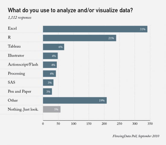
Tableau
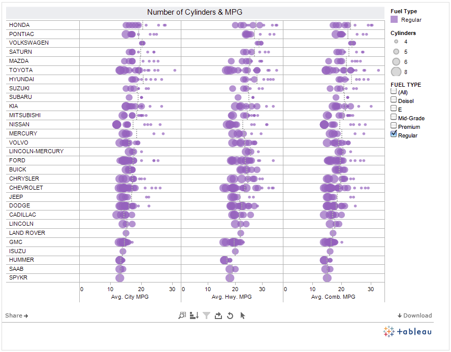
- 3rd most popular tool in poll
11/11/10 |
- discussion on the presentation on R from last week.
- Data Journalism and Visualization
- A short presentation: A (Visualization) Case for WikiLeaks
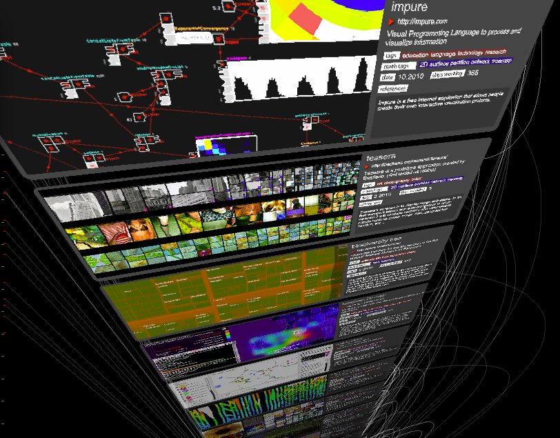
- A new language: Impure
From TED.com: David McCandless turns complex data sets (like worldwide military spending, media buzz, Facebook status updates) into beautiful, simple diagrams that tease out unseen patterns and connections. Good design, he suggests, is the best way to navigate information glut -- and it may just change the way we see the world.
12/16/10 |
Invited Speaker: Michael Olkin
- Michael Olkin, GIS Manager for the town of Amherst gives a guest lecture. Olkin worked as GIS Manager for the Town of West Springfield, MA, and worked for Applied Geographics, Inc (AGI). Olkin also served as GIS Coordinator for the Central Massachusetts Regional Planning Commission and as GIS consultant for the City of Northampton, MA.
Olkin holds a Masters in Geography from the University of Connecticut.
Notable News Items
- Flight Patterns of Refugees: This is a very nice set of three different visualizations showing the flow of refugees through the world over a time scale, using data from the UN.
- Data Store at the Guardian: The Guadian recently launched a new gateway to their data journalism and visualisations - find out what's new at guardian.co.uk/data
2/17/11 |
Invited Speaker: Prof. Greg Brown, Music Dept. Smith College
- Greg Brown will explore the aesthetic and technical aspects of creating a virtual machine to generate music that evolves in an autonomous and quasi-organic nature. He will provide a brief discussion of the concept of sonification and a review of the rules for Conway's Game of Life and how they can be adapted to the sonic realm. Finally, there will be a presention the music itself along with concurrent video.
- Location FH246.
Show and Tell
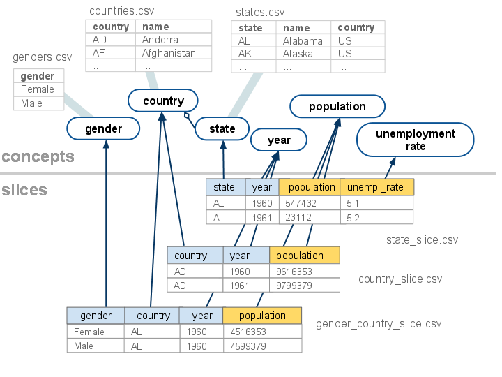
Data Publishing Language
Category: Algorithm/Visual Data Structures
Where: code.google.com
Implementation: NA
Date: Feb 2011
From googleblog.blogspot.com: Today, we’re opening the Public Data Explorer to your data. We’re making a new data format, the Dataset Publishing Language (DSPL), openly available, and providing an interface for anyone to upload their datasets. DSPL is an XML-based format designed from the ground up to support rich, interactive visualizations like those in the Public Data Explorer. The DSPL language and upload interface are available in Google Labs.
Follow Google's tutorial on DSPL here.
GeneaQuilts
Category: Algorithms
Where: www.aviz.fr
Implementation: Java
Date: 2010
From www.aviz.fr : GeneaQuilts is a new visualization technique for representing large genealogies of up to several thousand individuals. The visualization takes the form of a diagonally-filled matrix, where rows are individuals and columns are nuclear families. The GeneaQuilts system includes an overview, a timeline, search and filtering components, and a new interaction technique called Bring & Slide that allows fluid navigation in very large genealogies.
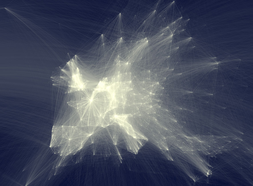
Map of Collaboration between Researchers
Category: Geographic/GIS
Where: science-metrix.com Olivier H. Beauchesne
Implementation: NA
Date: Jan 2011
From Beauchesne's blog: My employer, Science-Metrix, is bibliometric consulting firm. In other words, we engineer ways to measure the impact and growth of scientific discovery (and publications) in the world. To accomplish this, we license data from scientific journal aggregators like Elsevier’s Scopus and Thomson Reuter’s Web of Science. The data we have is bibliographic in nature. We don’t have the full text of the articles but rather citation networks, authors and their affiliations, abstracts, etc.
From this data, I extracted and aggregated scientific collaboration between cities all over the world. For example, if a UCLA researcher published a paper with a colleague at the University of Tokyo, this would create an instance of collaboration between Los Angeles and Tokyo. The result of this process is a very long list of city pairs, like Los Angeles-Tokyo, and the number of instances of scientific collaboration between them. Following that, I used the geoname.org database to convert the cities’ names to geographical coordinates.
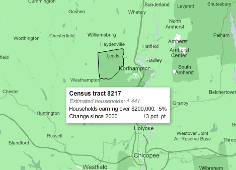
The NYT maps census data
Category: Political/Census
Where: The New York Times
Implementation: GoogleMap API
Date: Dec 2010
From The New York Times: Browse local data from the Census Bureau's American Community Survey, based on samples from 2005 to 2009. Because these figures are based on samples, they are subject to a margin of error, particularly in places with a low population, and are best regarded as estimates.
Google API Table
Category: KMS/Software
Where: code.google.com
Implementation: NA
Date: 2011
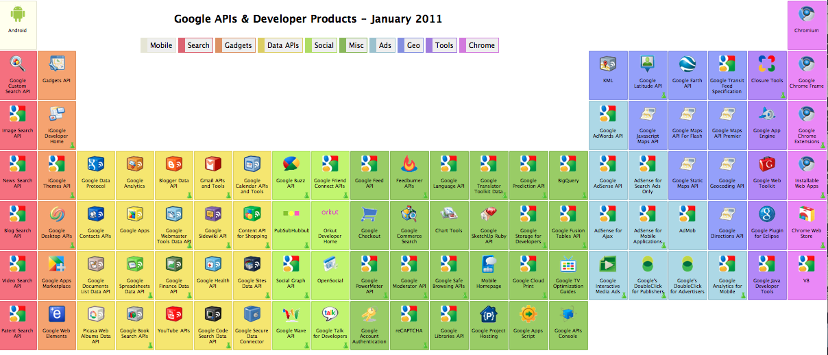
From coolinfographics.com: From the Google Code site, the Periodic Table of Google APIs & Developer Tools is a cool layout of the tools available. It’s actually well designed table, so each element is clickable, and takes you to the information page about that particular API.
Byook: animated books
Category: News/Books
Where: byook.com
Implementation: NA
Date: Feb 2011
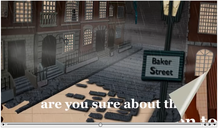
From byook.com: Byooks are a new way of reading on an iPhone/iPad.
Using magic and codes defined by books and movies, they entice you to read beyond words. Pictures, animations and sounds bring great classics and today’s bestsellers to life.
Relax, open a Byook and reveal the true potential of imagination.
Facebook Friendships
Category: Social Networks
Where: Paul Butler, of Facebook
Implementation: R
Date: Dec. 2010
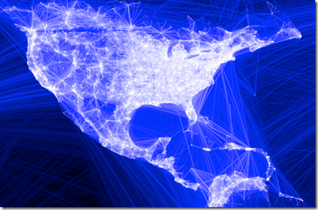
In [2], Paul Butler says: I began by taking a sample of about ten million pairs of friends from Apache Hive, our data warehouse. I combined that data with each user's current city and summed the number of friends between each pair of cities. Then I merged the data with the longitude and latitude of each city.
At that point, I began exploring it in R, an open-source statistics environment. As a sanity check, I plotted points at some of the latitude and longitude coordinates...
