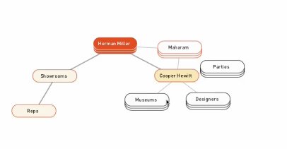
Interesting Processing application showing the automatically scaling/organizing of a tree. Done in Processing
http://www.cs.princeton.edu/~traer/randomarboretum/
Also uses a Physics libraryhttp://www.cs.princeton.edu/~traer/physics/
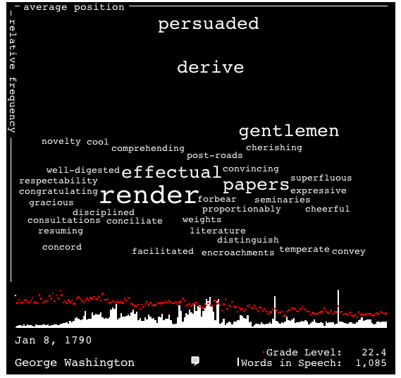
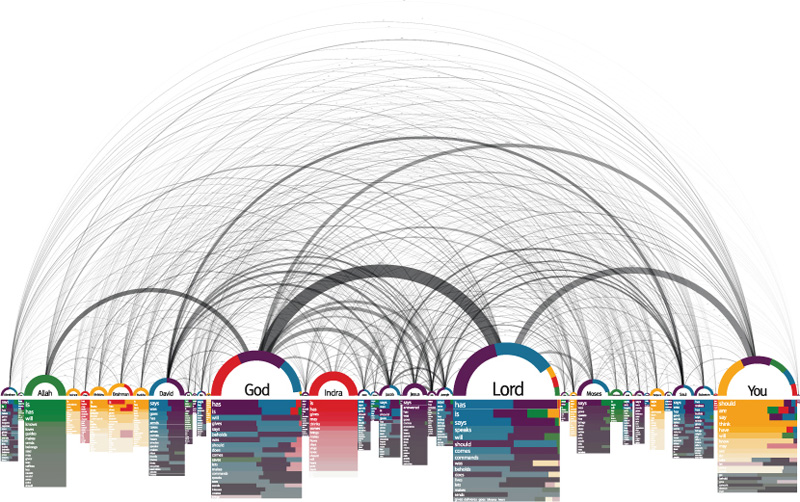
New York Times example of multi-D graph (elections)
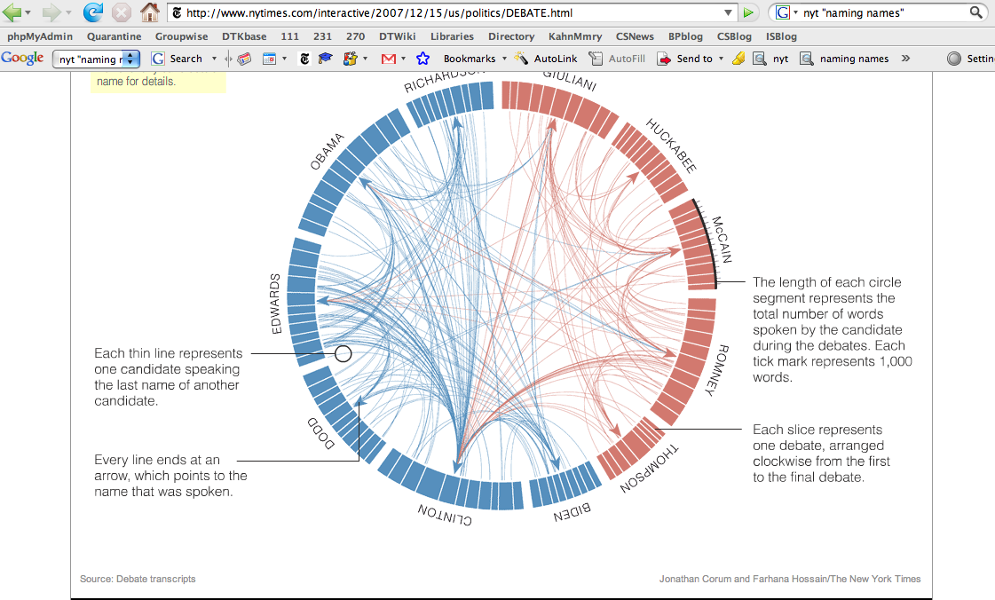
June 23rd, 2008 by adminFrom the NYT, shows statistics on words/concepts appearing in candidates speeches
Naming Names
June 21st, 2008 by adminFrom article in NYT on candidates naming each other names…
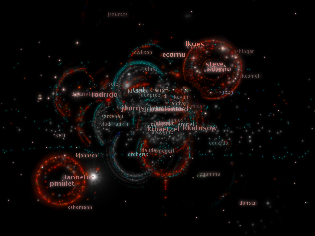
Code Swarm
June 19th, 2008 by adminCode-Swarm is a visualization technique to show the evolution of a software project under CVS as it is updated, modified, and as it evolves under the influence of many contributors/programmers.
From Slashdot: http://developers.slashdot.org/developers/08/06/16/1855209.shtml
“A student at UC Davis has created some stunning visualizations of open source software contributions, including Eclipse, Python, Apache httpd and Postgres. From the website: ‘This visualization, called code_swarm, shows the history of commits in a software project. A commit happens when a developer makes changes to the code or documents and transfers them into the central project repository. Both developers and files are represented as moving elements. When a developer commits a file, it lights up and flies towards that developer. Files are colored according to their purpose, such as whether they are source code or a document. If files or developers have not been active for a while, they will fade away. A histogram at the bottom keeps a reminder of what has come before.’”
Watch the video: code_swarm - Eclipse (short ver.) from Michael Ogawa on Vimeo.
The code is available on Google-Code, and the 6/19/08 version is available here:
http://cs.smith.edu/~thiebaut/IS_blog/software/code-swarm/ [1]
In the Art of a DNA Graph
June 18th, 2008 by adminArticle in the 6/18/08 NYT, Science Times.
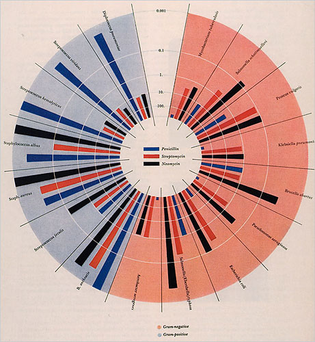
DESIGN AND SCIENCE: The Life and Work of Will Burtin
June 2nd, 2008 by adminExcerpts from article published in 6/1/08 NYT (Sunday Book Review section):
Visuals
Burtin was one of many designer exiles who fled the Nazis and Fascists, including the Bauhaus teachers Herbert Bayer and Laszlo Moholy-Nagy […] Burtin was the art director of Fortune magazine in the late ’40s, responsible for introducing abstract and conceptual art covers. Burtin’s most impressive contribution was the marriage of science and design.
After a recent spate of graphic designer biographies, this detailed monograph is definitely overdue. Burtin’s virtually forgotten work, like the exhibition “Metabolism — the Cycle of Life,” prefigures the interaction design practiced today on the Web and reveals just how entertaining well-articulated graphic and exhibition design about science can be.
TextArc
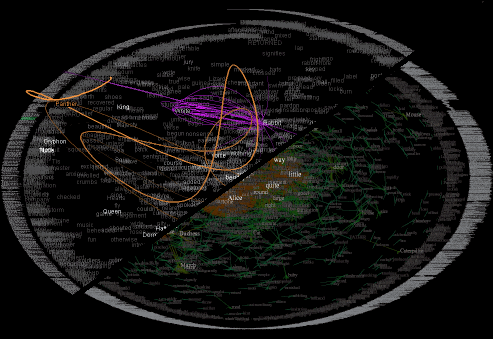
May 29th, 2008 by adminA somewhat confused vew of a whole book in one graphics. Visually pleasing, but what can we use it for?
Measuring dynamic relationships between readers and stories
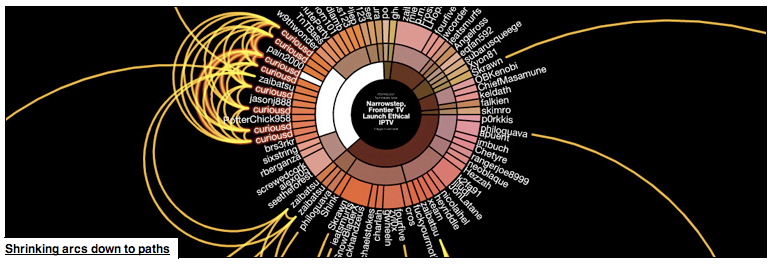
May 29th, 2008 by adminToo complicated (I think) for the average user. But shows a lot of information. Not intuitive, though…
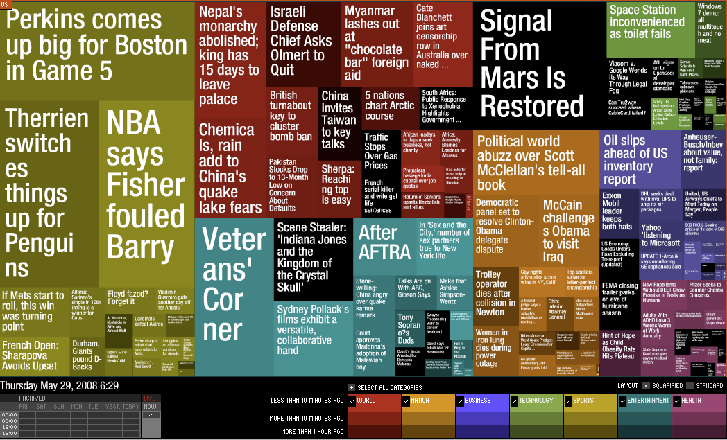
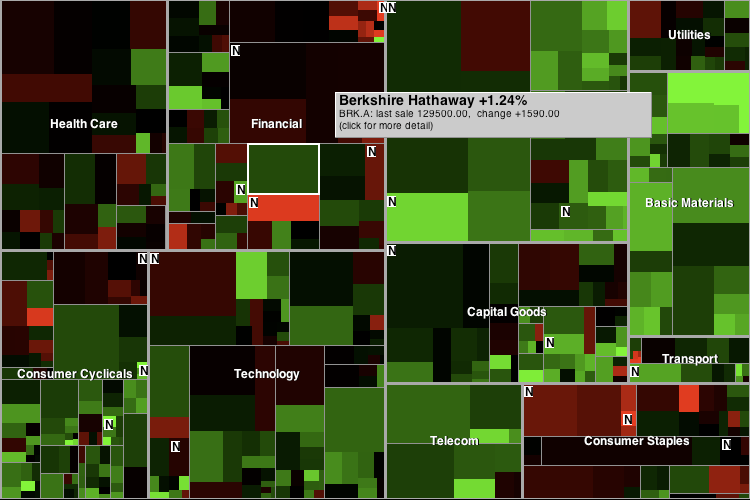
Maps of market and news
May 29th, 2008 by adminTwo interesting uses of treemaps. Both are referenced in the StateOfTheUnion.net web site (in the essay)
Words used in the State of the Union addresses across the years
May 28th, 2008 by adminhttp://stateoftheunion.onetwothree.net/
This is done with processing, and truly interactive. As the arrow key is moved left or right, we move by one year backward or foreward, respectively, and see in red the words used the year before, and in white the words of the current year. Cool…
The link contains an interesting essay, reproduced below:
The {Sorry} State We Are In
by Brad Borevitz
The triumph of iconicity over rhetoricity–call it the society of the spectacle, call it what you will. The change has certainly not gone unobserved. And yet, we are likely to blinker our awareness of the situation–and imagine that the mechanisms of our governance continue unaffected–that the institutions of democracy are somehow untouched by these changes. But how can this possibly be the case?
A democratic system of government depends on communicative practices that are founded on rhetoric: an art of persuasion. This implies a public sphere as the ground of a competitive exchange of argument and counter argument. Reason theoretically rules such a domain, where syllogistic conventions determine the outcome of a competition of ideas based on the strength of evidence and the logical coherence of their exposition.
What has displaced this rhetorical arena is a screen on which assertions are projected. It may be that these assertions compete for attention, but they don’t entertain argument or tolerate critique. Assertions are immune from denigration based on counterfactual evidence, or the revelation of faulty logic. Competition in this environment is a matter of precedence, authority, style, volume, frequency, and ultimately saturation.
Contemporary political ideas, which take the form of memes circulating in the soup of our media saturated world, are formally equivalent to the fragments of iconic identity circulating as agents of corporate entities, the brands. Politics is branding, the media practice of producing identity as awareness and desire, through the deployment of declarative language and image.
Not only have commercial interests produced a scarcity of actual public space by their domination of the landscape and their occupation of the commons, they have gained almost total control over the virtual spaces of communication, and colonized the language of political discourse itself.
In this atmosphere, the public debate over ideas is obsolete, if not impossible. The significance of such a change is immense. In Benjaminian terms, politics enters the realm of the aesthetic, a situation symptomatic of fascism.
How is it that we have arrived at this state? Why are we so surprised as we wake now to the nightmare? After all, here in the U.S., the president has been informing us of the state of the union from the year the constitution was ratified. Were we not listening to the message–not reading in this text the signs of transformation? When was it that the words addressed to us changed from having a rhetorical significance to an iconic one? When was it that the words last demanded our understanding, and when did they come to simply demand that we buy in?
A Form
The State of the Union address is a particularly apt data set to explore for clues about the change in political language: it is a remarkably consistent form available annually over the entire history of the United States. Article II Section 3 of the Constitution inaugurates the practice:
[The President] shall from time to time give to the Congress Information of the State of the Union, and recommend to their Consideration such Measures as he shall judge necessary and expedient …
Very quickly, the address acquired a conventional form as a yearly message delivered by the office of the president, at the beginning of the year, to the congress, the representatives of the people. This consistent structure, which endures over the course of U.S. history, is what allows for a useful comparison between actual instances of the address. Such comparisons would be difficult to make otherwise between more random fragments of political discourse not regulated by a uniform temporal frame and an archetypal structure of address.
In the ceremonious address in congress, when the president is announced, he is called, “the president of the United States,” and not mentioned by name. The State of the Union is specifically not delivered by the person of the president–the specific officeholder of that position–but rather, the office of the president–that space of authority that the person merely occupies temporarily. Even if he signs his name to the document (if it is written), the text has very rarely been composed exclusively by him–it is merely approved or intoned by him. Presidents have always had help with writing, starting with Washington who relied on Hamilton for this service; though, Coolidge (1923-29) was the first to have an official speechwriter on staff.
In addition to the hypothesized change in language between the rhetorical and the iconic, the State of the Union has, from the beginning, been subject to various tensions and trends both political and linguistic, which also affect its language. One of these is the opposition between written and oral delivery of the message. The address was first given in person, but starting with Jefferson in 1801, the message was written and delivered to congress where it was read by a clerk.
Jefferson’s objection to the spoken format was the inappropriately monarchical implication of the address, given its similarity to the imperial practice of the speech from the throne. From Jefferson, until Wilson in 1913, the message was written, and referred to as the “President’s Annual Message to Congress.” The contemporary usage of the term “State of the Union Address” starts with Roosevelt in 1935. With the exception of the years 1919-20 (Wilson), 1924-28 (Coolidge), 1929-32 (Hoover), 1944-45 (Roosevelt), 1946 and 1953 (Truman), 1956 (Eisenhower), 1961 (Kennedy), 1973 (Nixon), and 1981 (Carter), all messages since 1913 were delivered orally (in 1945 and 1956 they were broadcast as radio addresses, though they delivered to Congress as written messages).
The oral delivery of the address in the modern period coincides with a tendency towards broader dissemination of the message in the press and the media more generally as the century progresses. 1923 brings the first radio broadcast. In 1947, the speech was televised. In 1965 it was moved to the evening hours, presumably to be made accessible to the working person. And, in 2002, it was available live via the web. The audience for the message had always included office-holders in government, the direct address of the public via broadcasting, would certainly impact the language used. Broadcast demands a different, probably less formal, communication style, and an extra self-consciousness in targeting the more populous and diverse audience. Simultaneously, speech in general has likely become less formal.
Given that affirmation or rejection rather than argument are the possible responses to anti-rhetorical speech acts, the applause of the live audience, the congress, the supreme court, and dignitaries assembled in the capital building, takes on a special importance and contributes significantly to the length of the address. Applause are, more and more, a partisan affair, with the members of the president’s party responsible for most of the acclamation, and the members of the court abstaining from all but the most perfunctory and polite participation. In this respect, the speech comes to resemble a sporting event with a partisan audience both present and remote, and with referees maintaining their impartiality at the sides. Since Bush’s first speech in 2002, White House transcripts have contained parenthetical notations of the applause and laughter.†
The content of the State of the Union messages certainly vary according to the issues of the day, but they also contain constants: the words that constitute the mythos of our governance and the machinery of its ideology. With characteristic eloquence, Jimmy Carter writes in the 1979 address:
As long as I’m President, at home and around the world America’s examples and America’s influence will be marshaled to advance the cause of human rights.
To establish those values, two centuries ago a bold generation of Americans risked their property, their position, and life itself. We are their heirs, and they are sending us a message across the centuries. The words they made so vivid are now growing faintly indistinct, because they are not heard often enough. They are words like “justice,” “equality,” “unity,” “truth,” “sacrifice,” “liberty,” “faith,” and “love.”
These words remind us that the duty of our generation of Americans is to renew our Nation’s faith, not focused just against foreign threats but against the threats of selfishness, cynicism, and apathy.
Despite Carter’s protest to the contrary, those key words he claims are not heard, are, in fact, heard constantly: the word “justice” appears in 180 addresses a total of 752 times. It is a staple of presidential expression. To be fair, other of these words have been less popular of late in State of the Union speeches, and may also be less popular in colloquial speech. Certainly justice, liberty and faith, at least, are constantly in our ears.
| Word | Speeches | Occurrences |
|---|---|---|
| Justice | 180 | 752 |
| Equality | 85 | 149 |
| Unity | 60 | 102 |
| Truth | 69 | 101 |
| Sacrifice | 57 | 90 |
| Liberty | 137 | 306 |
| Faith | 134 | 341 |
| Love | 54 | 78 |
| Freedom | 154 | 676 |
| Peace | 207 | 1821 |
| War | 206 | 2631* |
*Not including plural forms
A word like “Freedom,” a Bush favorite, is in 154 of the speeches. The words “peace” and “war” occur together in 200 out of the 214 addresses–fully 93% of them. If there is a single issue, which dominates the corpus, it must be this. Practically the first thing out of Washington’s mouth in the very first speech was: “To be prepared for war is one of the most effectual means of preserving peace.” In that sentence, it is as if he sets the agenda for the next 200 years of history and inaugurates the confusion, which persists to this day, over the meaning of these two simple words.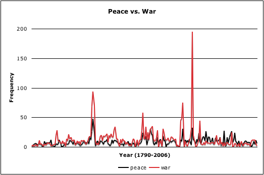
Each iconic word has a history of usage, a profile of its popularity, and a trace of the contest between words within the ecology of political language. Visualizing this history gives us insight into these struggles. The words “peace” and “war” seem bound tightly together in their rhythmic march into the future, but “war” peaks dramatically during major conflicts leaving peace far below in its shadow. Between “freedom” and “justice” the dynamics are livelier. Whereas “justice” seemed the favored value trending upwards from the beginning, World War II marks a dramatic reversal of fate. “Freedom,” it seems, is now more important than “justice.” And that just might explain some things.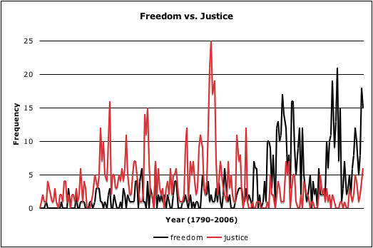
Another Reading
The counting up of words suggests a different sort of reading practice. There is reason to be skeptical of the positivist implications of a statistical analysis of language, but there is also motive to appreciate and explore the current vogue of quantitative methods. There is something compelling in the urge to empirically examine this particular corpus for clues as to how things have gone horribly wrong. Maybe we can no longer bear to listen to the address, or maybe it has become impossible for us to read it. There are certainly few who would be willing to scrutinize all 3000 pages of our legacy of 214 messages from the president. Perhaps counting is a defense against the spell of iconic language. It may be that counting is simply the automation of a practice that we participate in already, as we measure unconsciously our saturation in the messages of the media–as they work us over completely.
Is it a problem to conceive of reading practices that satisfy the will to process the material, to refine it, to empty it of its gold, but not necessarily to understand it? We fear succumbing to the desire to consume the messages, for consumption entails risks and investments that we will not bear. It is too much. The scanning of words abstracted from their context produces a reading that is dependent on iconic recognitions and specifically not on rhetoric. This is an analysis that is blind to motive but cunning to structure–or is this an analysis at all? If it is true that rhetoric is lost, it is a way of reading that those dead texts deserve.
Certainly, such practices already exist, separating attention into surface and depth: the scan and the mine. The task is divided between our parts: our silicon organs, and our fleshy ones. Applications of this kind surround us: search engines, maps of markets (Marketmap), of headlines (Newsmap), of books (Amazon’s concordance). We are increasingly aware of the degree to which our lives are the texts that are mined and scanned by industry and government alike. A quantitative reduction is not simply a violence, a prelude to injustice, a methodological inadequacy, a mistake, or a failure, it is a practice matched with a circumstance.
The master’s tools are turned against him. We can envision a Total Information Awareness program of our own and aim its tentacles at government documents. It is an ironic pleasure to scan in seconds the one-and-a-half-million-word corpus of the State of the Union for important keywords and significant characteristics, even as the government’s programs mine our personal data for incriminating evidence–how much more so with the revelations in late 2005 that domestic spying was not simply post-9/11 paranoia, that the theoretical capabilities of the now defunct Information Awareness Office had actually been deployed out of the dark side of the Defense Department.
† The version of the Bush addresses that are published in the Congressional Record contain only a few scattered notations of applause, mostly at the begining and end of the speech, while the White House transcripts (as well as those on CSPAN) include upwards of 50 parenthetical notations of applause in each.
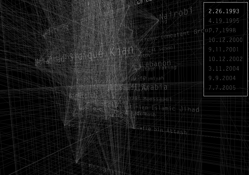
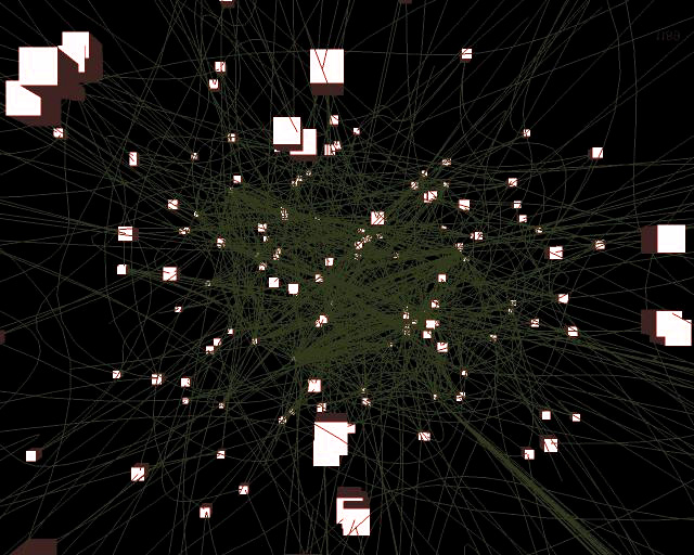
Processing-driven visualization of a 3D network of word relationships
May 28th, 2008 by adminhttp://jamesnsears.com/applets/spies/
This was done for the NYT, 3 Dec. 2006. The article is “Rewiring the Spy”. This is done in Processing and shows the connections existing between words in a government database dealing with terrorism.
Funny Cartoons
May 26th, 2008 by admin
(Foreplay)
(wikipedian protester)
From the geeky site http://xkcd.com/. Note that the page on the laptop looks like a wikipedia page! There was a NYT article on 5/25/08, Link by link: This is funny only if you know Unix on this web-toon site.
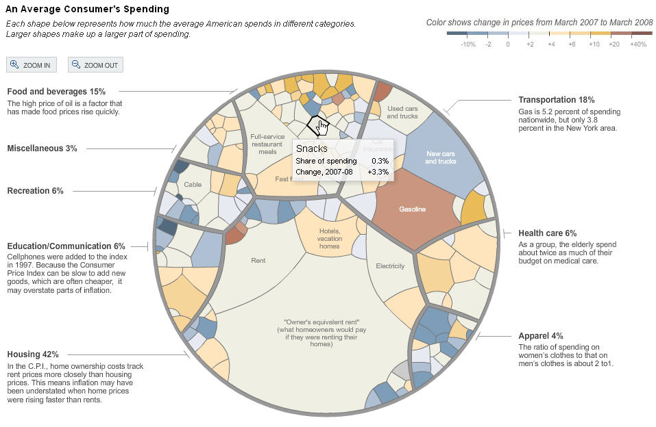
NYT 050408: Inflation’s Little Parts
May 20th, 2008 by adminInteresting article exhibiting a very “organic” chart showing influence of various factors in the inflation.
Note the scale given at the top, showing the relationship between color and change in price. The graph itself is hierarchic, with 8 different categories (apparel, health care, etc…), and each is divided up into sub categories shown as blobs of various sizes, the size being proportional to the part of spending.
The graph is interactive on the NYT web site, and gives more info about a blob on mouse-over.
The graph is done in flash.
SeaDragon
May 19th, 2008 by adminTechnology for browsing large amount of pictures in jpeg2000 format. SeaDragon was purchased by Microsoft.
Watch the video: [2]
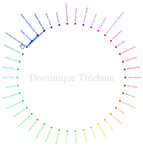
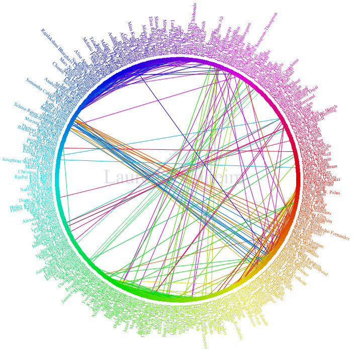
Facebook’s “friend wheel”
May 19th, 2008 by adminInteresting display of friendship links on Facebook.
First example, mine:
Next, Lauren’s friend wheel (Lauren just graduated from Smith):
Visualizing 3D
May 14th, 2008 by adminNew article from the NYT on 5/13/08.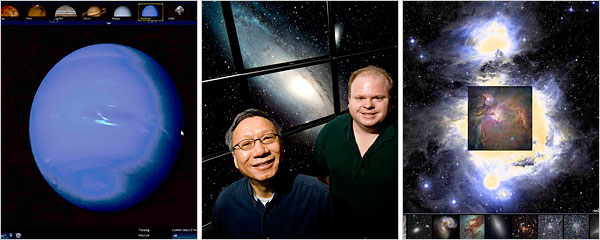
“Exploring the virtual universe is incredibly smooth and seamless like a top-of-the-line computer game, but also the science is correct”
The WorldWide Telescope results from careful planning and lengthy development in a research division. It has the richer graphics and it created special software to present the images of spherical space objects with less polar distortion. WorldWide Telescope requires downloading a hefty piece of software, and it runs only on Microsoft Windows.
Google Sky started as a Google “20 percent” project, in which engineers can spend time on anything they choose. Google Earth, where Google Sky began, requires a software download, but its Web-based version, which came out in March, does not. The Google culture encourages engineers to put new things onto the Internet quickly and keep improving them, a philosophy geared to constant evolution instead of finished products.
Design and the Elastic Mind
May 12th, 2008 by adminPaul Antonelli, the curator of the exhibit “Design and the Elastic Mind” speaks to Charlie Rose in a 1-hour interview. Great stuff!
http://www.charlierose.com/shows/2008/05/07/1/design-and-the-elastic-mind
Final Version
May 3rd, 2008 by AllieSo the final version of this project is almost as interactive as it is meant to be. Due to some unforeseen complications I wasn’t able to implement the functionality that would allow a user to submit the name of a wikipedia page and then have the data about that page displayed. Currently the visualization statically displays the revision information about the page titled “Diebold.” The information about the revisions on the Diebold page is retrieved from a MySQL database and displayed.
The source code is linked on the page at the bottom.
Progress on 4/22! To do for last meeting 4/29…
April 22nd, 2008 by adminA good reference for counting quantities in mysql databases can be
found here:
http://dev.mysql.com/doc/refman/5.0/en/counting-rows.html
Here are some queries that can be useful for getting information
about wikipedia pages and their contributors
- get the page Id of a page with a particular title:
select pageId, title from pages where title like 'Maria Callas';
select pageId, title from pages where title like 'king kong%';
- Use the % sign sparingly, otherwise it will match a lot of stuff we may not be interested in.
- get all the contributors that edited a page with a given PageId:
select Id, revisionId, pageId, contributorId, comment
from revisions where pageId = 10;
- get the number of revisions made by each contributor on a given page with Id PageId (here 1000):
select `contributorId`, count(*) from `revisions` where
         `PageId`=1000 group by `contributorId`;
- get the number of revisions made by each contributor on the page with title “Maria Callas“:
select contributorId, count(*) from revisions where
PageId=( select pageId from pages where title like 'Maria Callas'
limit 1 ) group by contributorId;
Note that the ”’limit 1”’ forces the subquery to return only 1 page-Id. If one
wants to catch all the contributors to all the pages that start with
Maria Callas, then we can try something like this:
select contributorId, count(*) from revisions where PageId in
( select pageId from pages where title like 'Maria Callas%' )
group by contributorId;
Notice the introduction of the keyword in and the %-sign, and the removal of limit 1.
- Be careful, though, this query took several minutes to execute on a 3 GHz Pentium server! This is because there are many pages (20+) with Maria Callas in their title, and for each one we get a list of contributors, then merge all the data together… But it would take longer to do this in Php or Processing, so it pays to make the mysql server do the work. (One way to make the work go faster is to cleverly index the database… I’ll check on whether the indexing of the data can be improved at some point…)
- Finally, we can sort the results by count, so that the most prolific contributors are listed first. This way we can pick only the top N contributors, or only those who contributed more than R revisions.
select contributorId, count(*) as theCount from
         revisions where PageId = ( select pageId from pages where title like
         'Maria Callas' limit 1 ) group by contributorId order by theCount desc;
Note that we give a temporary name to the result of count(*), theCount, so that we can specify what to sort the returned result on.
To Do for next week:
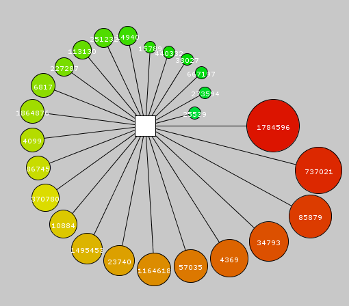
- Start from a string containing the name of a wikipage, say “Maria Callas”, and create a graph with the rectangle in the middle showing the page name, and circles exploding around showing the contributors. Put the contributor Id in the circle. Make the size of the circle or the size of the link proportional to the number of contributions
- Create a table on the side of the graph with statistics about the page. For example, the page title, the total number of revisions, the total number of contributors, and maybe the top contributor.
- Create a mouse-over or a mouse-click event that will display in the status box information about what the mouse is pointing to.
To Do for 4/22/08
April 21st, 2008 by adminI should have posted it last week, but working from memory, this is what I remember us agreeing upon.
- We want something that may not have the bells and whistles, but that can grab information (a wikipedia page and its contributors) from a mySql database
- Display the page at the center of a Processing graph
- Display the contributors as circles around the page
- Show a measure of the amount of contribution from a contributor to the page (number of lines of edits, for example, or number of times contributor modified the page)
- Have some labeling system so that we can find out what the title of the page is, and who the contributors are. It might be too confusing to have the names inside the circles, so an alternative could be to have numbers in each circle and a table on the side indicating what name is associated with each number.
- Have a clickable map, so that clicking on a contributor could trigger some action such as going to the database and fetching more information, such as all the pages that have been contributed to by this person.
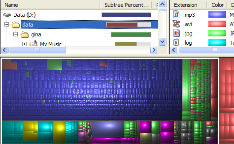
Tree-maps: another interesting visual display of information
April 10th, 2008 by adminFrom http://lifehacker.com/software/disk-space/geek-to-live–visualize-your-hard-drive-usage-219058.php
Development Paused for the Week
April 7th, 2008 by AllieSo while looking at my calendar for the week I realized that this weekend is Collaborations! So instead of doing development I made the poster for Collaborations and had the opportunity to reflect on the different aspects of the project. More and more I’m surprised that there isn’t a large presence of research being done on the subject, especially by Google.
So here is the current poster, which is in need of editing before it goes to the printer.
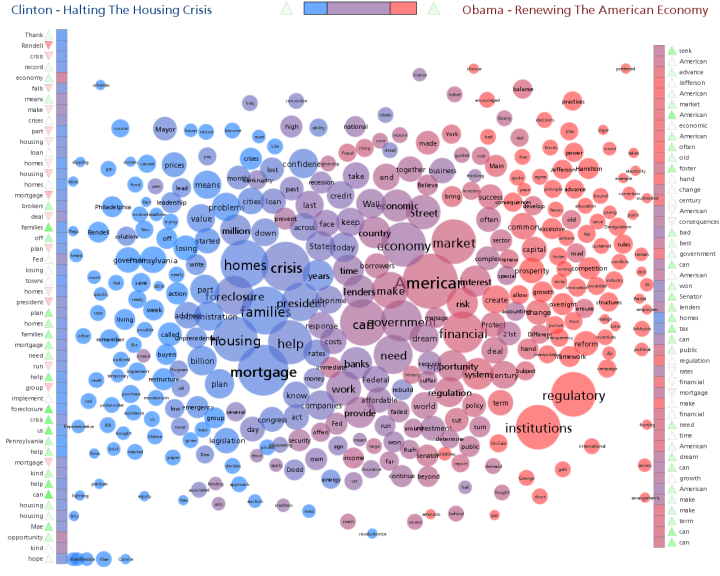
Interesting word chart
April 1st, 2008 by adminhttp://www.neoformix.com/2008/ObamaClintonSpeechContrast.html
Interesting comparison of two speeches…
New version of exploding circles
April 1st, 2008 by adminJust finished going over the code with Allie, and we got a nice smooth display.
Here’s the link
Ideas for what to implement for next week:
- Make the dimensions of the display constant and everything else depends on it. We might want to keep in mind that with some graphs, their might be so many circles that scaling might become important. Check the Processing documentation for how scaling can be done. (Scaling means that the window has a geometry of, say, 500 x 500, but that we are actually using a mathematical world that might be 1000×1000)
- Put all the properties of the circles in arrays. These arrays eventually will be filled by a query to the database. But right now we might want to have an array of strings which will be shown inside the circles, and an array of numbers defining the connectivity of the circle (wikipedia contributor) to the center square (wikipedia page). You might want to use this number to define the color of the circles, the size of the circles, or the width of the edges (or a combination of them).
- Look at ways to make the circles or the square clickable, so that clicking on one will cause the browser to present new information.
- Look at ways to show information on mouse-over events. If the mouse moves over a circle, it would be nice to have a box give more information about this circle.
Geometry is complicated…
March 31st, 2008 by AllieHere are my three latest trials. I was able to implement the circles having text on them but for some reason the text would not show within the web browser. It has to do with how processing renders text and I’m not sure how to get around it.
4 Circles around a Square: Link 1
12 Circles around a Square: Link 2
24 Circles around a Square: Link 3
Some Graphviz Examples
March 30th, 2008 by adminJust found this while looking for ways to represent the CS curriculum as a graph. I think our direction using Processing is good, and I don’t want to go back to Graphviz, but looking at ways people are using graphing packages to show relationships is interesting, no matter what package they use.
http://www.flickr.com/search/?q=graphviz&w=all&s=int
To do for 4/1/08
March 25th, 2008 by adminGood job on today’s applets.
For next week, here is what we are shooting for:
- square in the middle
- 10 circles distributed on a wheel around the center square. They may start all overlapping over the middle square, and quickly move out on the spokes of the wheel to settle at safe distances from the center square and from each other
- the circles have random dimensions
- the circles are connected to the center square by edges
- for speed, we may want to redraw the circles in gray before redrawing them in white to prevent filling the whole background every time.
Fun with Applets
March 24th, 2008 by AllieSo spring break is over, my flu isn’t yet, but I was still able to get all our goals accomplished! There are two examples of applets. The first is with static, overlapping circles and then the second is with moving circles. An unexpected side affect of moving the circles to avoid colliding is that the circles aren’t redrawn a new one is just drawn for every frame. I’m not sure how to fix that just yet. Also after reading the collision avoidance section I just decided to write all my own code. Since I’m currently taking about 120mg of sudafed there is something wrong with my algorithm that makes the circles lock in perpetual motion if they sit right on top of each other. It’s probably an easy fix though.
I would have gone ahead with drawing lines and labels but I wanted to learn how to un-draw the objects first before adding even more visual clutter to the window.
First trial with multiple circles: http://www.cs.smith.edu/~abellew/multipleCircles/
Second trial with moving circles: http://www.cs.smith.edu/~abellew/movingCircles/
To do for 3/25/08
March 11th, 2008 by admin1) study if we can put two circles (ellipses) on a plan, overlapping, and have them move away from each other until they do not overlap. Investigate how much programming is involved, and whether the movement can be automatically controlled by Processing
2) Create a “daisy” diagram of a few nodes, with one node in the center of the star, and several nodes around. Each node should have a label, and the nodes are connected to the center node with links/edges of varying width.
3) Figure out how to generate an applet from a Processing program.
A Processing Program
March 11th, 2008 by admin
// ellipses on springs
int ellipses = 5;
float[]x = new float[ellipses];
float[]y = new float[ellipses];
float[]w = new float[ellipses];
float[]h = new float[ellipses];
float[]angle = new float[ellipses];
float[]frequency = new float[ellipses];
float[]amplitude = new float[ellipses];
float[]strokeWt = new float[ellipses];
float[]damping = new float[ellipses];
int springSegments = 24;
int springWidth = 8;

void setup() {
  size(600, 400);
  frameRate(30);
  smooth();
  fill(0);
  setSpring();
}

void draw() {
  background(255);
  for (int i=0; i<ellipses; i++) {
      createSpring(x[i], y[i], w[i], h[i], strokeWt[i]);
      noStroke();
      fill(0);
      // draw ellipses
      ellipse(x[i], y[i], 50, 50);
      // spring behavior
      y[i] = y[i]+cos(radians(angle[i]))*amplitude[i];
      angle[i]+=frequency[i];
      amplitude[i]*=damping[i];
   }
  // press the mouse to reset
  if (mousePressed) {
     setSpring();
  }
}

void setSpring() {
  for (int i=0; i<ellipses; i++) {
    // size approximates mass
    w[i] = random(20, 70);
    h[i] = w[i];
    // stroke weight approximates
    // spring strength (resistance)
    strokeWt[i] = random(1, 4);
    x[i] = ((width/(ellipses+1))*i)+width/(ellipses+1)-w[i]/2.0;
    y[i] = (w[i]*3)/strokeWt[i];
    angle[i] = 0;
    // spring speed
    frequency[i] = strokeWt[i]*4;
    // amplitude based on mass/spring strength
    amplitude[i] = (w[i]*1.5)/strokeWt[i];
    // calculate damping based on stroke weight
    // simulates resistance of spring thickness
    switch(round(strokeWt[i])) {
      case 1:
        damping[i] = .99;
        break;
      case 2:
        damping[i] = .98;
        break;
      case 3:
        damping[i] = .97;
        break;
      case 4:
        damping[i] = .96;
        break;
     }
   }
}

// plot spring
void createSpring(float x, float y, float w, float h, float strokeWt) {
   stroke(50);
   strokeWeight(strokeWt);
   for (int i=0; i<springSegments; i++) {
     // for spring end segment
     if (i==springSegments-1) {
        line(x+w/2+springWidth, (y/springSegments)*i, x+w/2, (y/springSegments)*(i+1));
     }
     else {
       // alternate spring bend left/right
       if (i%2==0) {
          line(x+w/2-springWidth, (y/springSegments)*i, x+w/2-springWidth, (y/springSegments)*(i+1));
       }
     }
  }
}
The resulting applet: [processing/index.html applet]
To do list for 3/11/08
March 4th, 2008 by adminWe are following the Processing path.
From Allie’s exploration of Processing, it seems that we can represent a star graph in 3-D with springs linking the outside nodes to the node at the center of the star, and use non-collision attributes of the nodes to make sure they do not overlap in space. It seems that using a “force field” around the nodes would force them to be some distance away from each other in a pleasing way.
The different ideas we discussed:
- on a mouse-over event over a node, a box opens up with information about the node visited, and a link that can bring up a new page, or a new graph
- we can use the mouse to ‘move’ the graph around and see what is “behind”
- we could have a series of checkboxes, or text input boxes that would allow for interesting filtering of the data:
- We can block all the contributors belonging to the same IP group together (all the contributors working at MS, for example), in one big node
- we can color-tag all the contributors that have a particular status: working at a given company, having contributed in the last week/month, having contributed to other pages
- We could also organize the nodes on some kind of geodesic space around the center node
Processing + PHP
February 25th, 2008 by AllieSo I did a search for “php” within the http://processing.org domain and received a number of interesting results, the most interesting being this forum post about a trick to using php requests for MySQL data.
This post is also interesting (notably Reply #6):
Processing is just the visual framework that will work for this project I think and since now I know it’s possible to connect it to MySQL through PHP we can move ahead! This is very exciting indeed and since it’s already being used in the department it’s a great tool to perpetuate.
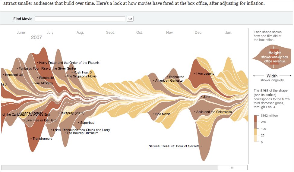
Showing the time variation of various quantities
February 24th, 2008 by adminToday’s NYT (2/24/08) shows an interesting graph of the money made by different movies in 2007. It’s an interesting way to show time-variation of several tens of quantities.
The graph is interactive, as the mouse is moved over the different movies, some information is displayed, as well as the length of their duration. http://www.nytimes.com/February 22nd, 2008 by admin
(Note: I will keep adding more links as the time comes, so please keep checking this post often ![]()
Click here to see an applet in action
Something new to explore!
February 21st, 2008 by adminJust attended a talk today by Ben Fry in the Art Department. Super stuff. Wish you had seen it, Allie.
Ben is the co-author of a language called “processing” (http://processing.org). He showed some very interesting animation and 3-D graphs that seem perfect for what we want to do. The graphics look pretty spectacular. I am not just sure how much coding is behind all the example.
I would like to change the “todo” list for this coming Tuesday and have you explore Processing instead. By the way, Processing is the language used in CSC106, taught by Eitan and Thomas, so several seniors including Jordan and Stephanie might be good people to brainstorm with…
Happy exploring!!!
Tags: Ben Fry, Processing
Posted in Uncategorized | No Comments »
To do for 2/26/08
February 19th, 2008 by admin- Modify the current display page and remove the frames
- Explore how to get better interaction from the SVG file when we click on nodes
- Aim for our next goal: a form with a box at the top where we can enter keywords (Hillary Clinton, say), and a submit button. Clicking on the button triggers a php program that generates a star graph with Hillary Clinton in the middle and the 10, 20, N most active contributors all around. Somehow we need to convey the scale of the number of edits. Probably a scale on the side (which we won’t worry about making user-modifiable right now), and links of varying width or color (or both) linking the contributors to the center node. The number 10, 20 or N might also be numbers in a text-entry box of the form.
- Clicking on a contributor node will bring up a new graph with this contributor in the center of a star, and the top 10, 20, N pages it has contributed to all around. We’ll probably want to see the “Hillary Clinton” page as part of these 10, 20, N pages, even if its ranking does not place it in this group.
- Explore stored procedures under mySql 5.0… Also, do not hesitate to make mySql do the dirty work, i.e. counting the number of contributors:
select count( `contributorId` ) from `tablex` where `contributorId`=N and `pageId`=P;
Tags: form, Hillary Clinton, SVG, to do
Posted in Uncategorized | No Comments »
How to generate PNG and SVG images of graphs in Php using Neato or Dot
February 19th, 2008 by adminThis does generate PNG and SVG files for directed and undirected graphs.
First, you must login to tango.csc.smith.edu, as Graphviz is only installed on tango, and not on beowulf. Use your regular Linux login information to connect.
Next, cd to /var/www/html/abellew/ to make it your working directory, and create the two subdirectories specified below.
Create a subdirectory in your working directory called Image. Make sure it is world-readable. This directory will contain a Php file containing a php class that takes care of generating png images from various GraphViz commands.
Create another subdirectory called images that is world readable and writable. This is where the Php class will store the png and svg image files.
Copy the file GraphViz.php into the Image subdirectory. It’s the Php class we’re going to use. Make sure it is world-readable.
Create a test file called graphviztest.php in your working directory (of which Image and images are subdirectories). Make sure this file is world-readable as well.
Point your browser to this new address:
http://tango.csc.smith.edu/abellew/graphviztest.php
and verify that you get a page with two pictures of the same graph. The top image is in png, the bottom one in svg. Verify that you can click on the nodes of the svg image and follow links (although they have the bad problem of opening up in the embedded frame, not the whole browser window… File:Icon sad.gif
Tags: dot, graphviz, neato, php, png, SVG
Posted in Uncategorized | No Comments »
Example Php program to access wikipedia history
February 19th, 2008 by adminThe following page contains Php code to retrieve pages id from the wikipedia history database, along with the contributors to a page with a given Id. (The page will take several seconds to load as the query is performing a search for keywords in the 11 million pages in the database).
Note that the current version retrieves only the contributors for 1 page, but that with little effort we can change the query to retrieve the contributors to a list of several pages Ids.
In order to run the program you must have a copy of the accessvars.php file, shown below:
<?php
//--------------------------------------------------------------
// MySql variables
//--------------------------------------------------------------
$params = array( 'host' => "tango.csc.smith.edu",
'database' => "enwikihistory2",
'table' => "pages",
'user' => "yourmysqlloginname",
'passwd' => "yourmysqlpassword" );
?>
Tags: contributors, mysql, PageId, php
Posted in Uncategorized | No Comments »
An Interactive Page
February 19th, 2008 by AllieThis week I was able to make a new page with the three specified frames showing the title of the wiki page in the top, the svg in the middle and potential contributor information in the bottom. I was able to give the nodes the appropriate links except that because of the frame structure the links target the frame in which they are clicked instead of a different frame or new window.
I thought about the different ways to create a scale and these were my thoughts:
- There are two ways to go about the scale. The first way is including the scale in the svg and the other is to have the scale live in another part of the webpage.
- If the scale should be part of the svg I’m not sure how to implement it using the DOT language.
- If the scale should be in another part of the webpage then what kind of control should it be? Also, how is it going to communicate with the page creating/running the svg, via PHP, JavaScript or maybe something else?
So I didn’t complete the scale part of this week’s tasks because I bogged myself down with the greater end goals. Also in order to get the correct scale requires a complex SQL Select statement and some post-processing. I looked up some static information in the database and wrote the topmost frame to look some revision information similar to what will be needed for the scale. So while I didn’t get a scale, this is foundation for what will need to be decided/done in the future.
Also in order to keep as many versions of this project as might be helpful I am storing each week’s work in a separate folder denoted by month.day.year so this week’s new work (any pages/code that I edited) is stored here (click on “viz.html”):
Tags: dot, graphviz, SVG
Posted in Uncategorized | No Comments »
February 17th, 2008 by admin
Tags: animation, graph, Tinrocket
Posted in Uncategorized | 1 Comment »
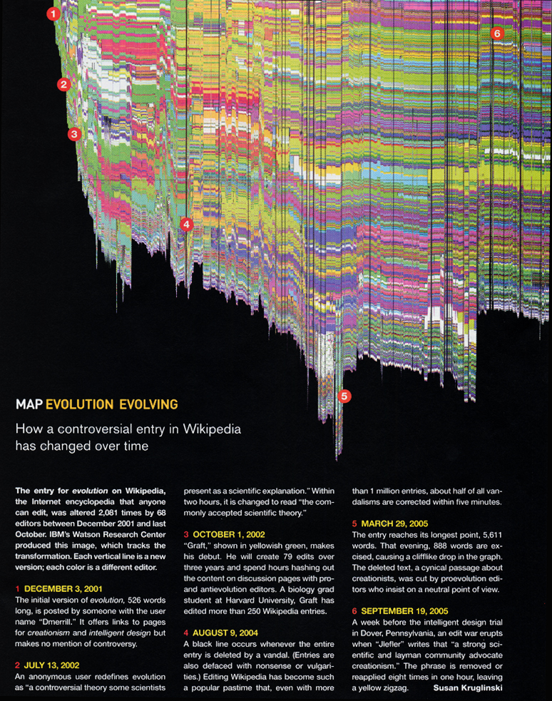
Graphing the history of a wikipedia page
February 12th, 2008 by adminGenerated by Martin Wattenberg and
described in “Studying Cooperation and Conflict between Authors
with history flow Visualizations”, 2004 (link).
Tags: history, martin wattenberg
Posted in Uncategorized | No Comments »
35 Great Visualizations
February 12th, 2008 by adminCan be found here: abeautifulwww.com
Tags: collection, visualization
Posted in Uncategorized | No Comments »
To do for 2/19/08
February 12th, 2008 by admin- Make SVG clickable with nodes pointing to other pages
- Put SVG in a system of 3 frames, with middle frame showing the svg graph, top slim frame showing a title, and bottom slim frame showing an image from the wikipage (static image for right now). When user clicks on a node, information about this node shows up in bottom frame
- Question: is SVG the only format that allows for interaction with user (clickable)?
- Investigate creating a scale to show what information is represented by the link. If using color, then need a color scale. If using line width as measure of # of contributions, then show a scale with 4 or 5 thicknesses and what # they represent. Use a linear map between # of contributions and thickness for right now.
- Watch Tamara Munzner’s video, and explore her web site and her group’s web site
- Semester-long project: look for turn-key software systems for displaying graphs.
Tags: munzner, SVG
Posted in Uncategorized | No Comments »
Competition on Visual Network Dynamics
February 12th, 2008 by adminCompetition on visualizing network dynamics
2007, Queens, NY
Some interesting designs for representing large networks.
Tags: competition, network dynamics, visualization
Posted in Uncategorized | No Comments »
Must-watch video!
February 12th, 2008 by adminTamara Munzner of U. British Columbia presents a talk at Google titled 15 Views of a Node Link Graph: An Information Visualization Portfolio
http://video.google.com/videoplay?docid=-6229232330597040086 & q=type%3Agoogle+engEDU
It’s one-hour long, but worth it. It would be nice to see if some of the software she demonstrates for exploring graphs is available…
Tags: google talk, tamara munzner, visualization
Posted in Uncategorized | No Comments »
Progress on project!
February 11th, 2008 by AllieSo far I have created a hap-harzard couple of Python objects to parse a text file with data in it. I definitely spent more time this week on function rather than commenting but I am guessing most of my work so far will be changed/adjusted as the programming language changes (from Python to PHP) and as the complexity of my task increases. Here is a link to all the files that I worked on/created:
http://maven.smith.edu/~thiebaut/IS_blog/abellew/2.18.2008/
pluginspage=”http://www.adobe.com/svg/viewer/install/” />Html code to embed svg in html:
<embed src="http://www.cs.smith.edu/~abellew/2.12.2008/neatoTrial.svg" width="600" height="1000" type="image/svg+xml" pluginspage="http://www.adobe.com/svg/viewer/install/" />
Tags: graphviz, neato, python, SVG
Posted in Uncategorized | No Comments »
Graph Visualization Specifics
February 11th, 2008 by AllieThe graph visualizer in Silverlight, while supporting physics algorithms to display the graph in the most rigid fashion, we are not interested in rigidity but rather the best way to visually represent the information for extrapolation. Graphviz is the best option for accomplishing that goal.
For the actual graph.. in order to quickly and easily identify which Wikipedia users contributed most to an article I would like to use a color bar from blue (less contribution) to red (more contribution) on the line connecting the user to an article. Using a color scheme like this instead of varying degrees of line thickness is more intuitive for detecting levels of activity.
Tags: graphviz, silverlight
Posted in Uncategorized | No Comments »
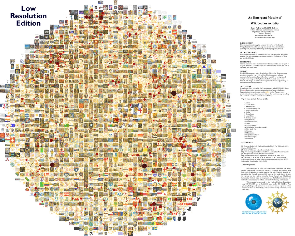
Neat graphical representation of activity in Wikipedia
February 11th, 2008 by adminClick here for full size image.
Very interesting and artistic way to depict activity in the wikipedia pages.
For more information, check Bruce Herr’s http://abeautifulwww.com/2007/05/20/visualizing-the-power-struggle-in-wikipedia/
or “Visualizing the ‘Power Struggle’ in Wikipedia”
A nicer web-2.0 type graph where the user can zoom in and out can be found here:
http://scimaps.org/maps/wikipedia/
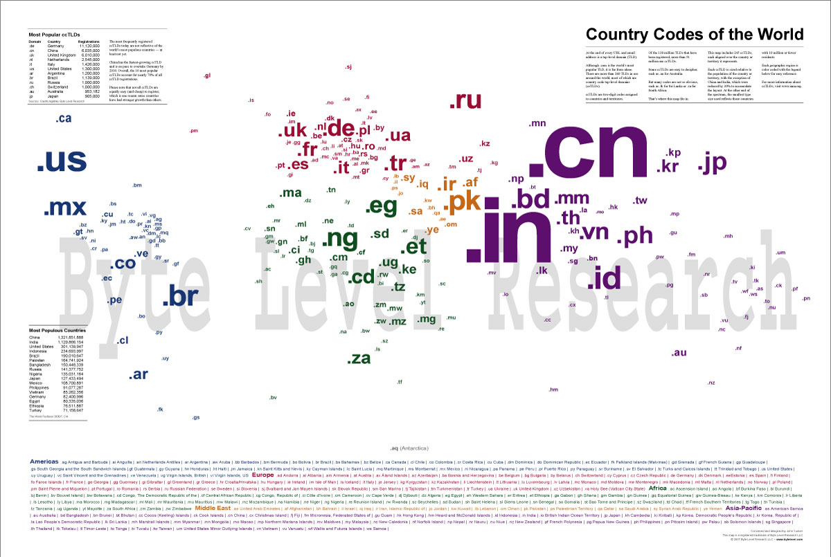
Another nice image representing graphically the geography and activity by domain name
Tags: bruce herr, scimaps, visualization
Posted in Uncategorized | No Comments »
Interesting visualization packages
February 5th, 2008 by adminTags: IBM, ManyEyes, visualization package
Posted in Uncategorized | No Comments »
To do for 2/12/08
February 5th, 2008 by adminCreate a text file with the following entries
- title of the page (this will be in a circle in the middle of the graph)
- the link to the page (this will be called when we click on the circle)
- a collection of 20 triplets (3-line blocks)
- contributor name
- # of contributions to the current page
- link to the contributor (this will be a link to a php page which will get the Id of the contributor)
Generate from this a dot file
process the dot file to get an svg file
put the svg file on your web site
install the svg plugin for your browser
display the graph
Tags: SVG, to do
Posted in Uncategorized | No Comments »
