Difference between revisions of "MatPlotLib Tutorial 1"
(→Scatter Plot of (X, Y) points) |
(→A Simple Bar-Graph) |
||
| Line 203: | Line 203: | ||
x = range( N ) | x = range( N ) | ||
width = 1/1.5 | width = 1/1.5 | ||
| − | plt.bar( x, y, width ) | + | plt.bar( x, y, width, color="magenta" ) |
plt.show() | plt.show() | ||
</source> | </source> | ||
Revision as of 19:14, 25 April 2011
--D. Thiebaut 10:27, 25 April 2011 (EDT)
|
|
Other Sources of Information
- MatPlotLib's tutorials, at http://matplotlib.sourceforge.net/users/pyplot_tutorial.html
Setup
We use the Eclipse IDE and PyDev to develop Python packages. If you want to setup your environment to match the one used here you will need to install:
- Eclipse: http://www.eclipse.org/downloads/
- Python: http://www.python.org/download/
- PyDev: http://pydev.org/download.html
- EDP from Enthought: https://www.enthought.com/products/. It contains all you need to run MatPlotLib.
Default Python
- You should make the Python version installed by EDP as the default Python interpreter for Eclipse/PyDev.
- First open a Terminal window and type:
 which python
 /Library/Frameworks/Python.framework/Versions/Current/bin/python
- Record the answer to the command and enter it in Eclipse's Preference window for PyDev:
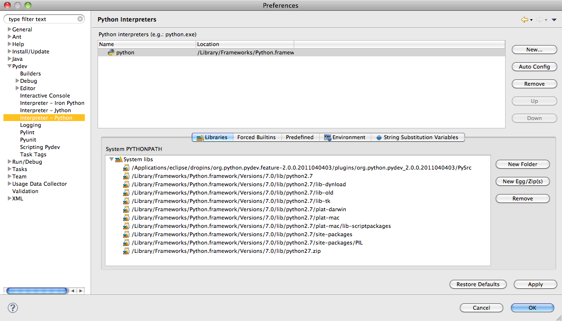
Testing
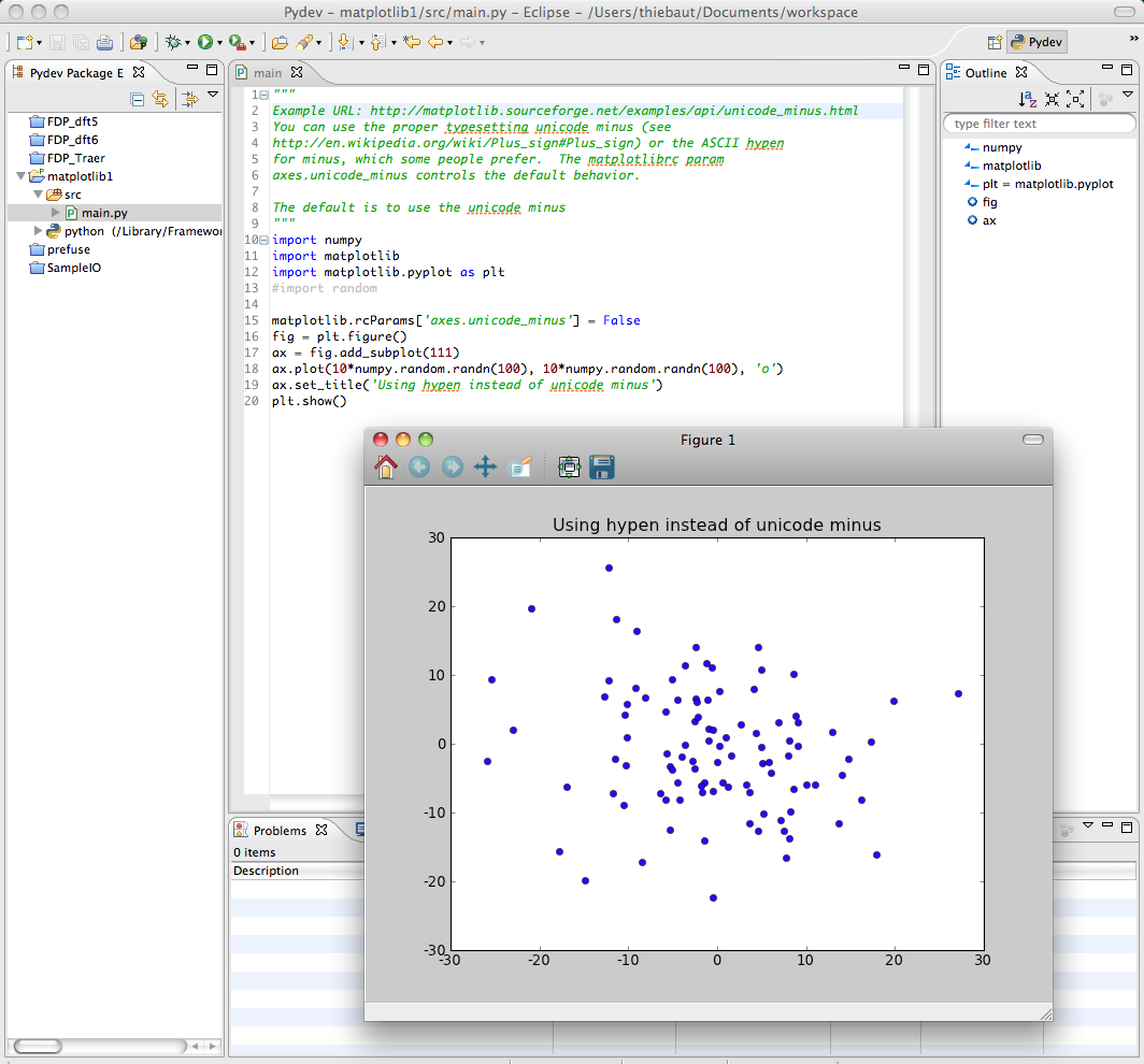
- To test that your installation is ready to go, load up the code from this URL http://matplotlib.sourceforge.net/examples/api/unicode_minus.html and run it. You should get a plot, as shown below:
Scatter Plot of (X, Y) points
The Simplest Approach
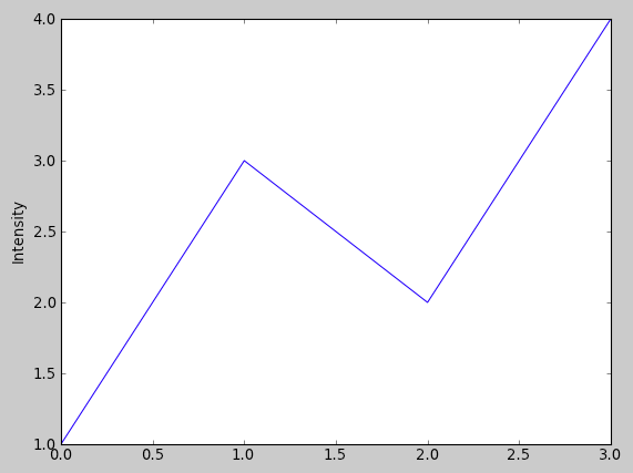
- You have an array of N Y-values, and you want to display them at X-values ranging from 0 to N-1:
def plot2():
    plt.plot([1,3,2,4])
    plt.ylabel('Intensity')
    plt.show()
Changing Colors and Adding Markers
def plot3():
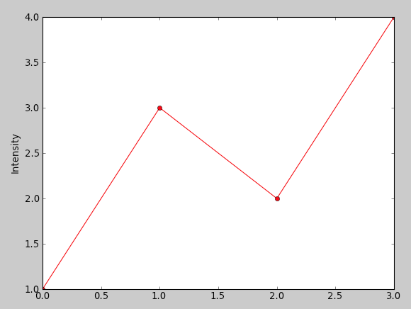
    plt.plot([1,3,2,4], 'ro-' )
    plt.ylabel('Intensity')
    plt.show()
To change the color, simply use a string at the last parameter of the plot() function and define the color, 'r' for red, for example, and the type of marker, 'o' for circle. 'ro' would display red circles only. 'ro-' would display red circles linked by a line. This is similar to the Matlab syntax. '--rs' would display a dash line between red squares. ':bs' would display a dotted line between blue squares.
Two list of coordinates
def plot4():
    x = [1, 2, 3, 4, 5, 6]
    y = [1, 2, 4, 3, 6, 5]
    plt.plot( x, y, ':rs' )
    plt.axis( [0, 10, 0, 6])
    plt.xlabel( "X values" )
    plt.ylabel( "Y values" )
    plt.show()
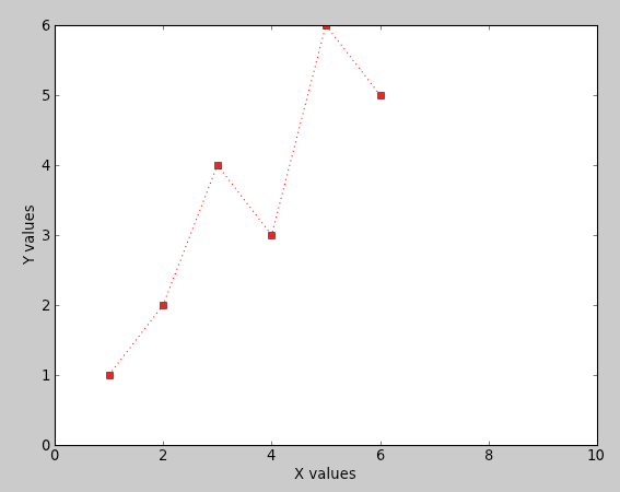
Here we present the plot with two arrays, one for the X values, one for the Y values. We also define the range of values for the X-axis and the range of values for the Y-axis, and provide labels for each one.
The line and marker styles are defined by ':rs' , meaning dotted line, red square.
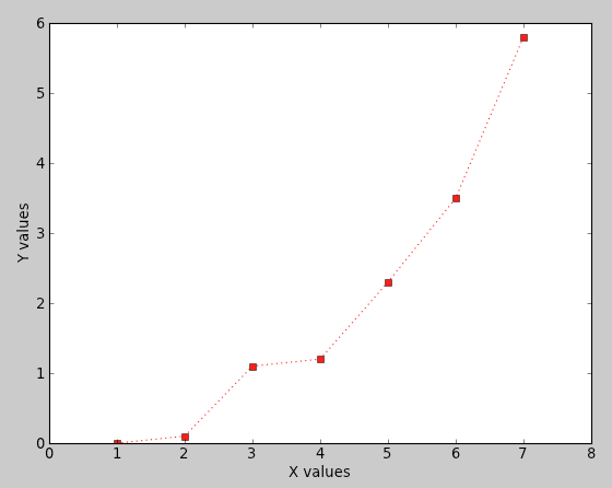
What if the List is a List of Pairs of Coordinates?
def plot5():
    data = [ (1, 0), (2, 0.1 ), (3, 1.1), (4, 1.2), (5, 2.3),
                (6, 3.5), (7, 5.8) ]
    X = [ x for (x,y) in data ]
    Y = [ y for (x,y) in data ]
    #print X
    #print Y
    plt.plot( X, Y, ':rs' )
    plt.axis( [0, 8, 0, 6])
    plt.xlabel( "X values" )
    plt.ylabel( "Y values" )
    plt.show()
We just use Python to break the list of pairs into two lists of numbers, one for x, one for y.
Plotting Two Different Curves
import numpy as np

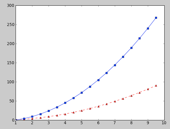
def plot6():
    t = np.arange(1, 10, 0.5)
    plt.plot( t, t**2, 'r^--', t, 3*(t**2)-3, 'bs-' )
    plt.show()
Here we plot two functions, one is y = x^2, in red with triangular markers, and dashed line. Then we print y = 3*x^2 -3, with blue squares and a solid line.
Plotting Two Different Curves defined as Lists
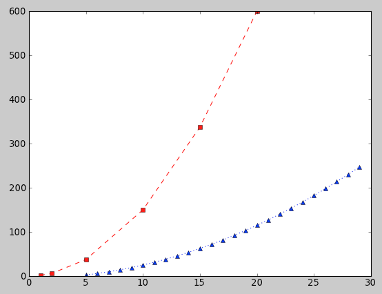
def plot7():
    x1 =[ 1, 2, 5, 10, 15, 20]
    y1 =[ 1.5 * x**2 for x in x1 ]
    x2 = range( 5, 30)
    y2 = [ 0.3 * x**2 -5 for x in x2 ]
    plt.plot( x1, y1, "rs--", x2, y2, ":b^")
    plt.show()
Note that the X-range for the first curve and for the second curve are not the same, but overlap. PyPlot adjusts the display and plots both curves correctly.
Bar-Graphs
A Simple Bar-Graph
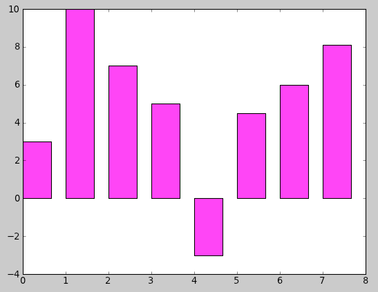
def plot8():
    y = [ 3, 10, 7, 5, -3, 4.5, 6, 8.1]
    N = len( y )
    x = range( N )
    width = 1/1.5
    plt.bar( x, y, width, color="magenta" )
    plt.show()

