Difference between revisions of "A (Visualization) Case for WikiLeaks"
(→Der Spiegel: Iraq War Logs) |
(→Der Spiegel: Iraq War Logs) |
||
| Line 23: | Line 23: | ||
=Der Spiegel: Iraq War Logs= | =Der Spiegel: Iraq War Logs= | ||
| − | + | [[Image:DerSpiegelInternational.png|right|150px|link=http://www.spiegel.de]] | |
| + | <br /> | ||
<center>[[Image:DerSpiegelWikiLeaks.png|500px|link=http://www.spiegel.de/international/world/0,1518,724000,00.html]]</center> | <center>[[Image:DerSpiegelWikiLeaks.png|500px|link=http://www.spiegel.de/international/world/0,1518,724000,00.html]]</center> | ||
<br /> | <br /> | ||
Revision as of 23:35, 10 November 2010
--D. Thiebaut 04:14, 11 November 2010 (UTC)
Contents
This page is a short report illustrating how high quality data visualization is being performed in the area of journalism. As an example, we focus here on the 391,832 documents released Oct. 22, 2010 by WikiLeaks which have been the source and focus of data visualizer, creating compelling, effective, and effective data visualization.
Jeff Jarvis, in his blog post Big Brother's Big Brother in Buzzmachine.com first pointed out the link between Wikileaks data, journalism and stunning visualizations.
War Data:Visualization of Afghanistan Hotspots Using Wikileaks Data
- Authors: Mike Dewar, Drew Conway, John Myles White, and Harlan Harris
- Published: Taming Data.com
- Implementation: R (code available on github.com)
- Reported by JEWEL WARD, War Data: Visualization of Afghanistan Hotspots Using Wikileaks Data, 2010/10/26, on Taming Data.com
Mike Dewar says This is a visualisation of activity in Afghanistan from 2004 to 2009 based on the Wikileaks data set. Here we’re thinking of activity as the number of events logged in a small region of the map over a 1 month window. These events consist of all the different types of activity going on in Afghanistan.
The intensity of the heatmap represents the number of events logged. The colour range is from 0 to 60+ events over a one month window. We cap the colour range at 60 events so that low intensity activity involving just a handful of events can be seen – in lots of cases there are many more than 60 events in one particular region. The heatmap is constructed for every day in the period from 2004-2009, and the movie runs at 10 days per second.
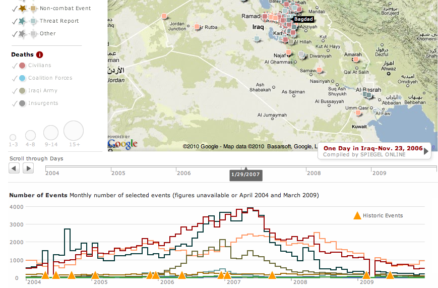
Der Spiegel: Iraq War Logs
