Geo-Mapping Data using Google Charts
--D. Thiebaut 12:02, 20 March 2013 (EDT)
This is a series of (quick) steps taken to generate a geographical representation of a list of countries appearing in a CSV-formatted file (comma-separated values). The Google Charts library is used to display the map. a The representation associates with each country the number of lines in the file that contain that country. For example, if the country "Belgium" appears 100 times in the CSV file, the value 100 will be associated with Belgium, and the darkness of the color used to show the country will be chosen to show the intensity of 100 compared to the most cited country. Some Python code is used to generate the HTML/Javascript code.
Contents
The Data
The data generated was generously shared by Ecomod. It represents the dump of an eXcel spreadsheet in CSV format, and is shown in this page.
The Google Charts Library
Reference Pages
The Google Charts library has a special feature for generating maps. You should read Google's pages on this feature, and in particular the GeoMap page.
We will use the region option to display our data. Markers would have been a nice alternative, showing cities rather than countries, but as Google restricts the number of data points to 400 maximum per chart, and we have more than 400 entries in our CSV file, the region option is better suited here.
Debugging
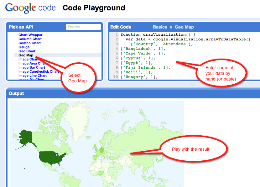
Google provides a nice page to debug your code before putting it together in a Web page. The page is at https://code.google.com/apis/ajax/playground/?type=visualization#geo_map. We use it to troubleshoot our format and country entries. (Using this page allowed us to discover that some of the country names were not formatted correctly, containing quotes, for example, which broke the Javascript strings.
Make sure you play with this page to tune your output. This goes for colors and size as well.

Python to the Rescue!