Faculty Learning Communities: Data Visualization
If you are interested in the Fall 08 workshop on the Aesthetics of Data Visualization, please go here

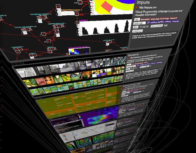
(Image from datavisualization.ch)
Participants
| David Bickar (Chemistry) (link) | 
|
| Robert Dorit (Biological Sciences) (link) | 
|
| Judy Franklin (Computer Science) (.) | 
|
| Aisha Gabriel (ETS, Faculty Learning Community liaison) | 
|
| Virginia Hayssen (Biology) (link) | 
|
| Nick Horton (Math & Stats) (link) | 
|
| Christopher Loring (Director of Libraries) | 
|
| Catherine McCune (Director Quantitative Learning Center) | 
|
| Eitan Mendelowitz (Computer Science, Art) (link) | 
|
| Chester Michalik (Art & photography) | 
|
| Larry Owens (History, Umass) | 
|
| Lee Spector (Computer Science/Cognitive Science, Hampshire College) (link) | 
|
| Dominique Thiebaut, (Computer Science) organizer (link) | 
|
| Doreen Weinberger (Physics) (link) | 
|
Meetings
10/07/10
Invited Speaker: Matthew Mattingly
- Multimedia Tools for Data Visualization in Education
- Matthew Mattingly
- Multimedia Director
- Center for Educational Software Development (CESD)
- Multimedia Tools for Data Visualization in Education
- Educational multimedia applications present a variety of data visualization challenges that are not always addressed by standard formats and approaches. The types of data involved may be very specific to a topic or discipline, and the context in which they are to be displayed may not be a simple transfer of information. Study aids, assessment tools and constructivist learning activities are among the applications that use data visualization for learning, and each requires a different mode of presentation. In this talk, Mr. Mattingly will demonstrate some of the projects that the UMass CESD has produced, including interactive simulations, time and map-based displays, and construction activities, and will discuss the processes of their design and development.
He will also introduce some new directions and tools, including online collaboration combined with mobile devices and locative media.
- Educational multimedia applications present a variety of data visualization challenges that are not always addressed by standard formats and approaches. The types of data involved may be very specific to a topic or discipline, and the context in which they are to be displayed may not be a simple transfer of information. Study aids, assessment tools and constructivist learning activities are among the applications that use data visualization for learning, and each requires a different mode of presentation. In this talk, Mr. Mattingly will demonstrate some of the projects that the UMass CESD has produced, including interactive simulations, time and map-based displays, and construction activities, and will discuss the processes of their design and development.
- Link to Matthew Mattingly's material: http://www.cesd.umass.edu/smith-talk.html
Food for Thought
Journalism in the Age of Data
A very nice overview of the state of data visualization. Some of the people interviewed: Martin Wattenberg, Fernanda Viegas, Ben Fry, Jeffrey Heer, Steve Duenes, Matt Ericson, Amanda Cox, Nicholas Felton, Eric Rodenbeck.
Although the video is available on Vimeo, watch it directly on the Stanford's site, where it is annotated.
Augmented Reality Book
From Mark Lukas, [1]: This is a concept and a demo of a book and augmented-reality display of the book contents. The book comes with a CD, which, when loaded up in a laptop uses the video-cam to detect symbols on the pages of the book and displays 3D graphics superimposed on the book.
Implementation: Flash, Felx, Flartoolkit, ARToolkit
Tableau
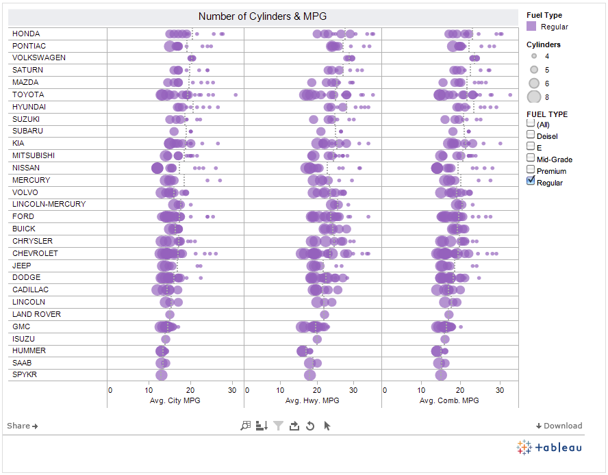
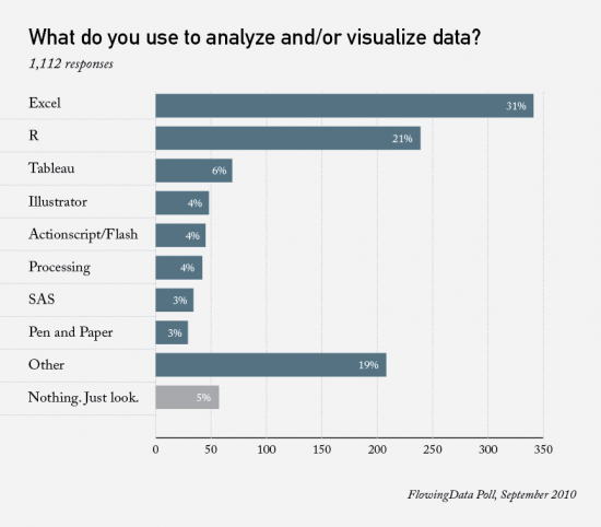
- 3rd most popular tool in poll
11/11/10
- discussion on the presentation on R from last week.
- Data Journalism and Visualization
- A short presentation: A (Visualization) Case for WikiLeaks
- A new language: Impure
From TED.com: David McCandless turns complex data sets (like worldwide military spending, media buzz, Facebook status updates) into beautiful, simple diagrams that tease out unseen patterns and connections. Good design, he suggests, is the best way to navigate information glut -- and it may just change the way we see the world.
12/16/10
Invited Speaker: Michael Olkin
- Michael Olkin, GIS Manager for the town of Amherst gives a guest lecture. Olkin worked as GIS Manager for the Town of West Springfield, MA, and worked for Applied Geographics, Inc (AGI). Olkin also served as GIS Coordinator for the Central Massachusetts Regional Planning Commission and as GIS consultant for the City of Northampton, MA.
Olkin holds a Masters in Geography from the University of Connecticut.
Notable News Items
- Flight Patterns of Refugees: This is a very nice set of three different visualizations showing the flow of refugees through the world over a time scale, using data from the UN.
- Data Store at the Guardian: The Guadian recently launched a new gateway to their data journalism and visualisations - find out what's new at guardian.co.uk/data
2/17/11
Invited Speaker: Prof. Greg Brown, Music Dept. Smith College
- Greg Brown will explore the aesthetic and technical aspects of creating a virtual machine to generate music that evolves in an autonomous and quasi-organic nature. He will provide a brief discussion of the concept of sonification and a review of the rules for Conway's Game of Life and how they can be adapted to the sonic realm. Finally, there will be a presention the music itself along with concurrent video.
- Location TBD.
