MatPlotLib Tutorial 1
--D. Thiebaut 10:27, 25 April 2011 (EDT)
What is MatPlotLib?
From the MatPlotLib Website (matplotlib.sourceforge.net):
- The matplotlib code is conceptually divided into three parts: the pylab interface is the set of functions provided by matplotlib.pylab which allow the user to create plots with code quite similar to MATLAB figure generating code (Pyplot tutorial). The matplotlib frontend or matplotlib API is the set of classes that do the heavy lifting, creating and managing figures, text, lines, plots and so on (Artist tutorial). This is an abstract interface that knows nothing about output. The backends are device dependent drawing devices, aka renderers, that transform the frontend representation to hardcopy or a display device (What is a backend?). Example backends: PS creates PostScript® hardcopy, SVG creates Scalable Vector Graphics hardcopy, Agg creates PNG output using the high quality Anti-Grain Geometry library that ships with matplotlib, GTK embeds matplotlib in a Gtk+ application, GTKAgg uses the Anti-Grain renderer to create a figure and embed it a Gtk+ application, and so on for PDF, WxWidgets, Tkinter etc.
Other Sources of Information
- MatPlotLib's tutorials, at http://matplotlib.sourceforge.net/users/pyplot_tutorial.html
Setup
We use the Eclipse IDE and PyDev to develop Python packages. If you want to setup your environment to match the one used here you will need to install:
- Eclipse: http://www.eclipse.org/downloads/
- Python: http://www.python.org/download/
- PyDev: http://pydev.org/download.html
- EDP from Enthought: https://www.enthought.com/products/. It contains all you need to run MatPlotLib.
Default Python Interpreter
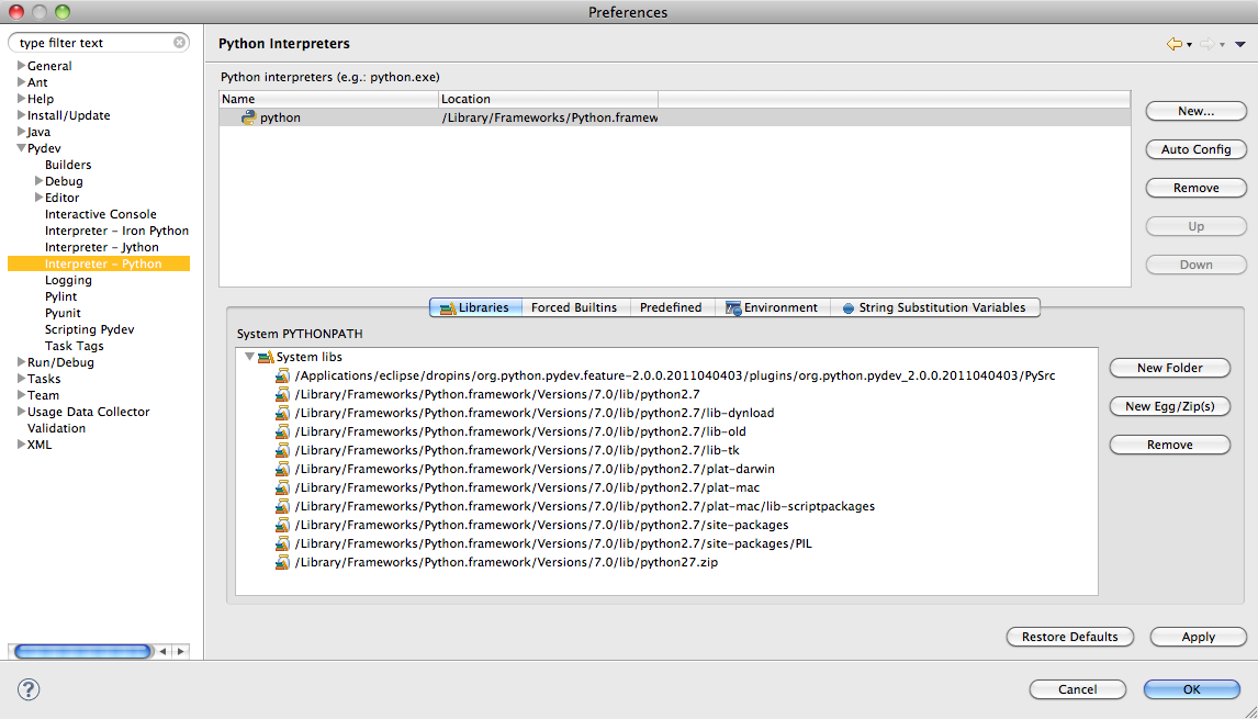
- You should make the Python version installed by EDP as the default Python interpreter for Eclipse/PyDev.
- First open a Terminal window and type:
 which python
 /Library/Frameworks/Python.framework/Versions/Current/bin/python
- Record the answer to the command and enter it in Eclipse's Preference window for PyDev:
Testing the Installation
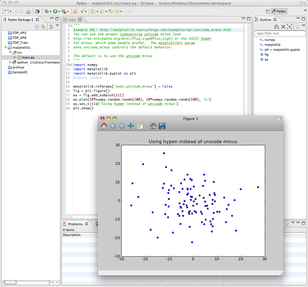
- To test that your installation is ready to go, load up the code from this URL http://matplotlib.sourceforge.net/examples/api/unicode_minus.html and run it. You should get a plot, as shown below:
Scatter Plot of (X, Y) points
The Simplest Approach
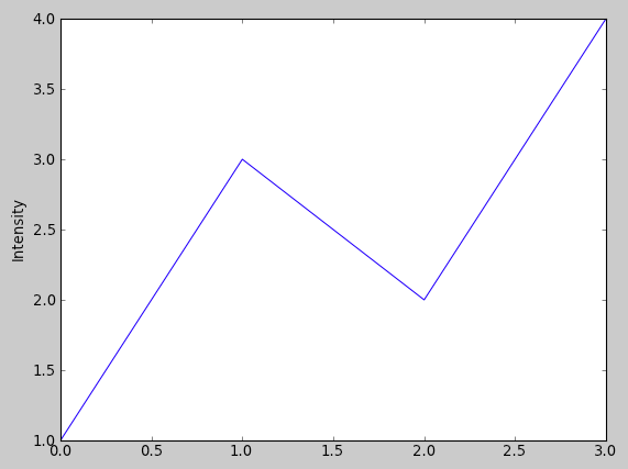
We have an array of N Y-values, and you want to display them at X-values ranging from 0 to N-1. By default if only one series is specified, it is assumed to be the Y-values, and the X-values automatically become range(N).
import numpy as np
import matplotlib.pyplot as plt

def plot2():
    plt.plot([1,3,2,4])
    plt.ylabel('Intensity')
    plt.show()

plot2()
Changing Colors and Adding Markers
import numpy as np
import matplotlib.pyplot as plt

def plot3():
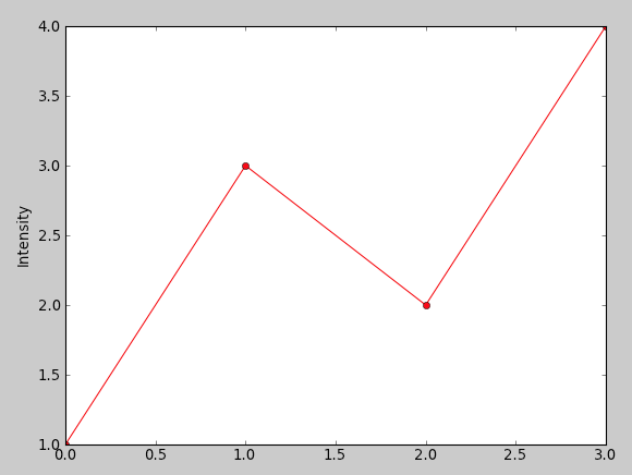
    plt.plot([1,3,2,4], 'ro-' )
    plt.ylabel('Intensity')
    plt.show()

plot3()
To change the color, simply use a string at the last parameter of the plot() function and define the color, 'r' for red, for example, and the type of marker, 'o' for circle. 'ro' would display red circles only. 'ro-' would display red circles linked by a line. This is similar to the Matlab syntax. '--rs' would display a dash line between red squares. ':bs' would display a dotted line between blue squares.
Two lists of coordinates
import numpy as np
import matplotlib.pyplot as plt

def plot4():
    x = [1, 2, 3, 4, 5, 6]
    y = [1, 2, 4, 3, 6, 5]
    plt.plot( x, y, ':rs' )
    plt.axis( [0, 10, 0, 6])
    plt.xlabel( "X values" )
    plt.ylabel( "Y values" )
    plt.show()

plot4()
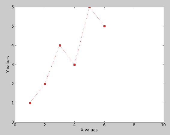
Here we present the plot with two arrays, one for the X values, one for the Y values. We also define the range of values for the X-axis and the range of values for the Y-axis, and provide labels for each one.
The line and marker styles are defined by ':rs' , meaning dotted line, red square.
What if the List is a List of Pairs of Coordinates?
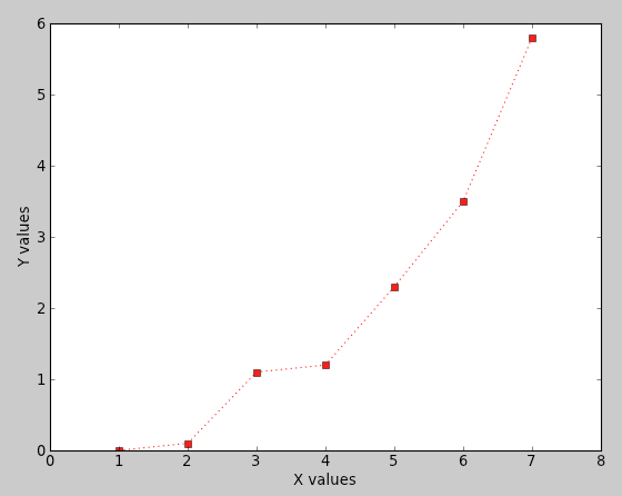
def plot5():
    data = [ (1, 0), (2, 0.1 ), (3, 1.1), (4, 1.2), (5, 2.3),
                (6, 3.5), (7, 5.8) ]
    X = [ x for (x,y) in data ]
    Y = [ y for (x,y) in data ]
    #print X
    #print Y
    plt.plot( X, Y, ':rs' )
    plt.axis( [0, 8, 0, 6])
    plt.xlabel( "X values" )
    plt.ylabel( "Y values" )
    plt.show()
We just use Python to break the list of pairs into two lists of numbers, one for x, one for y.
The axis( [minX, maxX, minY, maxY] ) function is used to define the bounds of the two axes.
Plotting Two Different Curves
import numpy as np

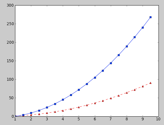
def plot6():
    t = np.arange(1, 10, 0.5)
    plt.plot( t, t**2, 'r^--', t, 3*(t**2)-3, 'bs-' )
    plt.show()
Here we plot two functions, one is y = x^2, in red with triangular markers, and dashed line. Then we print y = 3*x^2 -3, with blue squares and a solid line.
Plotting Two Different Curves defined as Lists
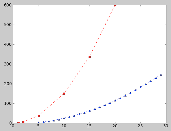
def plot7():
    x1 =[ 1, 2, 5, 10, 15, 20]
    y1 =[ 1.5 * x**2 for x in x1 ]
    x2 = range( 5, 30)
    y2 = [ 0.3 * x**2 -5 for x in x2 ]
    plt.plot( x1, y1, "rs--", x2, y2, ":b^")
    plt.show()
Note that the X-range for the first curve and for the second curve are not the same, but overlap. PyPlot adjusts the display and plots both curves correctly.
Line Graph with String X-Values
A Simple Line of a series of (label, y) Points
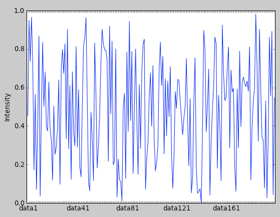
def plot11():
    t = np.arange( 0, 200, 1)
    N = len( t )
    y = np.random.rand( N )
    x = np.arange( 1, N+1 )
    labels = [ "data"+str(k) for k in range(1, N+1) ]
    samples = [ '' ] * N
    for i in range( 0, N, N/5 ):
        samples[i] = labels[i]
    width = 1.0
    plt.plot( x, y )
    plt.ylabel( 'Intensity' )
    plt.xticks(x + width/2.0, samples )
    plt.show()
We use some random points with y-values in the range 0 to 200, and x-values of the form "data1", "data2", "data3", etc. The values on the X-axis are printed every fifth of the axis length.
Area-Curve
One Curve, Colored Area Under the Curve
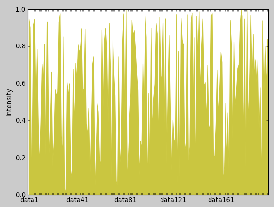
def plot12():
    t = np.arange( 0, 200, 1)
    N = len( t )
    y = np.random.rand( N )
    x = np.arange( 1, N+1 )
    labels = [ "data"+str(k) for k in range(1, N+1) ]
    samples = [ '' ] * N
    for i in range( 0, N, N/5 ):
        samples[i] = labels[i]
    width = 1.0
    plt.fill_between( x, 0, y, color='y' )
    plt.ylabel( 'Intensity' )
    plt.xticks(x + width/2.0, samples )
    plt.show()
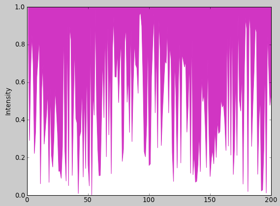
One Curve, Colored Area Above the Curve
def plot12():
    t = np.arange( 0, 200, 1)
    N = len( t )
    y = np.random.rand( N )
    x = np.arange( 1, N+1 )
    labels = [ "data"+str(k) for k in range(1, N+1) ]
    samples = [ '' ] * N
    for i in range( 0, N, N/5 ):
        samples[i] = labels[i]
    width = 1.0
    '''plt.fill_between( x, y, 1, color='m' )'''
    plt.ylabel( 'Intensity' )
    plt.xticks(x + width/2.0, samples )
    plt.show()
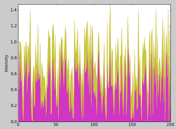
Two Curves, Stacked, Color under the Curves
def plot13():
    t = np.arange( 0, 200, 1)
    N = len( t )
    y1 = np.random.rand( N)
    delta = np.random.rand( N )
    y2 = y1 + delta/2
    x = np.arange( 1, N+1 )
    labels = [ "data"+str(k) for k in range(1, N+1) ]
    samples = [ '' ] * N
    for i in range( 0, N, N/5 ):
        samples[i] = labels[i]
    width = 1.0
    plt.fill_between( x, 0, y1, color='m' )
    plt.fill_between( x, y1, y2, color='y' )
    plt.axis( [0, N, 0, max(y2)] )
    plt.ylabel( 'Intensity' )
    #plt.xticks(x + width/2.0, samples )
    plt.show()
Bar-Graphs
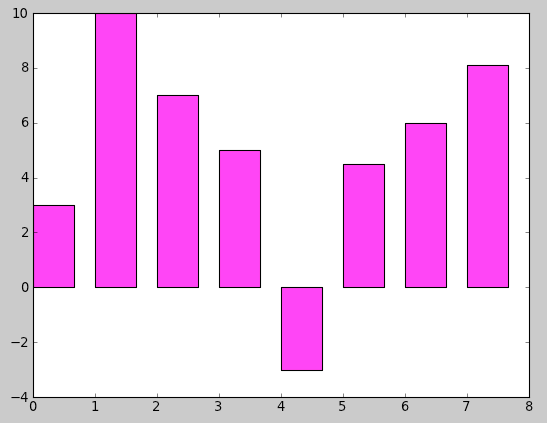
A Simple Bar-Graph
def plot8():
    y = [ 3, 10, 7, 5, -3, 4.5, 6, 8.1]
    N = len( y )
    x = range( N )
    width = 1/1.5
    plt.bar( x, y, width, color="magenta" )
    plt.show()
Adding String Labels for X Values
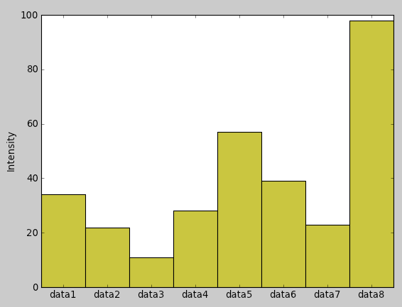
def plot9():
    data = [ ("data1", 34), ("data2", 22),
            ("data3", 11), ( "data4", 28),
            ("data5", 57), ( "data6", 39),
            ("data7", 23), ( "data8", 98)]
    N = len( data )
    x = np.arange(1, N+1)
    y = [ num for (s, num) in data ]
    labels = [ s for (s, num) in data ]
    width = 1
    bar1 = plt.bar( x, y, width, color="y" )
    plt.ylabel( 'Intensity' )
    plt.xticks(x + width/2.0, labels )
    plt.show()
Here we set the width to 1 to make the bars fill the space.
Adding Sampled String Labels for X Values
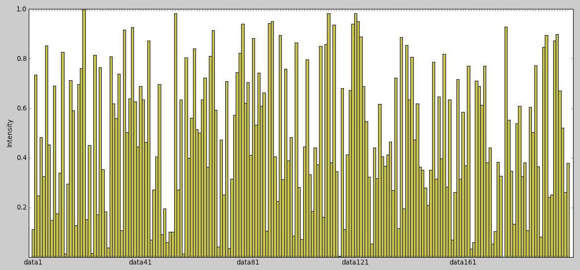
def plot10():
    t = np.arange( 0, 200, 1)
    N = len( t )
    y = np.random.rand( N )
    x = np.arange( 1, N+1 )
    labels = [ "data"+str(k) for k in range(1, N+1) ]
    samples = [ '' ] * N
    for i in range( 0, N, N/5 ):
        samples[i] = labels[i]
    width = 1.0
    bar1 = plt.bar( x, y, width, color="y" )
    plt.ylabel( 'Intensity' )
    plt.xticks(x + width/2.0, samples )
    plt.show()
Histograms
More good information on MatPlotLib's site.
Basic Histogram
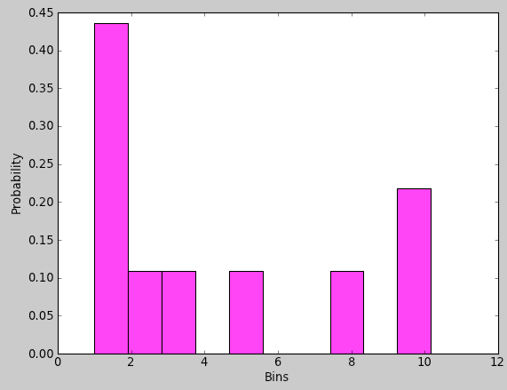
def plot14():
    # the number of bins
    N = 12

    # the samples
    samples = np.array([1, 1, 1, 3, 2, 5, 1, 10, 10, 8])

    n, bins, patches  = plt.hist( samples, N, facecolor="magenta",
                                  range=[1,N], normed=True )
    plt.xlabel( 'bins' )
    plt.ylabel( 'Probability' )
    plt.show()
- Change normed to False to get the counts instead of the percentage or probability.
- Add cumulative=True to get a probability distribution.
Stacked Histograms in the same graph
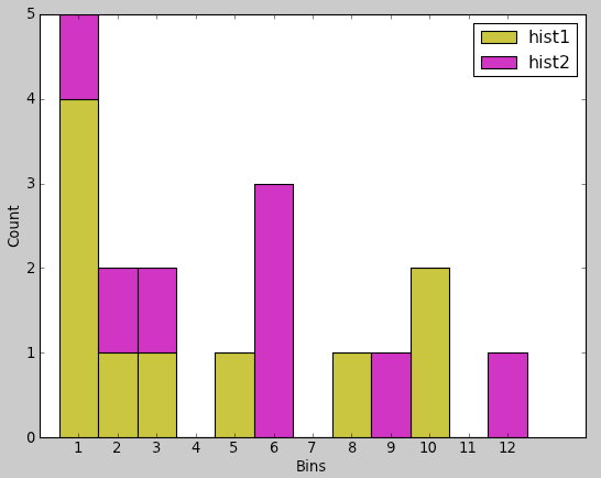
There is very likely a more "MapPlotLib" way to do this, but until somebody points out a more elegant way to do this, we simply create the distribution in the bins ourselves and display the stacked histograms as two bar-graphs in the same system of axes, one on top of the other.
def plot17():
    #--- the two samples ---
    samples1 = np.array([1, 1, 1, 3, 2, 5, 1, 10, 10, 8])
    samples2 = np.array([6, 6, 6, 1, 2, 3,9 ] )

    #--- put the samples in two sets of bins ---
    N = 12          # number of bins
    hist1 = [0] * N     # create N bins indexed from 0 to N-1
    hist2 = [0] * N
    for x in samples1:
        hist1[x] += 1
    for x in samples2:
        hist2[x] += 1

    width = 1       # the width of the bars
    p1 = plt.bar( np.arange(1,N+1), hist1, width, color='y' )
    p2 = plt.bar( np.arange(1,N+1), hist2, width, color='m', bottom=hist1 )
    plt.legend( (p1[0], p2[0]), ( 'hist1', 'hist2' ) )
    plt.xlabel( 'Bins' )
    plt.ylabel( 'Count' )
    plt.show()
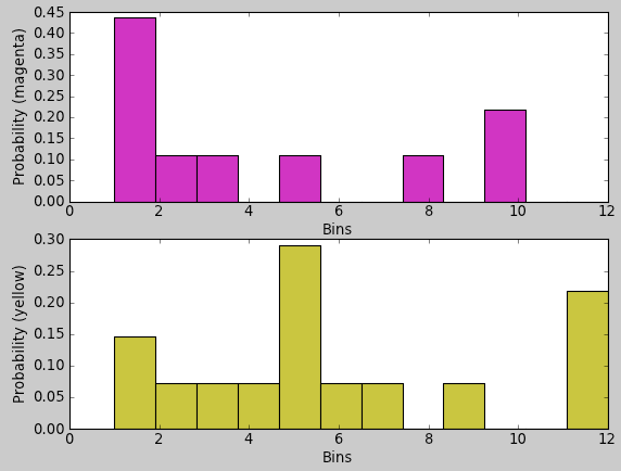
Two Histograms One Above the Other
def plot15():
    N = 12
    samples1 = np.array([1, 1, 1, 3, 2, 5, 1, 10, 10, 8])
    samples2 = np.array([5,5,5,5,6,7,1,1,2,12,12,12,9,3,4])

    plt.figure( 1 )
    plt.subplot( 2, 1, 1 ) # 2 rows, 1 column, figure 1
    n1, bins1, patches1  = plt.hist( samples1, N, facecolor="m",
                                  range=[1,N], normed=True )
    plt.xlabel( 'Bins' )
    plt.ylabel( 'Probability (magenta)' )

    plt.subplot( 2, 1, 2 )
    n2, bins2, patches2  = plt.hist( samples2, N, facecolor="y",
                                  range=[1,N], normed=True )
    plt.xlabel( 'Bins' )
    plt.ylabel( 'Probability (yellow)' )
    plt.show()
- A good reference: PyPlot Tutorial
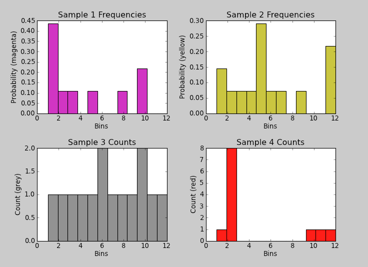
Four Histograms, in a Quadrant System
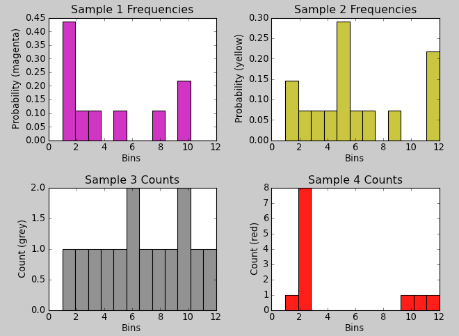
Note that this method does scale the vertical axes individually. In other words the histograms are not to scale in the vertical
axis.
def plot16():
    N = 12 # the number of bins
    samples1 = np.array([1, 1, 1, 3, 2, 5, 1, 10, 10, 8])
    samples2 = np.array([5,5,5,5,6,7,1,1,2,12,12,12,9,3,4])
    samples3 = np.array([1,2,3,4,5,6,6,7,8,9,10,10,11,12])
    samples4 = np.array([1,2,2,2,2,2,2,2,2,10,11,12])
    plt.figure( 1 )
    #--- top left ---
    plt.subplot( 2, 2, 1 )
    n1, bins1, patches1  = plt.hist( samples1, N, facecolor="m",
                                  range=[1,N], normed=True )
    plt.xlabel( 'Bins' )
    plt.ylabel( 'Probability (magenta)' )
    plt.title( "Sample 1 Frequencies")

    #--- top right ---
    plt.subplot( 2, 2, 2 )
    n2, bins2, patches2  = plt.hist( samples2, N, facecolor="y",
                                  range=[1,N], normed=True )
    plt.xlabel( 'Bins' )
    plt.ylabel( 'Probability (yellow)' )
    plt.title( "Sample 2 Frequencies")

    #--- bottom left ---
    plt.subplot( 2, 2, 3 )
    n3, bins3, patches3  = plt.hist( samples3, N, facecolor="grey",
                                  range=[1,N], normed=False )
    plt.title( "Sample 3 Counts")
    plt.xlabel( 'Bins' )
    plt.ylabel( 'Count (grey)' )

    #--- bottom right ---
    plt.subplot( 2, 2, 4 )
    n4, bins4, patches4  = plt.hist( samples4, N, facecolor="r",
                                  range=[1,N], normed=False )
    plt.title( "Sample 4 Counts")
    plt.xlabel( 'Bins' )
    plt.ylabel( 'Count (red)' )

    plt.show()
Adjusting the Placement of Sub-Plots
|
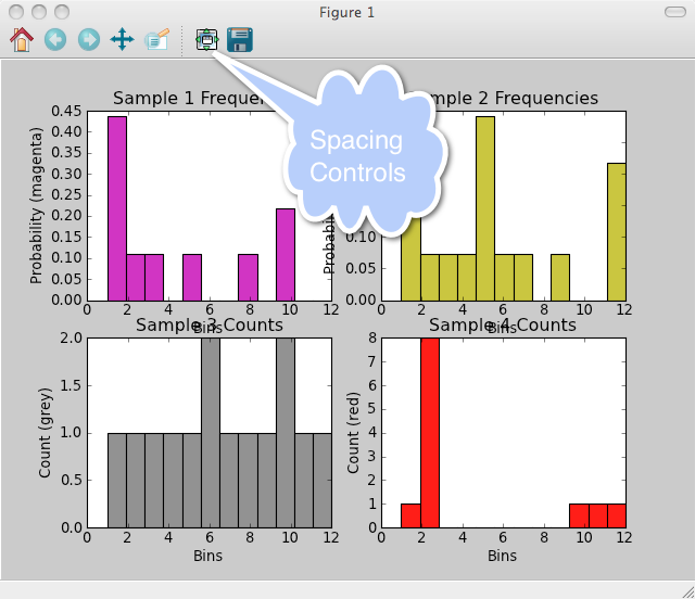
When generating several sub-plots in a plot, the labels may overlap graphics elements, as shown in the picture to the right, where the titles and the Y-axis labels overlap elements of the neighboring plots. To remedy this problem, use the spacing controls to move the graphics elements of the plot. |
|
|
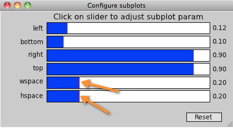
In the Controls window move the wspace and hspace sliders to control the horizontal and vertical spacing separating the sub-plots. You may use the other controls to get the desired esthetics. |
|
|
The resulting graph shows non-overlapping sub-plots and can then be safely saved to file. |
Saving Your Plot to File
- Adjust the geometry of your plot and sub-plots if any.
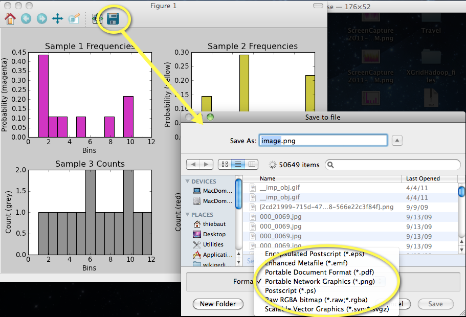
- Click on the Save icon in the display window,
- In the "Save As" menu, pick the graphic file format. The fomats supported in the version used for this tutorial are
- eps
- emp
- png
- ps
- raw
- svg

