Geo-Mapping Data using Tableau
--D. Thiebaut 09:56, 26 March 2013 (EDT)
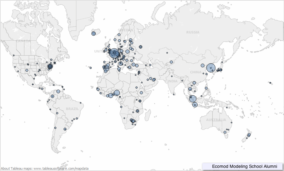
This is a series of (quick) steps taken to generate a geographical representation of a list of countries appearing in a CSV-formatted file (comma-separated values). The Tableau software package is used to display the map. The representation associates to each country the number of lines in the file that contain that country. For example, if the country "Belgium" appears 100 times in the CSV file, the value 100 will be associated with Belgium, and the darkness of the color used to show the country will be chosen to show the intensity of 100 compared to the most cited country. See the Geo-Mapping with Google Charts tutorial for an alternative way of displaying the data. The advantage of Google Charts is that you get the javascript code which you can directly imbed in your HTML files for interactive graphics.
|
|
References
The Tableau Web site contains many tutorials, including videos that give a quick introduction to the many features of Tableau.
Rutgers also has a nice video tutorial on Tableau that is worth seeing.
The Data
The data generated was generously shared by Ecomod. It represents the dump of an eXcel spreadsheet in CSV format, and is shown in this page.
Filtering the Data with Python
See the Python to the Rescue section on the Geo-Mapping Data with Google Charts page for ways to process the data and clean it up. Links to the data are also available on that page.
For this tutorial, however, we are using the raw CSV file and will let Tableau filter out the erroneous data. The raw CSV file is available here.
For this example we have added a line of headers as the first line of the CSV file, as illustrated below:
zip, city, country, dummy1, dummy2
1004, Tunis, Tunisia, ,
14195, Berlin, Germany, , TRUE
1000, Ljubljana, Slovenia, ,
1050, Brussels, Belgium, ,
20020-010, Rio de Janeiro, Brazil, ,
1050, Brussels, Belgium, ,
1050, Brussels, Belgium, TRUE,
B-1049, Brussels, Belgium, ,
1050, Brussels, Belgium, ,
...
Tableau
Tableau is a package (currently available for Windows, but that work fine virtualized on Mac OSX) that can be downloaded as a free Trial version from TableauSoftware.com. Tableau has a wealth of graphical format for representing data. They provide a drag-and-drop interface that is powerful for quickly getting plots illustrating quickly trends and hidden stories. Check out the Tableau introduction video. It is worth the time.
Here we're using Tableau Version 8, trial version.
Plotting Ecomod's Data, Step-by-Step
Open Tableau
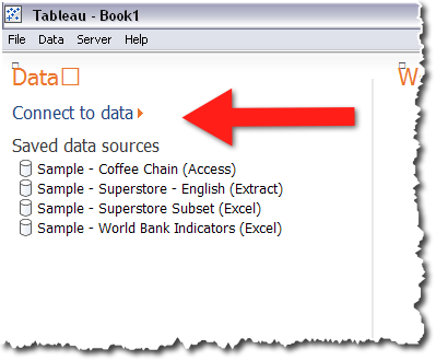
- Click on Connect to Data
Select Text File with your CSV Data-File
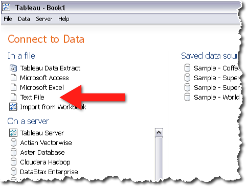
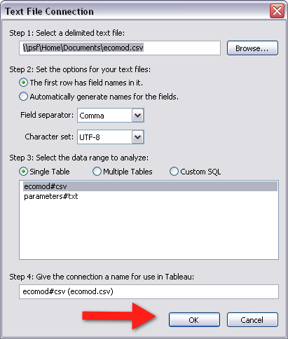
- Select Connect Live as your Data Connection.
Pick the Chart Format, the Data, and Adjust
In the next few steps you will pick
- the Geographical Map format
- the city and country data,
- the number of entries as the quantity of interest
- the various tweaks you can use to enhance the data visualization
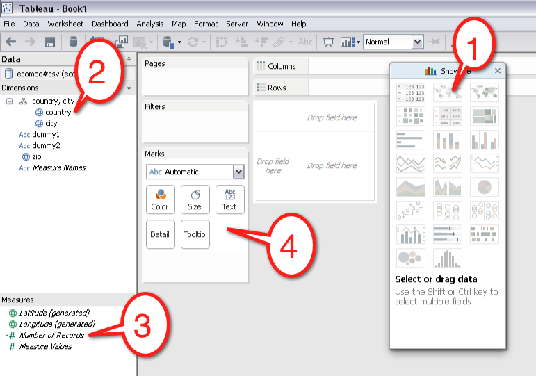
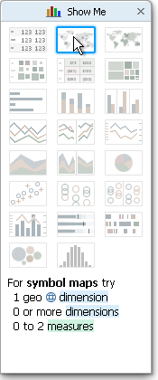
Pick the Geographical Map (#1)
- Open the chart type box and pick the For Symbol Map icon.
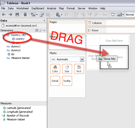
Drag Countries to the Map
- Drag the Country field to the Drop Field Here area.
- A map of the world should appear. Now drag and drop the City to the map.
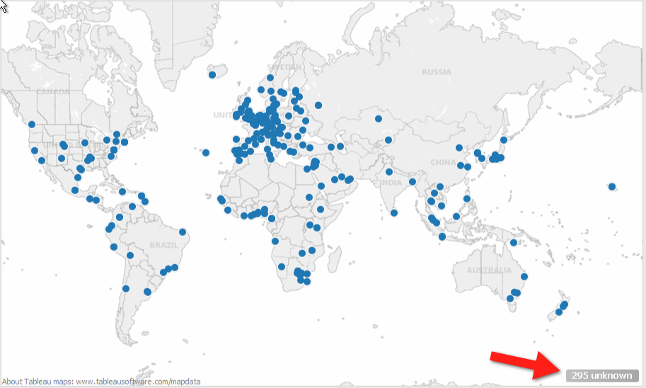
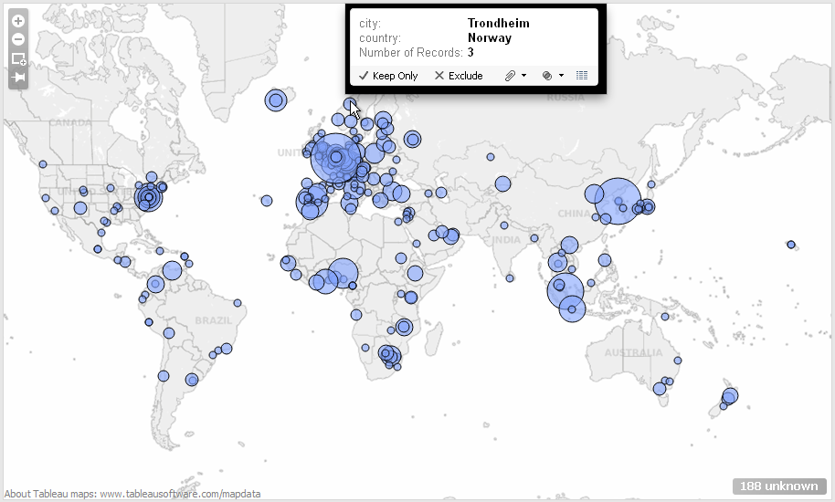
- Note that Tableau was not able to recognize 295 lines of data. We can reduce this number later with a filter.
Drag Number of Records To the Map
- Locate the =# Number of Records field in the Measures area and drag and drop it on the map.
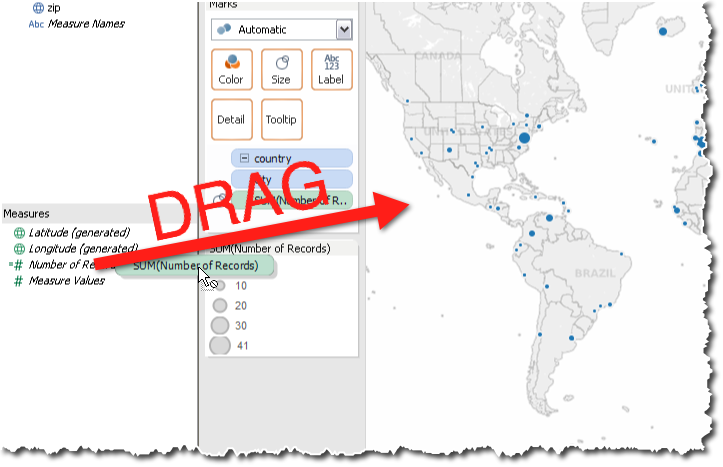
Filtering the Data
- To filter the data and remove erroneous data, drag and drop the Country field from the Dimension window to the Filters window. Then uncheck the data that is incorrect.
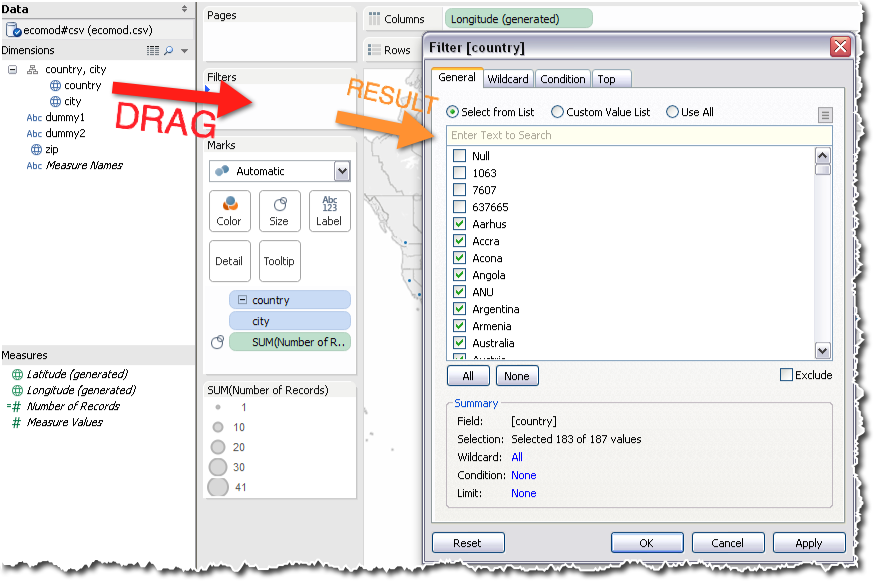
- The number of unknown data points has now reduced to 188. A more aggressive filtering of misspelled cities and/or countries should bring this number down to 0. But for this tutorial, this is good enough for illustrating the feature.
Enhancing the Map
- Use the icons in the Marks window to enhance your map.
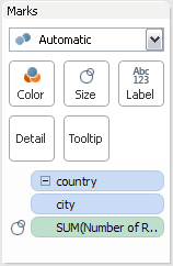
- Here's the result of tweaking the map with all the different features.
