DT's Page for Kahn Memory Project 2015-16
--D. Thiebaut (talk) 09:42, 26 March 2015 (EDT)
Contents
- 1 Kahn-Institute Memory Project, 2015-16
- 2 Suggested Speakers
- 3 A Virtual Museum
- 4 Data-Visualization of The Things They Carried
- 5 Interesting Links for the Concept of Memory in Computers
- 6 Data Vis. Examples (taken from DT's wiki)
- 6.1 Some Graphviz Examples
- 6.2 Icons of the Web
- 6.3 Visnomad
- 6.4 Chris Harrison--Visualizing the Bible
- 6.5 VisPedia: Standford's Visualization of Wikipedia
- 6.6 Measuring dynamic relationships between readers and stories
- 6.7 Listening to Wikipedia
- 6.8 Animating the Edit History of Wikipedia
- 6.9 Wikipedia Live Updates from Hatnote
- 6.10 Data-Vis of Wikipedia Meta-Data
- 7 Videos
Kahn-Institute Memory Project, 2015-16
Suggested Speakers
- Jeff Hawkins, Wikipedia entry
- Author of On Intelligence. (2004) where he presents a model for human intelligence and memory. His main point is that memory is necessary for intelligence, and human intelligence is based on the ability to constantly recognize patterns and perform short-term prediction of the future based on memory of recorded events.
- Short bio
- Taken from his Wikpedia entry: Jeffrey Hawkins (/ˈhɔːkɪnz/; born June 1, 1957) is the American founder of Palm Computing (where he invented the Palm Pilot)[1] and Handspring (where he invented the Treo). He has since turned to work on neuroscience full-time, founded the Redwood Center for Theoretical Neuroscience (formerly the Redwood Neuroscience Institute) in 2002, founded Numenta in 2005 and published On Intelligence describing his memory-prediction framework theory of the brain. In 2003 he was elected as a member of the National Academy of Engineering "for the creation of the hand-held computing paradigm and the creation of the first commercially successful example of a hand-held computing device."
Hawkins also serves on the Advisory Board of the Secular Coalition for America and offers advice to the coalition on the acceptance and inclusion of nontheism in American life.
- Taken from his Wikpedia entry: Jeffrey Hawkins (/ˈhɔːkɪnz/; born June 1, 1957) is the American founder of Palm Computing (where he invented the Palm Pilot)[1] and Handspring (where he invented the Treo). He has since turned to work on neuroscience full-time, founded the Redwood Center for Theoretical Neuroscience (formerly the Redwood Neuroscience Institute) in 2002, founded Numenta in 2005 and published On Intelligence describing his memory-prediction framework theory of the brain. In 2003 he was elected as a member of the National Academy of Engineering "for the creation of the hand-held computing paradigm and the creation of the first commercially successful example of a hand-held computing device."
- Interesting inteview on Gigaom. 2014. The comments at the end of the article indicate that half of the readership dismisses his approach, while the other half supports it. Might be too controversial a speaker...
- --- "Our belief in this comes really from studying the brain. This is what the neocortex does. The neocortex uses one framework for vision, audition, language, motor, planning, robotics, everything. Everything you do, writing, thoughts, planning conferences, it’s all the same thing. It’s one memory framework."
- --- "We’ve invented a term called hierarchical temporal memory, which describes the basic theory about what’s going on here. Very importantly, nothing in HTM is task-specific, just like in your brain."
- "
A Virtual Museum

- Discovered Umass Museum of Art: www.umass.edu/umca
- Background, taken from www.umass.edu/umca:
Wonder is two-fold. It is to act and to be, to ask and to awe. It is a gem that we carry in our memories, and the flint that sparks countless questions. These wonders give meaning to a world filled with uncertainties.
[...]
The wunderkammer, invented in the 16th century, not only represented a kernel of Enlightenment thought in the desire to accumulate, classify and investigate objects from around the world, but also existed as an early ancestor of today’s museums.
Data-Visualization of The Things They Carried
- Graphs and stats can be found here.
Interesting Links for the Concept of Memory in Computers
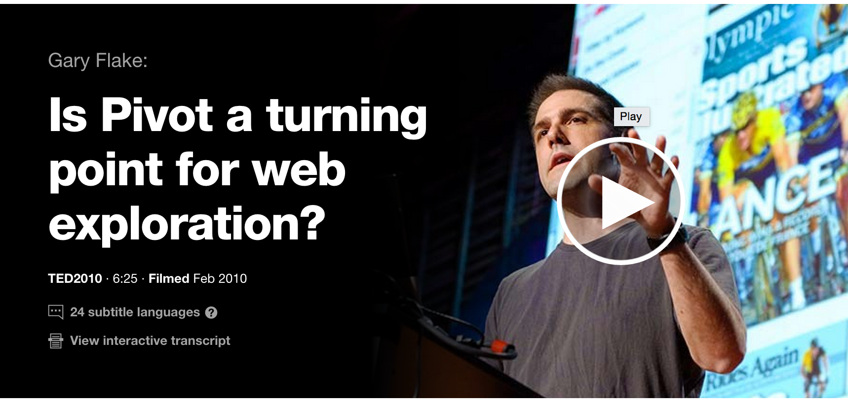
TED Talk, by Gary Flake
- What we wiki, D. Thiebaut
- Stacy Schiff, “Know It All, Can Wikipedia conquer expertise?”, The New Yorker, July 31, 2006.
- Don Tapscott and Anthony Williams, Wikinomics: How Mass Collaboration Changes Everything. Portfolio, 2006
- Michael Stube, and Simone Paolo Ponzetto, “WikiRelate! Computing Semantic Relatedness Using Wikipedia,” in Proceedings of the 21st National Conference on Artificial Intelligence, Boston, Mass., 16-20 July, 2006, pp. 1419-1424.
- Martin Hepp, Katharina Siorpaes, and Daniel Bachlechner, "Harvesting Wiki Consensus Using Wikipedia Entries as Vocabulary for Knowledge Management", IEEE Internet Computing, pp. 54-65., Sept. 2007.
This section is only visible to computers located at Smith College
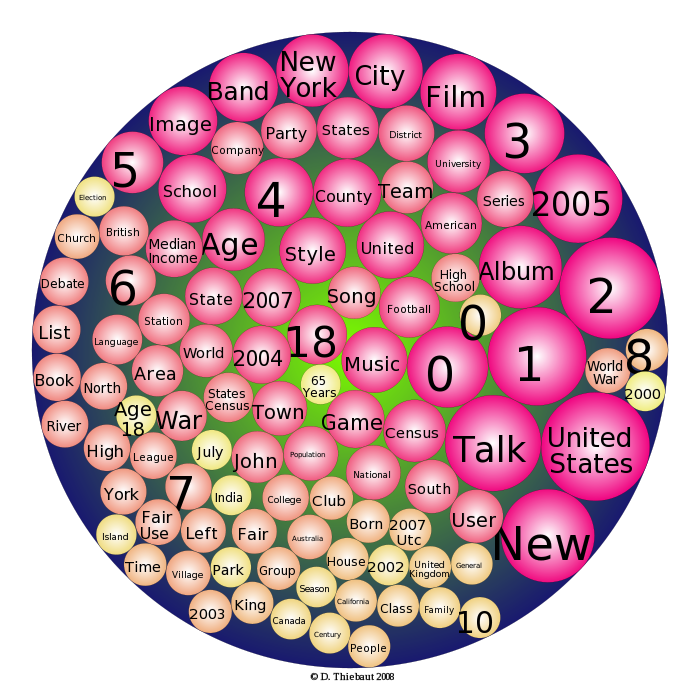
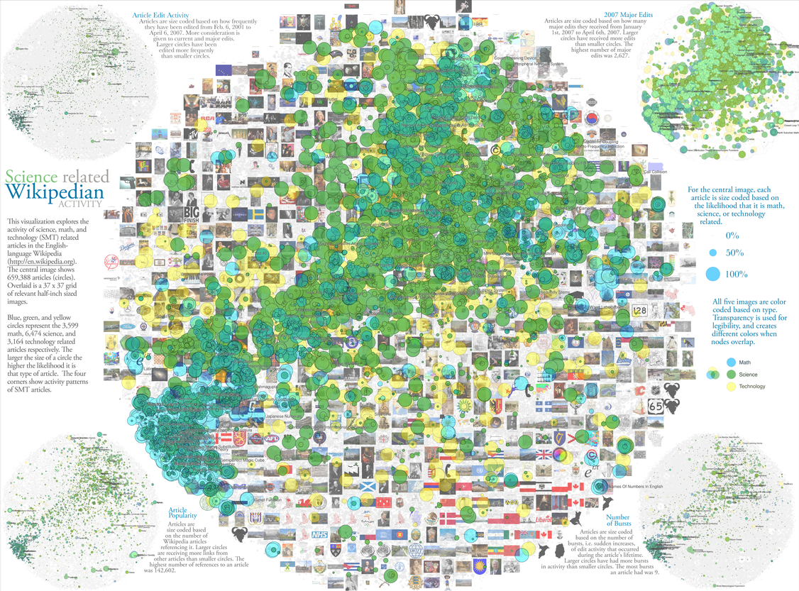
- Science related Wikipedian Activity (original image available here)
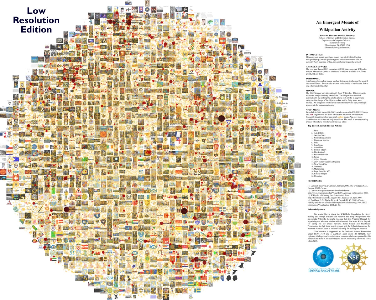
- An Emergent Mosaic of Wikipedia Activity (original image available here).
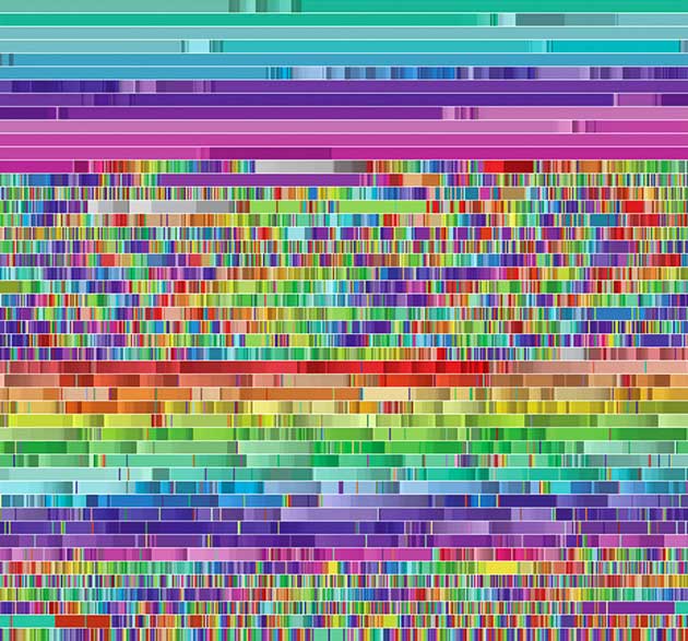
Seen in Wired Magazine: Source. A visualization of thousands of Wikipedia edits that were made by a single software bot. Each color corresponds to a different page.
Image: Fernanda B. Viégas, Martin Wattenberg, and Kate Hollenbach.
Data Vis. Examples (taken from DT's wiki)
Some Graphviz Examples
Category: Social Network
Author/Source: NA
Implementation: 2D
Date: 2008
Icons of the Web
Category: Art
Author/Source: NMap.org
Implementation: NMap Security Scanner
Date: 2010
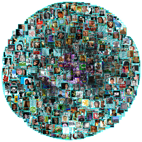
The area of each icon is proportional to the sum of the reach of all sites using that icon. When both a bare domain name and its "www." counterpart used the same icon, only one of them was counted. The smallest icons--those corresponding to sites with approximately 0.0001% reach--are scaled to 16x16 pixels. The largest icon (Google) is 11,936 x 11,936 pixels, and the whole diagram is 37,440 x 37,440 (1.4 gigapixels). Since your web browser would choke on that, we have created the interactive viewer below (click and drag to pan, double-click to zoom, or type in a site name to go right to it).
Visnomad
Category: Lexical/Text
Where: Smith College
Implementation: 2D, network
Date: 2009-present
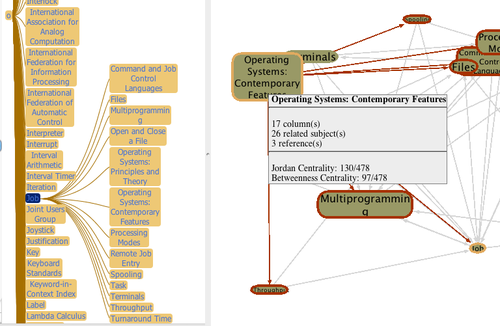
From http://visnomad.org: "We present an original visualizer that allows users to travel through the network of pages of an early encyclopedia of computer science. The purpose of this tool is to better understand the relationship between concepts of computer science at an early stage in the development of the field. The visualizer is written in Java, interfaces to a database server, and sports two different graphical representations, a tree and a graph that are logically connected. We present our design goals, our choices of implementations and the challenges encountered."
Chris Harrison--Visualizing the Bible
Category: Lexical/Text
Author/Source: Chris Harrison, CMU
Implementation: NA
Date: 2009
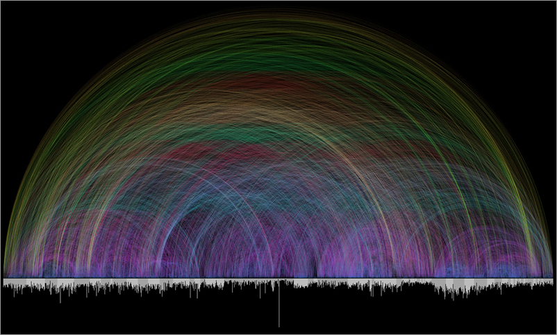
from http://www.chrisharrison.net/projects/bibleviz/index.html: "The bar graph that runs along the bottom represents all of the chapters in the Bible. Books alternate in color between white and light gray. The length of each bar denotes the number of verses in the chapter. Each of the 63,779 cross references found in the Bible is depicted by a single arc - the color corresponds to the distance between the two chapters, creating a rainbow-like effect."
VisPedia: Standford's Visualization of Wikipedia
Category: text / lexical
Author/Source:Stanford
Implementation: network
Date: 2009
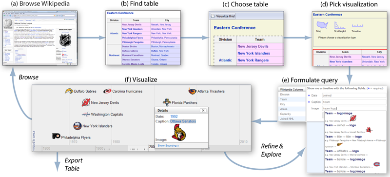
"We present Vispedia (live at vispedia.stanford.edu), a system that reduces the cost of data integration, enabling casual users to build ad hoc visualizations of Wikipedia data. Users can browse Wikipedia, select an interesting data table, then interactively discover, integrate, and visualize additional related data on-demand through a search interface and a query recommendation engine. This is accomplished through a fast path search algorithm over a semantic graph derived from Wikipedia. Vispedia also supports exporting the augmented data tables produced for use in more traditional visualization systems. We believe that these techniques begin to address the "long tail" of visualization by allowing a wider audience to visualize a broader class of data."
Measuring dynamic relationships between readers and stories
Category: Lexical/text
Author/Source: NA
Implementation: 2D
Date: 2008
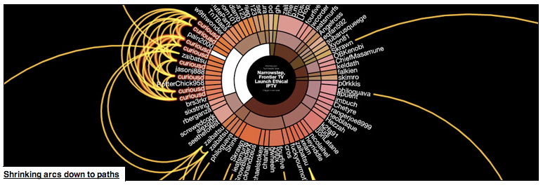
Digg Arc displays stories, topics, and containers wrapped around a sphere. Arcs trail people as they Digg stories across topics. Stories with more Diggs make thicker arcs.
Listening to Wikipedia
Category: multimedia/sound
Author/Source: listen.hatnote.com
Implementation: D3 and HowlerJS
Date: Sept. 2013
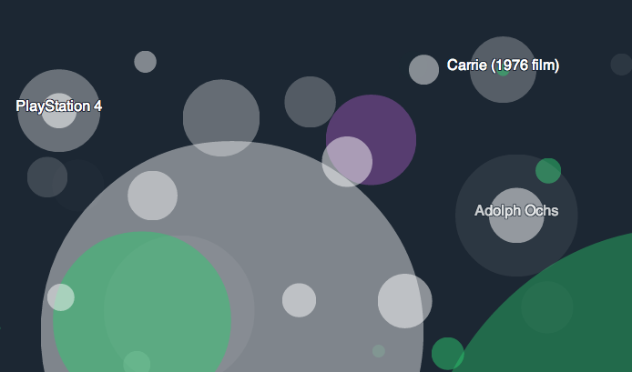
From hatnote.com: Listen to Wikipedia's recent changes feed. The sounds indicate addition to (bells) or subtraction from (strings) a Wikipedia articles, and the pitch changes according to the size of the edit. Green circles show edits from unregistered contributors, and purple circles mark edits performed by automated bots. You may see announcements for new users as they join the site -- you can welcome him or her by adding a note on their talk page.
This project is built using D3 and HowlerJS. It is based on Listen to Bitcoin by Maximillian Laumeister. Our source is available on GitHub, and you can read more about this project.
Built by Stephen LaPorte and Mahmoud Hashemi.
Animating the Edit History of Wikipedia
Category: Animation
Author/Source: blog.jonudell.net/
Implementation: NA
Date: 2005
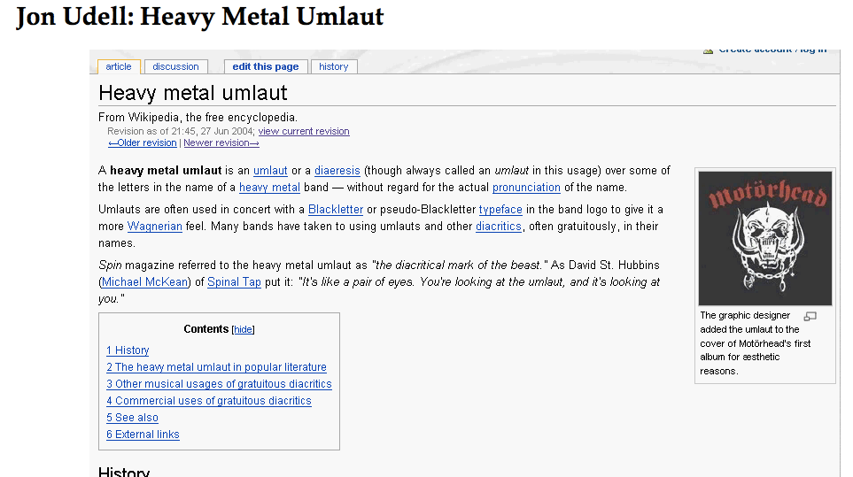
Animation of the history of a wikipedia page done by Jon Udell.
- The animation
- http://weblog.infoworld.com/udell/gems/umlaut.html
- Some information from the associated blog
- http://waxy.org/archive/2005/06/14/automati.shtml
Wikipedia Live Updates from Hatnote
Category: GIS/Social Network
Author/Source: hatnote.com
Implementation: d3, DataMaps, freegeoip.net, and the Wikimedia RecentChanges IRC feed, broadcast through wikimon. Source available on github.
Date: May 2013
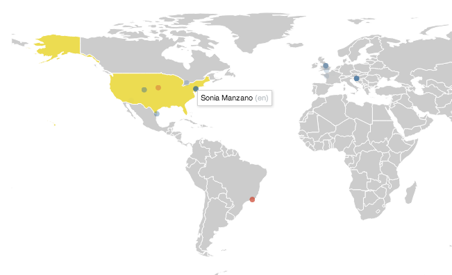
From hatnote.com: When an unregistered user makes a contribution to Wikipedia, he or she is identified by his or her IP address. These IP addresses are translated to the contributor’s approximate geographic location. A study by Fabian Kaelin in 2011 noted that unregistered users make approximately 20% of the edits on English Wikipedia: likely closer to 15%, according to more recent statistics], so Wikipedia’s stream of recent changes includes many other edits that are not shown on this map.
You may see some users add non-productive or disruptive content to Wikipedia. A survey in 2007 indicated that unregistered users are less likely to make productive edits to the encyclopedia. Do not fear: improper edits can be removed or corrected by other users, including you!
How it works: this map listens to live feeds of Wikipedia revisions, broadcast using wikimon. We built the map using a few nice libraries and services, including d3, DataMaps, and freegeoip.net. This project was inspired by WikipediaVision’s (almost) real-time edit visualization.
Data-Vis of Wikipedia Meta-Data
Category: Geographic/SocialNetwork
Author/Source: Olivier H. Beauchesne at olihb.com
Implementation: Python and Java
Date: Jan 2013
From olihb.com ( first reported by fastCodesign.com): A large number of Wikipedia articles are geocoded. This means that when an article pertains to a location, its latitude and longitude are linked to the article. As you can imagine, this can be useful to generate insightful and eye-catching infographics. A while ago, a team at Oxford built this magnificent tool to illustrate the language boundaries in Wikipedia articles. This led me to wonder if it would be possible to extract the different topics in Wikipedia.
This is exactly what I managed to do in the past few days. I downloaded all of Wikipedia, extracted 300 different topics using a powerful clustering algorithm, projected all the geocoded articles on a map and highlighted the different clusters (or topics) in red. The results were much more interesting than I thought. For example, the map on the left shows all the articles related to mountains, peaks, summits, etc. in red on a blue base map. The highlighted articles from this topic match the main mountain ranges exactly.
The author also shares some of the tools that he used to gather the data, and parse it. Among them are:
Videos
- Jimmy Wales on the Birth of Wikipedia. This is a bit dated; July 2005, and the numbers cited are all obsolete, but the information about the management of the site is still relevant.
- NYPD edits Wikipedia pages, article in Huffington Post.
